
Colors That Go With Charcoal Gray: 4 Practical Palettes

Charcoal gray can support far more than white: warm neutrals, muted greens, cool blues, and vivid accents all change its character in useful ways. The key is to choose each color for a role, then check value contrast, undertone, and light instead of trusting a name alone. The palettes below give you exact screen references and a practical way to translate them into rooms, crafts, and digital layouts.
Quick Answer: What Colors Go With Charcoal Gray?
Warm white, cream, wheat, tan, natural wood, muted pink, sage green, steel blue, teal, golden yellow, coral, and plum can all work with charcoal gray. Light colors produce clear value contrast, warm colors counterbalance a cool-looking charcoal, and blues or greens create a quieter relationship. The most successful choice depends on what the charcoal looks like beside your actual materials and lighting.
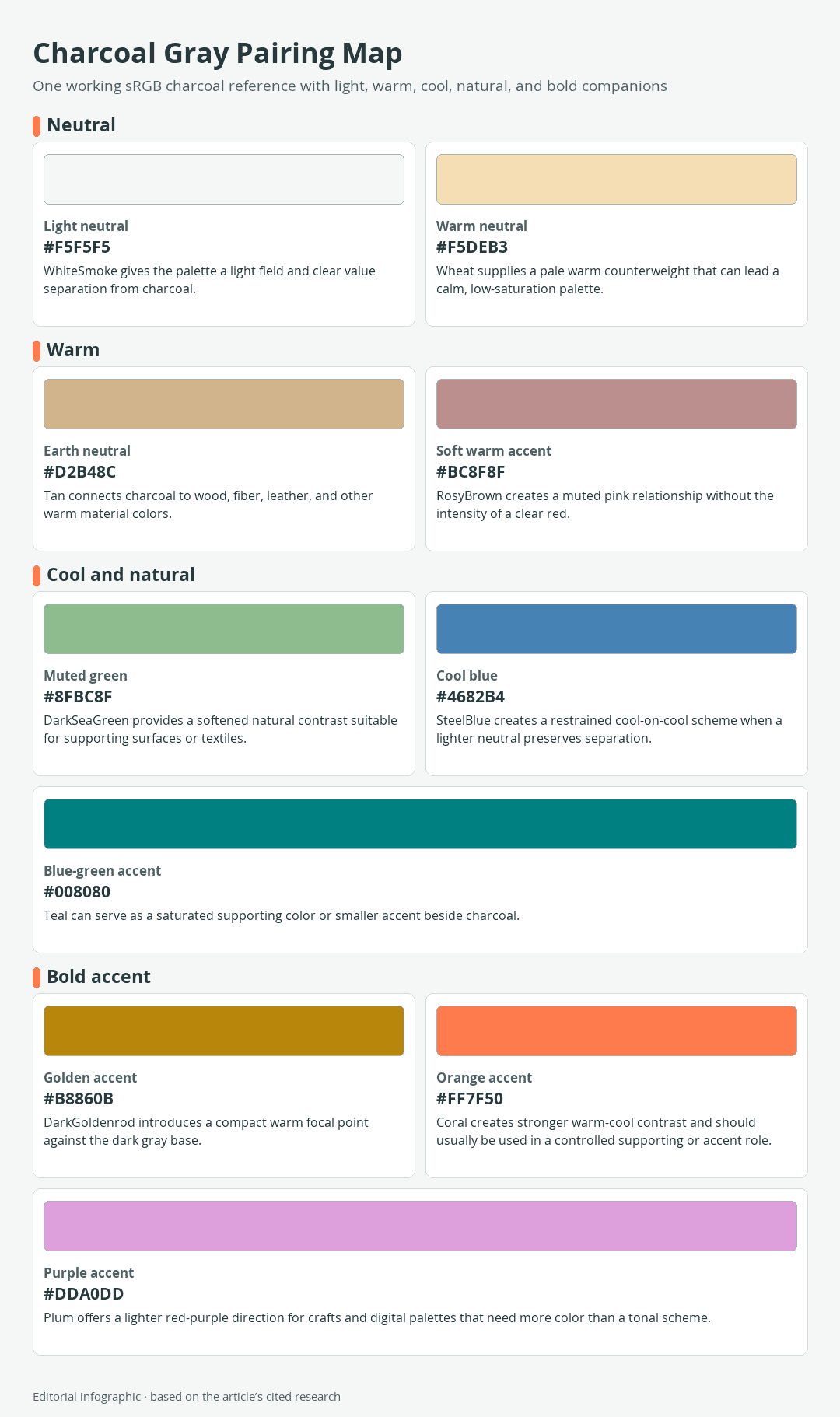
Download the complete color reference sheet (PNG): Charcoal Gray Pairing Map (PNG)
The charcoal reference used in the palettes
Charcoal gray describes a family rather than one universal color. This guide uses #36454F as its working sRGB screen reference. Digital color catalogs commonly associate that value with Charcoal, but it is not an official CSS named-color keyword or a specification for paint, fabric, ink, stained wood, or any other physical material.
| Name | HEX | RGB | Color |
|---|---|---|---|
| Charcoal, working reference | #36454F | 54, 69, 79 |
The slight blue-green lean of this reference helps explain why warm tan, gold, and coral provide noticeable temperature contrast. A physical charcoal may instead lean brown, green, violet, or more neutral, so use the relationship as a starting point rather than a guaranteed material match.
Useful companion colors at a glance
The companion values below are standardized CSS named colors. Their exact sRGB values make them reproducible for a screen palette, while the role descriptions show how to use them as design references.
| Name | HEX | RGB | Color |
|---|---|---|---|
| WhiteSmoke | #F5F5F5 | 245, 245, 245 | |
| Wheat | #F5DEB3 | 245, 222, 179 | |
| Tan | #D2B48C | 210, 180, 140 | |
| RosyBrown | #BC8F8F | 188, 143, 143 | |
| DarkSeaGreen | #8FBC8F | 143, 188, 143 | |
| SteelBlue | #4682B4 | 70, 130, 180 | |
| Teal | #008080 | 0, 128, 128 | |
| DarkGoldenrod | #B8860B | 184, 134, 11 | |
| Coral | #FF7F50 | 255, 127, 80 | |
| Plum | #DDA0DD | 221, 160, 221 |
These names are useful reference points, not a complete design taxonomy. For example, a paint sold as sage or terracotta will not necessarily match DarkSeaGreen or Coral. Match the visual relationship and role first, then select the actual product in person.
Practical Colors to Pair With Charcoal Gray
Warm white, cream, and wheat
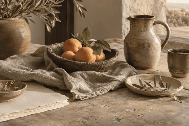
A pale neutral gives charcoal room to function as a strong outline, anchor, or focal surface. Use warm white on walls or trim when pure-looking white feels too sharp next to flooring, baskets, or wood. Wheat introduces more yellow warmth and works well for paper, woven textiles, rugs, and natural-fiber craft elements.
 AI-generated editorial illustration; not a measured color sample.
The pairing is most effective when the pale color occupies the larger area. Charcoal can then define cabinetry, furniture, frames, lettering, or smaller geometric details without making the whole composition dark.
Tan, camel, and natural wood
Tan connects charcoal with warm material colors found in wood, leather, fiber, and clay. That makes it a useful bridge when a room already contains brown flooring or furniture. A tan rug beneath charcoal upholstery, a wood frame around charcoal artwork, or kraft paper with charcoal ink creates warmth without requiring a bright accent.
Natural wood is not one fixed color. Compare its yellow, orange, red, or gray cast with the charcoal before repeating it elsewhere in the palette.
Blush and rosy brown
Muted pink softens the boundary between a dark neutral and warmer furnishings. RosyBrown is subdued enough for broad textiles or background shapes, while a clearer blush may be better reserved for cushions, flowers, ceramics, or small craft details.
Place a pale neutral between the two colors if the result feels heavy. That third color creates lightness separation and lets both charcoal and pink remain distinct.
Sage and muted green
A softened green can act as a supporting color rather than a conspicuous accent. Try it on upholstery, painted furniture, botanical artwork, storage boxes, or textile patterns beside a charcoal wall or work surface. Green is also among the colorful partners paint guidance suggests for cool gray neutrals.
Check whether the chosen green leans yellow or blue. A yellow-leaning sage supplies more temperature contrast, while a blue-green produces a more closely related scheme.
Steel blue and softer blues
Steel blue reinforces the cooler side of the working charcoal reference. Because both colors are moderately dark, introduce a pale field through walls, trim, paper, or negative space. Without that light element, the boundary between blue and charcoal can become difficult to see.
For a softer result, choose a lighter, grayer blue in the physical material rather than assuming a screen swatch will translate directly to paint or fabric.
Teal
Teal brings more saturation while retaining a blue-green relationship with charcoal. It can cover a chair, cabinet, patterned textile, or large graphic shape when WhiteSmoke or another pale neutral supplies separation. In a smaller role, use it for glassware, planters, handles, thread, or a single digital callout.
Teal and charcoal are both relatively dark in the references used here. They can look harmonious and still fail as a readable text-and-background pair, so do not judge legibility by hue alone.
Ochre and golden yellow
A deep golden yellow gives cool-looking charcoal a concentrated warm focal point. DarkGoldenrod works as a restrained screen reference for artwork, pillows, painted craft details, icons, or a narrow stripe. A lighter wheat or cream prevents the combination from becoming visually dense.
Gold-colored metal introduces reflection as well as color, so its appearance changes with finish and illumination. Treat a flat HEX swatch as a palette cue, not a simulation of metallic material.
Coral, rust, and terracotta
Coral creates a stronger warm-cool distinction than tan or rosy brown. Use it where attention is useful, such as a small cabinet, vase, artwork detail, package label, or digital button. Rust and terracotta can fill a similar role in physical decor, but their exact color depends on the material and product.
Repeat a bold accent sparingly across a few locations rather than making every movable object the same color. Charcoal will then hold the composition together while the warm notes direct attention.
Plum and burgundy
Red-purple colors provide an alternative to blue and green without becoming as bright as coral. A lighter plum can support charcoal in paper crafts, fabric patterns, and digital illustrations. Deeper burgundy is closer to charcoal in lightness, so it benefits from cream, wheat, or another pale separator.
Plum is the exact CSS reference shown here. Burgundy is a descriptive family in this context, not a claim that every product bearing the name has one standardized value.
Four Ready-to-Use Charcoal Gray Palettes
Each palette is an sRGB design reference with dominant, supporting, and accent roles. “Dominant” means the largest color field, while “accent” identifies the smallest, most selective role. The roles guide proportion without imposing a fixed formula, and they may be reassigned when a room, artwork, or craft has different needs.
Light and calm
| Name | HEX | RGB | Color |
|---|---|---|---|
| Dominant: WhiteSmoke | #F5F5F5 | 245, 245, 245 | |
| Supporting: RosyBrown | #BC8F8F | 188, 143, 143 | |
| Accent: Charcoal | #36454F | 54, 69, 79 |
Use the light neutral for walls, paper, or the main digital canvas. Rosy brown can carry textiles or broad secondary shapes, while charcoal defines frames, hardware, type, or fine outlines. This palette is useful when you want charcoal present but do not want it to dominate.
Warm and earthy
| Name | HEX | RGB | Color |
|---|---|---|---|
| Dominant: Wheat | #F5DEB3 | 245, 222, 179 | |
| Supporting: Charcoal | #36454F | 54, 69, 79 | |
| Accent: DarkGoldenrod | #B8860B | 184, 134, 11 |
Let wheat or a comparable pale material cover the broadest area. Charcoal supplies weight through furniture, lettering, or a feature surface, while the golden accent marks a few focal details. Natural wood can replace part of the wheat role after its undertone has been checked in place.
Cool and tailored
| Name | HEX | RGB | Color |
|---|---|---|---|
| Dominant: Charcoal | #36454F | 54, 69, 79 | |
| Supporting: SteelBlue | #4682B4 | 70, 130, 180 | |
| Accent: WhiteSmoke | #F5F5F5 | 245, 245, 245 |
This close, cool relationship needs the pale accent to clarify edges. Use charcoal for the main surface, steel blue for a secondary panel or pattern, and WhiteSmoke for trim, labels, stitching, or negative space. Do not set small steel-blue text directly on charcoal without checking contrast.
Bold and graphic
| Name | HEX | RGB | Color |
|---|---|---|---|
| Dominant: Charcoal | #36454F | 54, 69, 79 | |
| Supporting: Teal | #008080 | 0, 128, 128 | |
| Accent: Coral | #FF7F50 | 255, 127, 80 |
Charcoal creates the dark field, teal adds a distinct blue-green block, and coral supplies the warm point of emphasis. This arrangement suits posters, storage labels, geometric crafts, and decorative objects. Add a light neutral when the design needs readable text or more breathing room.
What Is the Complementary Color of Charcoal Gray?
The digital HSL hue opposite for #36454F
For the selected #36454F digital reference, rotating the hue by 180 degrees in HSL while retaining its saturation and HSL lightness gives #4F4036, a dark warm brown. This is a model-specific screen result for that particular charcoal reference, not the single complement of every charcoal gray. HSL lightness is a numeric component of that model and should not be mistaken for equal perceived lightness.
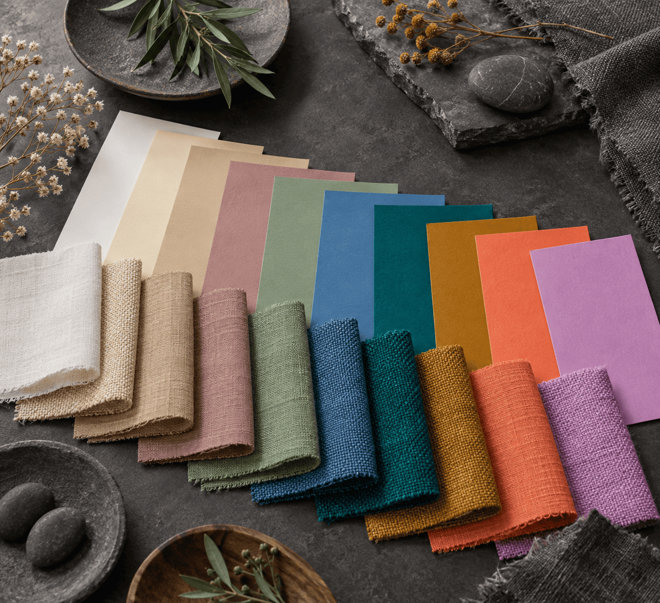 AI-generated editorial illustration; not a measured color sample.
| Name | HEX | RGB | Color |
|---|---|---|---|
| Charcoal, working reference | #36454F | 54, 69, 79 | |
| HSL hue opposite | #4F4036 | 79, 64, 54 |
The two colors are both dark, so their mathematical relationship does not create strong lightness contrast. In a room or graphic, wheat, tan, coral, or golden yellow may be a more useful warm companion because it is easier to distinguish from charcoal.
Why paint wheels and screen tools can disagree
RGB is an additive, light-based model used for screens, while the traditional artist-oriented RYB wheel organizes red, yellow, and blue as its primaries. Tools can also calculate an opposite from different definitions of hue, so they do not always return the same value.
Physical paint adds further variables: pigment behavior, finish, substrate, and illumination. A digital opposite therefore describes a screen relationship, not a paint-mixing formula or a guaranteed wall-color combination.
How to Choose the Right Pairing in a Real Room
Check the undertone first
Paint has a dominant visible color, often called its mass tone, plus subtler undertones that become clearer beside other colors. Compare your charcoal chip with a neutral reference and several neighboring grays. A blue, green, violet, or brown cast is easier to notice when the samples are viewed together.
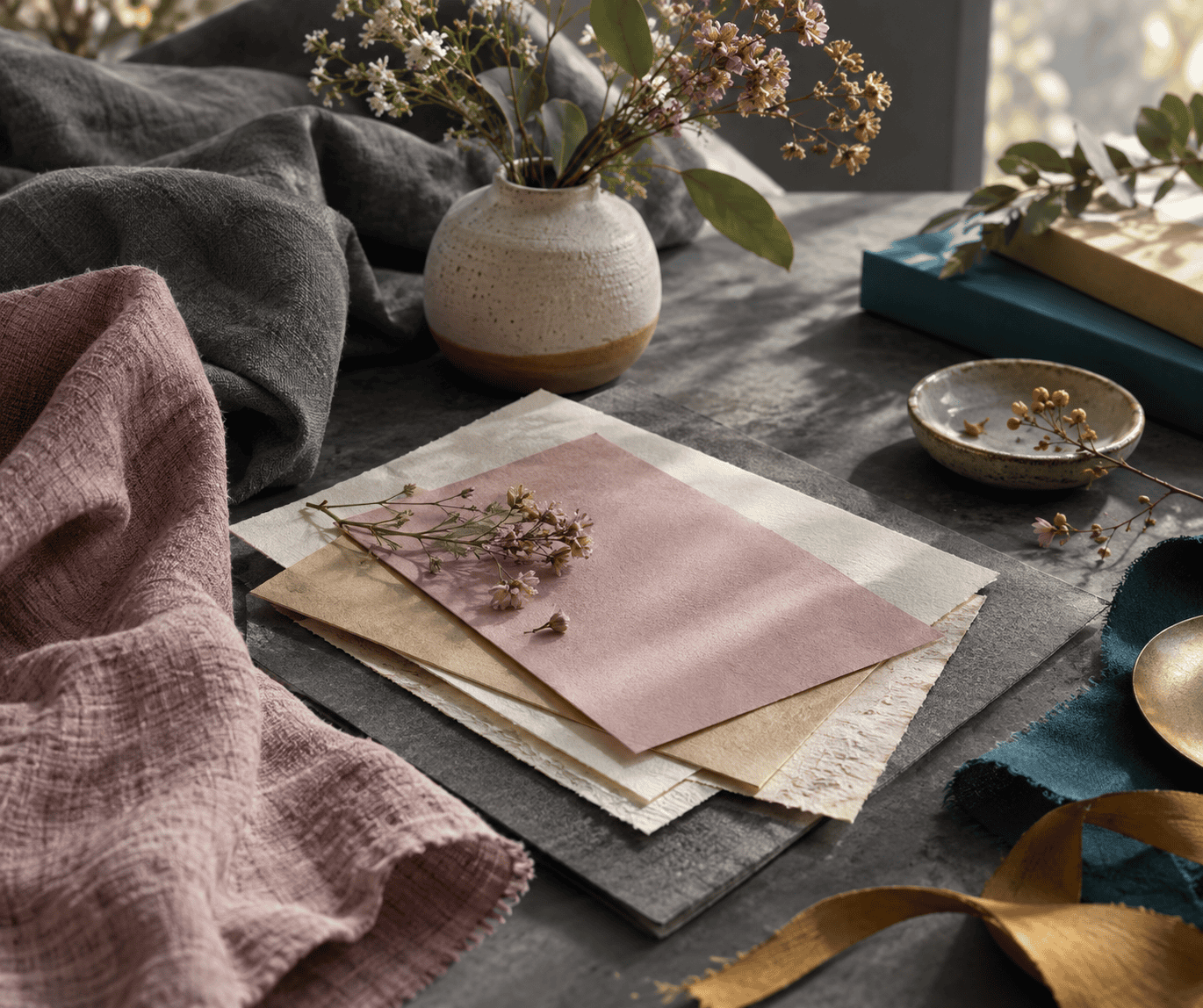 AI-generated editorial illustration; not a measured color sample.
You can repeat that undertone for cohesion or set up a deliberate warm-cool contrast. A blue-leaning charcoal may connect naturally with steel blue and teal, for example, while tan or coral creates a clearer temperature shift.
Use lightness as well as hue
Two colors may differ in hue yet remain difficult to separate if both are dark. This is why charcoal and steel blue often need pale trim, and why charcoal with deep burgundy benefits from cream or wheat. Squint at the samples or view a grayscale photo to see whether the large shapes remain distinct.
Decide which color should carry the largest surface, which should connect the elements, and which deserves attention. Assigning these roles is more reliable than collecting several attractive colors with no hierarchy.
Test paint and materials in place
View the actual candidates on the intended surface with the furnishings, flooring, and fixed finishes that will remain. Observe them from morning through evening and under the artificial lights normally used in the space. Natural and artificial light can bring different undertones forward.
Product, sheen, surface texture, and lighting can all make applied paint differ from a sample. Fabric pile, wood grain, reflective metal, and printed ink also affect appearance. Use the HEX palettes to plan relationships, then verify physical products together before buying or applying a large quantity.
Using Charcoal Gray in Digital Design
Keep names and HEX values distinct
The values in this guide are sRGB screen references. Standard CSS named-color tokens omit spaces when written in code, as in WhiteSmoke, DarkSeaGreen, and DarkGoldenrod. Charcoal is different: it is not a standardized CSS keyword, so use #36454F when you want this exact working reference.
A color name remains helpful for conversation, but the HEX value controls the digital result. That distinction also prevents a descriptive material name from being mistaken for a precise screen specification.
Check text contrast, not just color harmony
For WCAG Level AA, normal text needs a contrast ratio of at least 4.5:1. Large text needs at least 3:1 and is defined as 18pt regular or 14pt bold at minimum. Thresholds must not be rounded up, so a result just below the requirement still fails.
The figures below compare each exact companion value with #36454F. They are useful for screening these specific pairs, but a final design should be checked again after any color, opacity, background, or type-size change.
| Name | HEX | RGB | Color | Contrast with #36454F | Text use |
|---|---|---|---|---|---|
| WhiteSmoke | #F5F5F5 | 245, 245, 245 | 9.08:1 | Normal and large text | |
| Wheat | #F5DEB3 | 245, 222, 179 | 7.53:1 | Normal and large text | |
| Tan | #D2B48C | 210, 180, 140 | 5.02:1 | Normal and large text | |
| RosyBrown | #BC8F8F | 188, 143, 143 | 3.52:1 | Large text only | |
| DarkSeaGreen | #8FBC8F | 143, 188, 143 | 4.60:1 | Normal and large text | |
| SteelBlue | #4682B4 | 70, 130, 180 | 2.41:1 | Not sufficient for text | |
| Teal | #008080 | 0, 128, 128 | 2.07:1 | Not sufficient for text | |
| DarkGoldenrod | #B8860B | 184, 134, 11 | 3.04:1 | Large text only | |
| Coral | #FF7F50 | 255, 127, 80 | 3.96:1 | Large text only | |
| Plum | #DDA0DD | 221, 160, 221 | 4.78:1 | Normal and large text |
A passing ratio confirms measurable lightness contrast for the tested pair. It does not decide whether the colors are well proportioned, whether the palette suits its setting, or whether every user can distinguish non-text elements. Use contrast and color harmony as separate checks.

Learn more about Israel Benloulou and about us.