
Colors That Go With Mustard Yellow: 6 Easy Palettes

Mustard yellow works beautifully with navy, teal, olive, earthy red-browns, soft pink, purple, warm white, and deep gray. The trick is choosing which color leads and which one provides contrast, rather than giving every hue equal weight. These six practical palettes provide exact screen references and adaptable roles for rooms, crafts, and digital designs.
Best Colors to Pair With Mustard Yellow
For a quick decision, pair mustard yellow with navy or teal for cool contrast, olive or sienna for an earthy effect, misty rose for softness, or purple for a strong violet-family contrast. Floral white is a useful quiet background, while dark slate gray supplies visual structure.
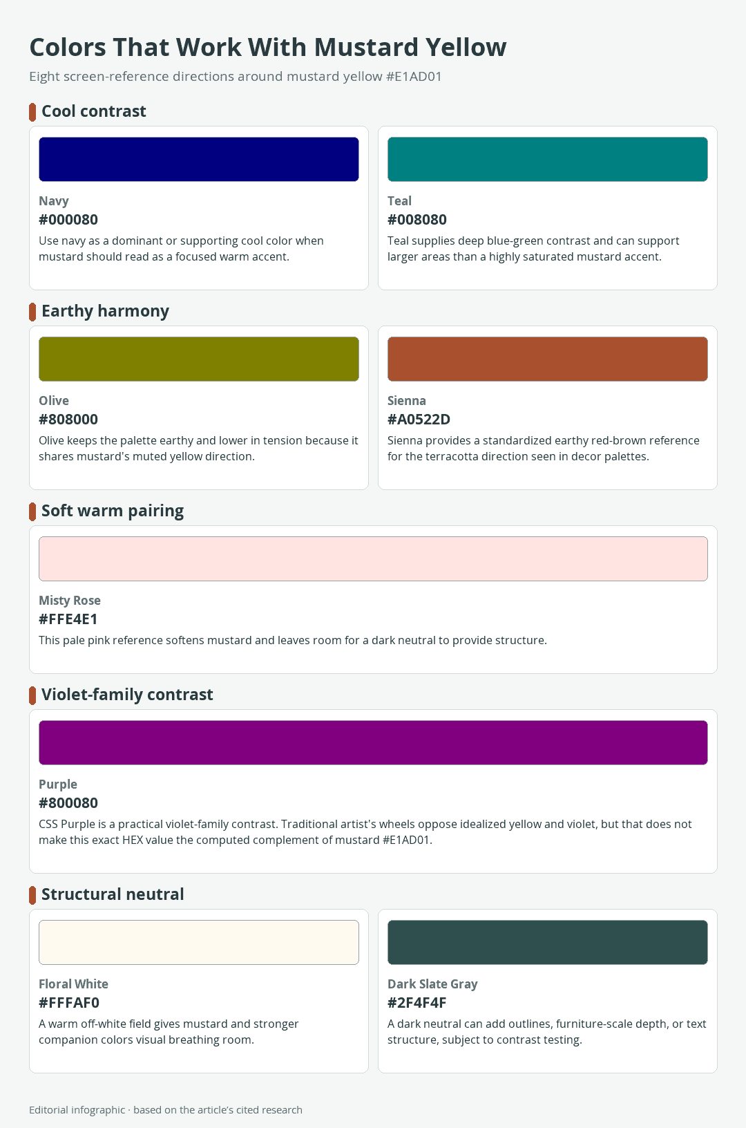
Download the complete color reference sheet (PNG): Colors That Work With Mustard Yellow (PNG)
The following values are sRGB screen references. The companion colors use standardized CSS named-color values, but the pairings themselves are practical editorial recommendations rather than universal rules.
The Quick Pairing Shortlist
| Name | HEX | RGB | Color |
|---|---|---|---|
| Mustard Yellow (working reference) | #E1AD01 | 225, 173, 1 | |
| Navy | #000080 | 0, 0, 128 | |
| Teal | #008080 | 0, 128, 128 | |
| Olive | #808000 | 128, 128, 0 | |
| Sienna | #A0522D | 160, 82, 45 | |
| Misty Rose | #FFE4E1 | 255, 228, 225 | |
| Purple | #800080 | 128, 0, 128 | |
| Floral White | #FFFAF0 | 255, 250, 240 | |
| Dark Slate Gray | #2F4F4F | 47, 79, 79 |
Navy and teal make mustard appear warmer by comparison. Olive and sienna keep it within a subdued, nature-based range. Misty rose reduces the palette’s visual intensity, while purple produces a more conspicuous hue contrast. The two neutrals help separate these stronger colors and prevent them from competing across every surface.
Which Mustard Yellow Is This Guide Using?
This guide uses #E1AD01 as its working mustard-yellow reference. It is a selected digital reference, not an official definition of mustard and not a paint formula. “Mustard” is absent from the standardized CSS named-color list, and published design resources apply the name to different values, including the brighter #FFCE1B.
That distinction matters because changing the base yellow changes every calculated relationship around it. Use #E1AD01 when you want to reproduce the palettes below on a screen. If your existing fabric, paint, or paper is called mustard, treat the physical sample as the controlling color instead.
Six Ready-to-Use Mustard Yellow Palettes
Each palette assigns jobs to its colors. “Dominant” means the largest visual area, “supporting” means a substantial secondary area, and “accent” means a smaller point of emphasis. These roles are starting positions, so the same palette can scale from a website to a room without prescribing fixed quantities.
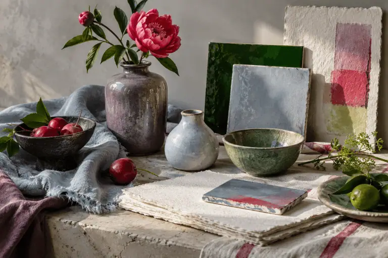
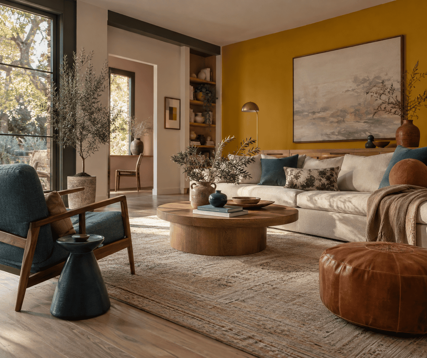 AI-generated editorial illustration; not a measured color sample.
Navy, Floral White, and Mustard: Crisp Contrast
| Name | HEX | RGB | Color |
|---|---|---|---|
| Navy (dominant) | #000080 | 0, 0, 128 | |
| Floral White (supporting) | #FFFAF0 | 255, 250, 240 | |
| Mustard Yellow (accent) | #E1AD01 | 225, 173, 1 |
Navy gives mustard a deep, cool counterweight, and floral white keeps the result from becoming visually heavy. In a room, navy can cover cabinetry, a sofa, or one focused wall while mustard appears in cushions, artwork, or a small piece of furniture. In a digital layout, use floral white for open space and reserve mustard for selected highlights rather than every control.
Teal, Floral White, and Mustard: Deep and Balanced
| Name | HEX | RGB | Color |
|---|---|---|---|
| Teal (dominant) | #008080 | 0, 128, 128 | |
| Floral White (supporting) | #FFFAF0 | 255, 250, 240 | |
| Mustard Yellow (accent) | #E1AD01 | 225, 173, 1 |
Teal combines blue-green coolness with enough depth to stand beside earthy mustard. This palette suits woven crafts, painted storage, poster graphics, and rooms where mustard should energize a calmer foundation. Floral white is especially helpful between teal and mustard because it gives each saturated color a clear boundary.
Olive, Mustard, and Dark Slate Gray: Earthy and Layered
| Name | HEX | RGB | Color |
|---|---|---|---|
| Olive (dominant) | #808000 | 128, 128, 0 | |
| Mustard Yellow (supporting) | #E1AD01 | 225, 173, 1 | |
| Dark Slate Gray (structure) | #2F4F4F | 47, 79, 79 |
Olive shares mustard’s muted yellow direction, so this combination feels more connected and less contrast-driven than the navy palette. Dark slate gray supplies a cooler boundary around the two related warm hues. Try it for botanical crafts, patterned textiles, painted boxes, or an interface that needs an earthy identity without relying on brown.
Because olive and mustard can appear close in brightness, do not rely on their boundary alone to communicate a shape or instruction. Add spacing, an outline, a pattern, or a tested dark separator when the distinction is functional.
Sienna, Floral White, and Mustard: Warm Craft Palette
| Name | HEX | RGB | Color |
|---|---|---|---|
| Floral White (dominant) | #FFFAF0 | 255, 250, 240 | |
| Sienna (supporting) | #A0522D | 160, 82, 45 | |
| Mustard Yellow (accent) | #E1AD01 | 225, 173, 1 |
Sienna provides a reproducible red-brown direction similar to the terracotta families often paired with mustard in decor. It works well when warmth is intentional, particularly in ceramics, paper crafts, textile motifs, and natural-material interiors. Let floral white occupy the largest area if the sienna and mustard combination begins to feel dense.
Misty Rose, Mustard, and Dark Slate Gray: Soft With Structure
| Name | HEX | RGB | Color |
|---|---|---|---|
| Misty Rose (dominant) | #FFE4E1 | 255, 228, 225 | |
| Mustard Yellow (supporting) | #E1AD01 | 225, 173, 1 | |
| Dark Slate Gray (structure) | #2F4F4F | 47, 79, 79 |
Pale pink softens mustard without turning the whole palette cool. Dark slate gray prevents the two warm colors from blending into an indistinct pastel field. This grouping can suit stationery, soft furnishings, decorative painting, or packaging where a gentle background needs a grounded edge.
Purple, Floral White, and Mustard: Violet-Family Contrast
| Name | HEX | RGB | Color |
|---|---|---|---|
| Floral White (dominant) | #FFFAF0 | 255, 250, 240 | |
| Purple (supporting) | #800080 | 128, 0, 128 | |
| Mustard Yellow (accent) | #E1AD01 | 225, 173, 1 |
CSS Purple #800080 provides a practical violet-family contrast with mustard, but it is not the exact complement of #E1AD01. Traditional artist’s wheels place idealized yellow opposite violet. The pairing is assertive, so a broad floral-white field lets it breathe. Use one of the two strong hues in a smaller role when you want contrast without equal visual competition.
Why These Mustard Combinations Work
Cool Contrast Versus Warm Harmony
Navy and teal contrast with mustard’s warm appearance, helping a small mustard element stand out. Olive and sienna move in a more closely related earthy direction, creating a gentler transition across materials or shapes. Pink sits on the warm side but is sufficiently lighter in this palette to soften the combination.
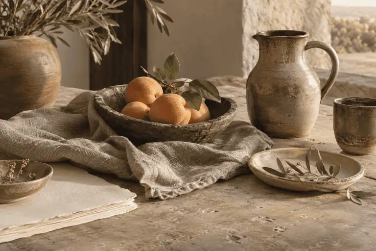
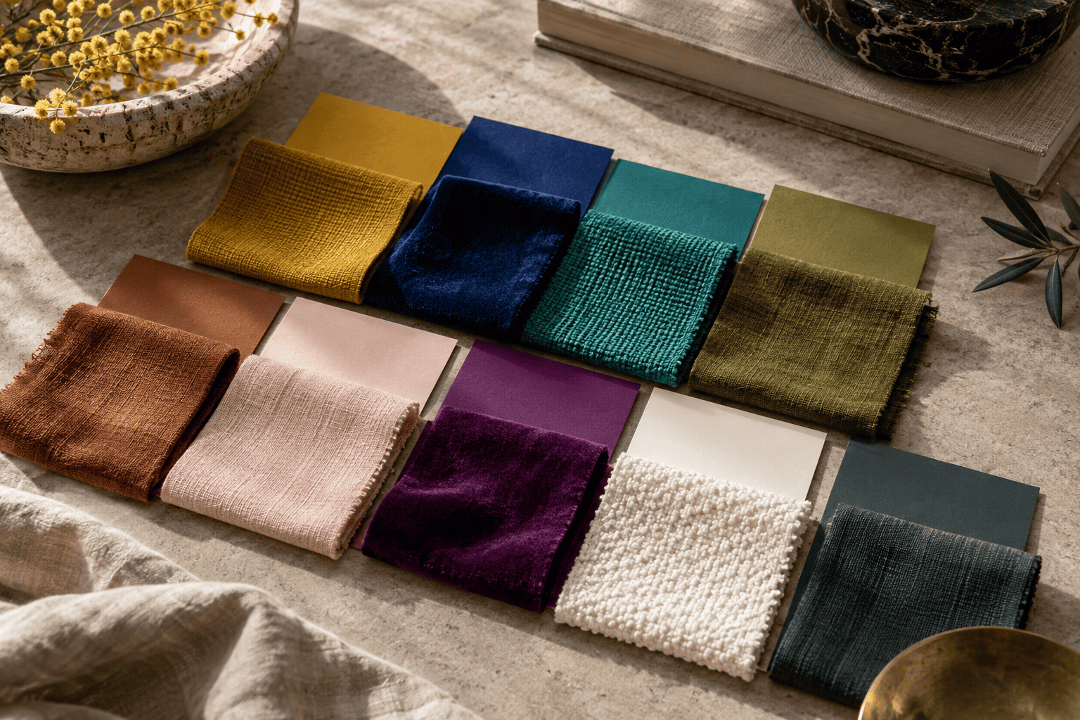 AI-generated editorial illustration; not a measured color sample.
These effects are visual directions, not guarantees about mood. Scale, texture, lighting, surrounding colors, and personal preference can change how the same pairing reads. A tiny navy line around mustard paper behaves differently from an entire navy wall behind a mustard chair.
Mustard Yellow’s Complement Depends on the Color Model
On a traditional artist’s wheel, idealized yellow and violet are treated as complementary hues because they sit opposite each other. You can see how complements, analogous neighbors, and other relationships are organized in this guide to using a color wheel.
That relationship does not make CSS Purple #800080 the exact complement of the selected #E1AD01 mustard reference. Digital tools may return a blue or blue-violet when they calculate an opposite from that specific value. The result depends on the digital color model and the selected mustard value, so this guide treats #800080 as a practical violet-family contrast rather than a universal mathematical opposite.
Use Proportion to Control the Result
The familiar 60-30-10 framework assigns roughly 60 percent of a design to the dominant color, 30 percent to support, and 10 percent to an accent. Treat it as a convenient starting framework, not a scientifically optimal rule. A detailed quilt, compact logo, and full room do not need identical proportions.
A more flexible method is to choose one clear field color, one supporting block, and one small attention color. Step back or reduce a digital design to thumbnail size. If all three colors demand attention equally, enlarge the quietest field or reduce the mustard or purple accents.
Choose Roles for Decor, Crafts, and Digital Design
When Mustard Is the Dominant Color
Make mustard dominant when its warmth is central to the project, such as a painted cabinet, a large textile panel, or the background of an illustration. Pair it with restrained areas of navy, dark slate gray, or purple, then add floral white where the eye needs rest.
Large mustard areas can change noticeably as the lighting changes. Test a broad physical sample rather than judging from a tiny chip or phone screen.
When Mustard Is a Supporting Color
As a supporting color, mustard can occupy a chair, throw, painted frame, broad stripe, or secondary interface panel. It is large enough to establish warmth but leaves navy, teal, olive, misty rose, or a neutral in control. Repeat a related mustard detail elsewhere to connect separated areas without copying identical proportions.
For craft work, place the actual materials beside each other before cutting or gluing. Glossy paper, matte yarn, translucent watercolor, and opaque paint can make nominally similar colors behave differently.
When Mustard Is a Small Accent
Mustard is easiest to control as a small accent. Use it for a border, drawer pull, stitched detail, vase, icon, or selected callout. Two or three separated appearances can create continuity, but repetition should follow the composition rather than a mandatory count.
In an interface, an accent is not automatically an accessible text or button color. A harmonious palette and a readable foreground-background pair answer different questions, so verify the final combination rather than judging the mustard swatch in isolation.
Check Contrast, Materials, and Lighting
Test Text and Interface Contrast
For web content, WCAG 2.2 sets a minimum contrast ratio of 4.5:1 for normal text and 3:1 for large text. Large text means at least 18pt regular or 14pt bold. Test the exact foreground and background values, and do not round a near-passing result upward.
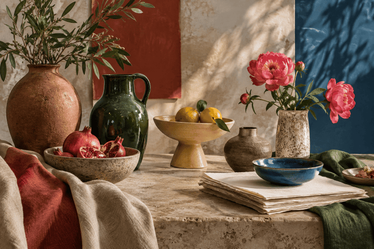
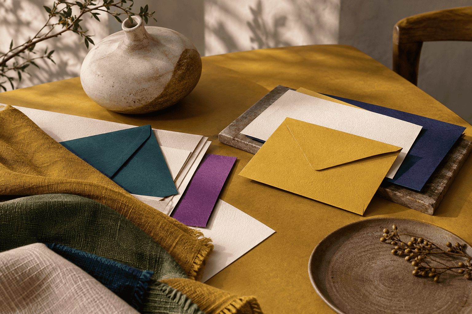 AI-generated editorial illustration; not a measured color sample.
Color should also never be the only cue for information or state. If mustard identifies an error, selected tool, or active step, reinforce it with text, an icon, a pattern, or another visible change. This remains necessary even when the mustard combination looks attractive.
Do Not Treat HEX as a Paint or Ink Formula
A HEX value specifies a digital sRGB reference; it does not prescribe pigments, binders, dyes, or printing inks. Paint brands can use different colorants under similar names, and printed output depends on the printer, ink, paper, and color profile. Fabric texture and sheen introduce still more variation.
For print, work with the appropriate output profile and use a proof when color accuracy matters. For paint and crafts, compare cured or dry samples on the intended surface and follow the product maker’s preparation, application, and safety instructions. If you want to alter a physical yellow rather than select a companion color, consult this guide to mixing and adjusting yellow paint, while remembering that no digital HEX value supplies a universal pigment ratio.
Sample the Combination in Its Final Light
Illumination changes the colors people perceive on physical objects. A palette selected beside a bright window may look different under warm evening lamps or in a dim hallway. Screens add their own variation through display settings and color profiles.
Place paint, fabric, paper, or ink samples together where the finished project will be used. Check them in daylight and under the room’s normal artificial lighting, then look at both the individual colors and their boundaries. This final comparison reveals whether the palette needs more neutral space, a darker structural color, or a smaller mustard area before you commit to the whole project.

Learn more about Israel Benloulou and about us.