

Burgundy Color Meaning: Context, History, and Design

Burgundy can suggest sophistication, seriousness, authority, or restrained intensity, but those meanings are conventions rather than properties built into the color. Its message shifts with the object, culture, period, material, and neighboring colors. Understanding those variables makes burgundy much easier to recognize and use deliberately.
What Does Burgundy Mean?
In contemporary English-language design guides, burgundy is associated with sophistication, seriousness, wealth, authority, and controlled intensity. These are documented design conventions, not effects that every viewer will experience.
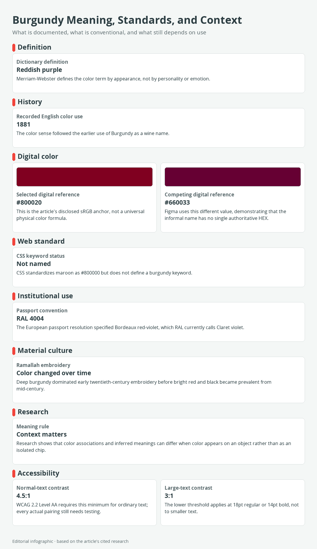
Download the complete color reference sheet (PNG): Burgundy Meaning, Standards, and Context (PNG)
Burgundy does not reveal a person’s character, diagnose a mood, stimulate an appetite, or guarantee that an audience will feel powerful or sophisticated. Color meaning develops through learned associations and can change with experience and context.
Common associations and their limits
Burgundy’s relative darkness can make it appear weightier and more reserved than a bright red. Put the same color on a velvet curtain, a sports uniform, a warning graphic, and a cosmetic package, however, and it participates in four different messages.
It is therefore more accurate to say that designers may use burgundy to communicate formality or status than to say that it inherently means either one. Audience expectations matter too. A convention familiar in one country, community, or design field may not transfer cleanly to another.
Why context changes the message
Color semantics concerns the meanings people infer from color. Those inferences are flexible, and a simple association between a color and a concept is not necessarily the meaning a viewer will take from a finished object. Peer-reviewed work has found that semantic ratings can change when people see a color on an object instead of as an isolated chip.
One study compared responses from 25 participants across 54 images. Some ratings differed between isolated colors and colored objects, which is a useful warning against treating a swatch as a complete message. Shape, function, material, lighting, wording, and surrounding colors all help determine what burgundy communicates.
Consider proportion as well. A small burgundy accent on an ivory page may feel polished and restrained, while a room dominated by the same digital reference may feel much heavier. Neither response can be predicted from the color name alone.
What Color Is Burgundy?
Burgundy is broadly defined as a reddish purple. For digital examples, this guide uses #800020 as its controlling reference in sRGB, the standard red-green-blue color space commonly used for screens. That value is widely associated with burgundy, but it is not an official definition of every color sold, printed, painted, woven, or described under the name.
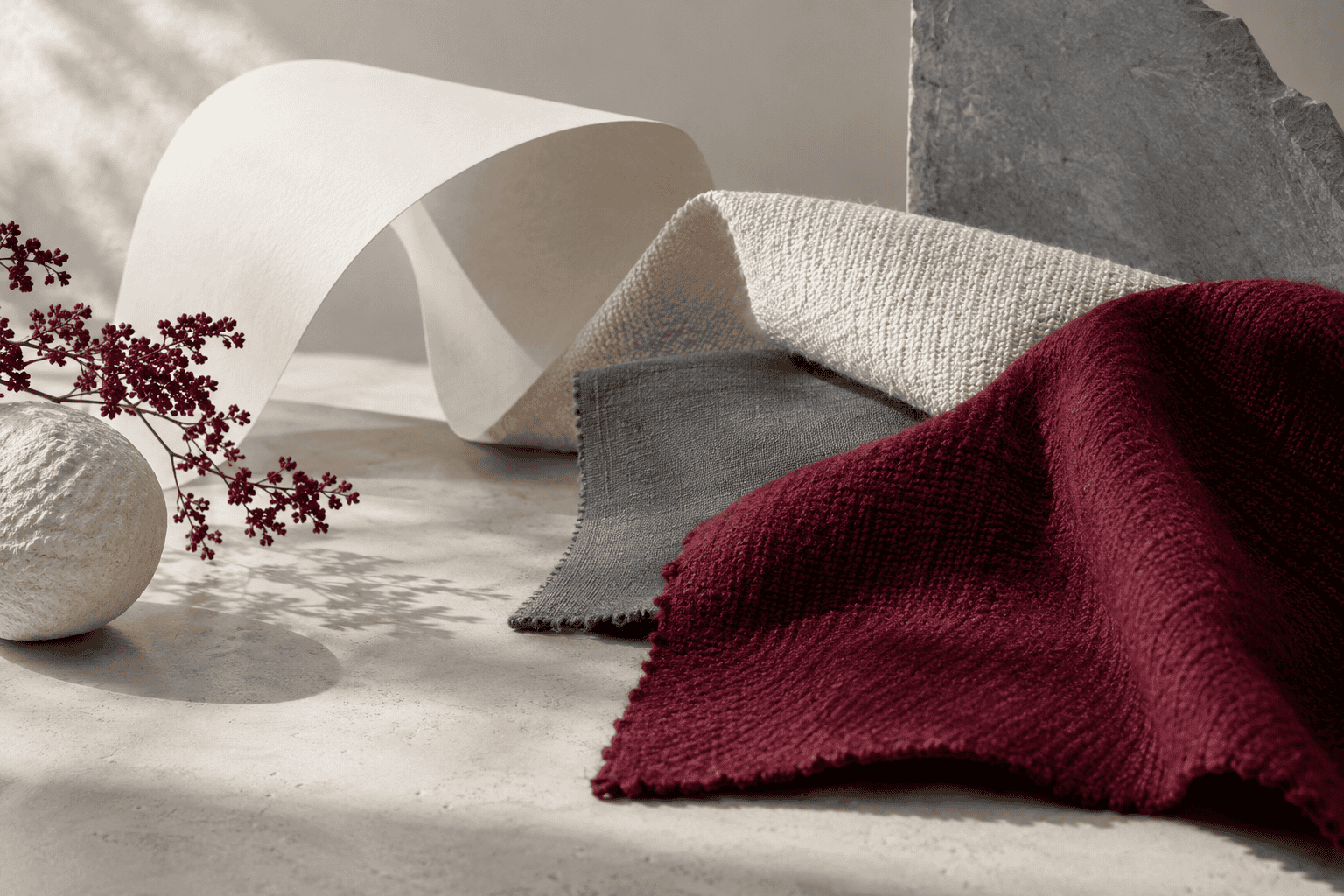 AI-generated editorial illustration; not a measured color sample.
The selected digital reference
| Name | HEX | RGB | Color |
|---|---|---|---|
| Burgundy, selected reference | #800020 | 128, 0, 32 | |
| Burgundy, alternate design reference | #660033 | 102, 0, 51 |
A six-digit HEX value encodes the red, green, and blue components of an sRGB color. In #800020, the first pair produces a red value of 128, the middle pair produces no green, and the final pair produces a blue value of 32.
The qualified names in the table matter. Major design references do not agree on one burgundy HEX value: some use #800020, while another uses #660033. The disagreement does not make either value useless. It shows why a designer should provide the code rather than expect the informal name to specify an exact screen color.
Burgundy versus maroon
Dictionaries offer a practical distinction: burgundy is reddish purple, while maroon is dark red. On the web, the difference becomes more technical because maroon is a standardized CSS named-color keyword with the value #800000. CSS does not provide a corresponding burgundy keyword.
| Name | HEX | RGB | Color |
|---|---|---|---|
| Burgundy, selected reference | #800020 | 128, 0, 32 | |
| Maroon, CSS named color | #800000 | 128, 0, 0 |
These two digital values share the same red component, but the selected burgundy includes a small blue component. Commercial names still overlap, so a fabric or paint labeled “maroon” may resemble another seller’s “burgundy.” Use a specification, sample, or product code when the distinction matters.
Why burgundy changes across screens and materials
A HEX value describes emitted screen color within sRGB. It is not a pigment recipe, dye formula, printing-ink specification, wine measurement, or guarantee of how a physical surface will look. Screens vary, and reflective materials also respond to their fiber, finish, texture, lighting, and surrounding colors.
RAL 4004 belongs to a separate industrial color collection and is named Claret violet. It should not be treated as another spelling of #800020 or converted into an exact equivalent without measured color data. The same caution applies when matching a digital mockup to wall paint, embroidery thread, upholstery, or printed packaging. Obtain a physical sample and examine it under the lighting in which it will be used.
How Burgundy’s Name and Uses Changed
Burgundy’s history demonstrates why color meaning needs a place, period, and object. A wine-derived name, an institutional specification, and a changing embroidery tradition can all involve burgundy-like colors without sharing one fixed symbolism.
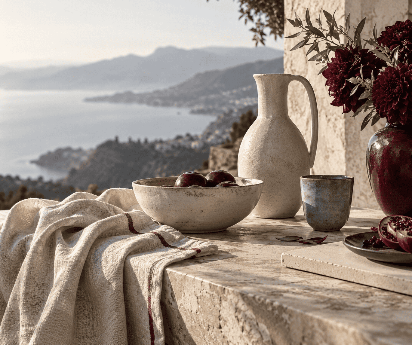 AI-generated editorial illustration; not a measured color sample.
From a French wine name to an English color term
Burgundy first identified a region of France. The English term was being used for its wine by the 1670s, and a recorded use for a wine-like color dates to 1881. The color name therefore carries a material comparison: it asks the reader to imagine the dark reddish-purple appearance associated with Burgundy wine.
This history does not establish why modern audiences make particular symbolic associations with burgundy. The appearance of wine itself also varies, so the name supplies a recognizable family resemblance rather than a laboratory specification.
Burgundy in a European passport specification
A 1981 resolution concerning a uniform passport for member states of the European Communities called for covers as close as possible to RAL 4004. The resolution described the color as Bordeaux red-violet, while the current RAL English name is Claret violet.
This is a documented institutional specification, not proof that burgundy universally represents Europe, citizenship, or authority. The standard involved was RAL 4004, not the article’s #800020 digital reference.
A changing textile color in Ramallah tatreez
Tatreez is Palestinian cross-stitch embroidery with styles that vary by place and period. Museum scholarship documents that women in Ramallah embroidered almost exclusively with deep burgundy during the early twentieth century. From the middle of that century, bright red and black cotton threads became predominant.
The documented account cautiously connects this transition with changes in fashion and with differences between natural and synthetic dyes. It should not be reduced to a claim that one burgundy shade held a permanent meaning for all Palestinians. Instead, the example shows how materials, trade, technology, and taste can change a color tradition within a particular community.
It also illustrates the limits of digital reconstruction. A fresh #800020 screen swatch cannot reproduce the appearance of aged thread, a specific dye, or embroidery viewed under museum lighting.
Using Burgundy in Design
Start with an exact reference, assign each color a role, and judge the result in its final medium. The following palettes use standardized CSS companion values with the selected #800020 burgundy. They are digital recommendations, not historical palettes or physical mixing formulas.
Three role-based burgundy palettes
Quiet editorial palette: Use ivory as the dominant field, burgundy for headings or focal areas, and slate gray for secondary blocks and decoration. The pale field emphasizes burgundy’s depth without making the entire composition feel dense.
| Name | HEX | RGB | Color |
|---|---|---|---|
| Dominant: Ivory | #FFFFF0 | 255, 255, 240 | |
| Supporting: Burgundy | #800020 | 128, 0, 32 | |
| Accent: Slate gray | #708090 | 112, 128, 144 |
Burgundy, gold, and ivory palette: Let burgundy dominate, reserve gold for limited accents, and use ivory where a light neutral is needed. This combination can suit a formal or ceremonial brief when that interpretation fits the audience and subject.
| Name | HEX | RGB | Color |
|---|---|---|---|
| Dominant: Burgundy | #800020 | 128, 0, 32 | |
| Supporting: Gold | #FFD700 | 255, 215, 0 | |
| Accent: Ivory | #FFFFF0 | 255, 255, 240 |
Contrasting accent palette: Build on beige, use burgundy for structure, and add teal sparingly. Teal creates stronger hue separation from burgundy than the neutral companions do, making it useful for small graphic accents and data categories.
| Name | HEX | RGB | Color |
|---|---|---|---|
| Dominant: Beige | #F5F5DC | 245, 245, 220 | |
| Supporting: Burgundy | #800020 | 128, 0, 32 | |
| Accent: Teal | #008080 | 0, 128, 128 |
Contrast and readable text
Never infer text readability from color names or visual preference. WCAG 2.2 Level AA requires a contrast ratio of at least 4.5:1 for normal text and 3:1 for text that is at least 18pt regular or 14pt bold.
Using the listed sRGB values, burgundy and ivory have a contrast ratio of about 10.74:1, burgundy and beige about 9.79:1, and burgundy and gold about 7.72:1. Each clears the 4.5:1 threshold. Burgundy with slate gray reaches only about 2.67:1, and burgundy with teal about 2.27:1, so those pairs should not be used as ordinary text and background combinations.
Contrast compliance does not make every layout easy to use. Keep body type comfortably sized, avoid thin letterforms, preserve visible focus indicators, and do not rely on color alone to communicate status or instructions. Recalculate contrast if any HEX value changes.
Warm, cool, and undertone judgments
The selected burgundy contains red and a smaller amount of blue, which gives it its reddish-purple identity. Whether it appears warm or cool is relative. Beside teal it may look warmer and redder; beside gold it can reveal more of its purple character. A different product sold as burgundy may lean browner, redder, or more violet.
For physical materials, compare samples side by side under the intended lighting. For digital work, place the exact colors at realistic proportions on the target display. A tiny accent swatch cannot predict the effect of a full wall, large textile, or screen background.
A Context Checklist for Interpreting Burgundy
Use these questions before assigning a meaning or approving a burgundy specification:
- Where and when is it used? Identify the country, community, period, and design field instead of assuming one global symbolism.
- What carries the color? A passport, wine label, embroidered dress, website button, and painted wall create different associations.
- Which burgundy is intended? Give an exact HEX value for sRGB work or name the relevant physical standard, manufacturer code, or approved sample.
- Is the claim observed or predicted? Separate a documented convention from a guess about the viewer’s emotions or personality.
- What surrounds it? Check proportion, lighting, surface, neighboring colors, words, imagery, and function.
- Does another name fit better? Maroon, wine red, claret, oxblood, and Bordeaux may describe nearby colors, but they are not automatically interchangeable specifications.
- Has the final output been tested? Inspect the real screen, print, paint, dye, or fabric under its intended conditions and verify text contrast where readability matters.
This method preserves what makes burgundy useful: it can carry strong, recognizable conventions without pretending that a color has one permanent meaning everywhere.
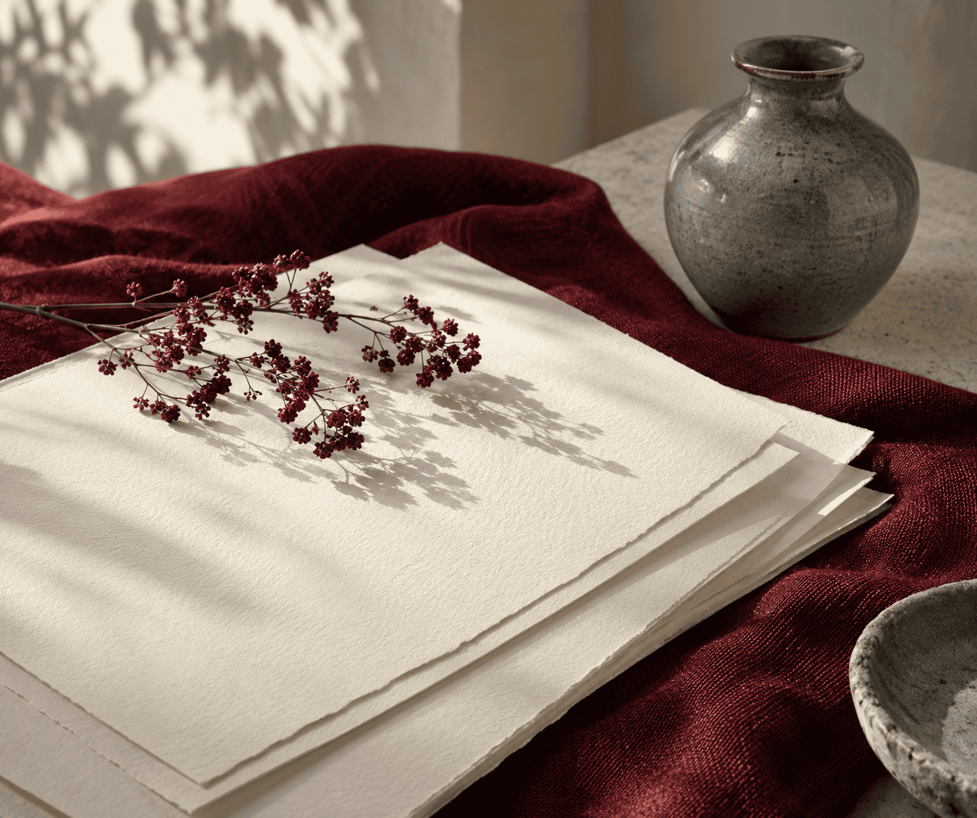 AI-generated editorial illustration; not a measured color sample.

Learn more about Israel Benloulou and about us.