
Celadon Color: HEX Codes, Palettes, History, and Mixing

Celadon is a pale, softened green that can lean slightly blue or gray, but the name covers more than one exact shade. A practical digital starting point is #ACE1AF, while pottery, paint, print, and other screens may look noticeably different. Use this guide to identify celadon, choose precise companion colors, mix a paint approximation, and avoid common color-matching mistakes.
What Color Is Celadon?
Celadon belongs to the light green family, with a restrained appearance rather than the sharp intensity of a highly saturated green. Depending on the object, glaze, light, or chosen digital value, it may appear greener, bluer, grayer, or warmer.
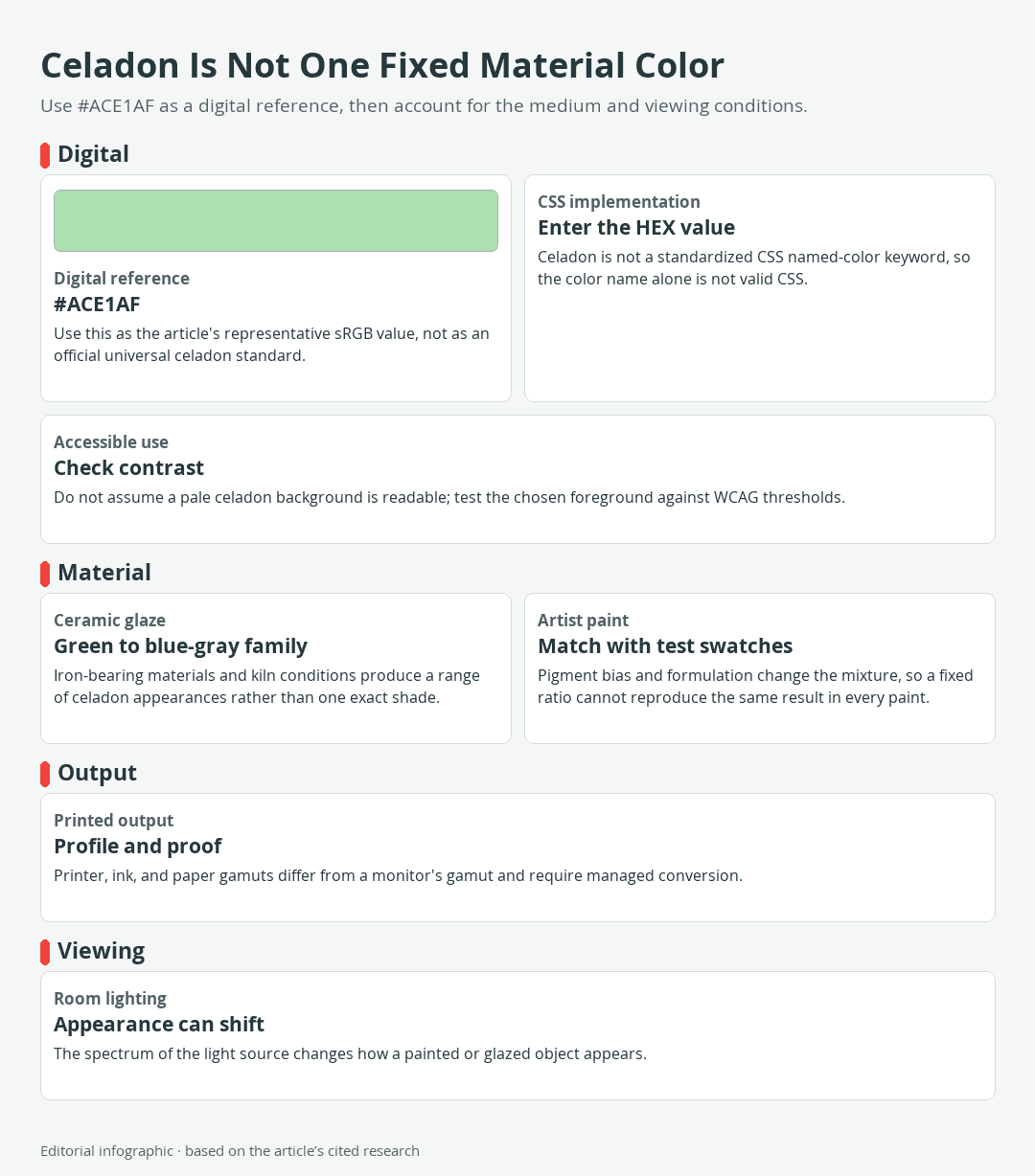
Download the complete color reference sheet (PNG): Celadon Is Not One Fixed Material Color (PNG)
The following value is a useful representative celadon for screen-based work. It is an informal modern convention, not a universal standard or a measurement of historical pottery.
| Name | HEX | RGB | Color |
|---|---|---|---|
| Celadon | #ACE1AF | 172, 225, 175 |
The representative digital celadon
In digital design, #ACE1AF describes an exact color in sRGB, the red, green, and blue color space to which CSS hexadecimal colors resolve. Its RGB channels are 172, 225, and 175. Entering the six-digit HEX value is more reliable than entering the word “celadon,” because celadon is not one of the standardized CSS named-color keywords.
Even color references do not agree on a single value. One widely used reference assigns #ACE1AF to celadon, while another uses #A8DCAB. Both are pale greens, but they are not identical. This disagreement is a useful warning: a descriptive color name communicates a family resemblance, whereas a HEX code identifies a particular screen color.
Why celadon does not have one universal value
The modern color name grew from the appearance of celadon ceramics, which encompass green, blue-green, and blue-gray glazes rather than one immutable sample. Iron-bearing materials, raw-material differences, and kiln conditions all affect a ceramic glaze. The same object may also appear different as its illumination changes.
The same distinction applies to paint and print. A HEX value is not a ceramic recipe, a tube-paint formula, or a guaranteed printed result. Physical color depends on the material and the light falling on it, while displays emit light and printers reproduce color with inks on a surface. Treat #ACE1AF as a clear digital reference point, then match the actual medium separately.
Neighboring names such as sage, mint, seafoam, and jade green are also used inconsistently across products and design catalogs. When an exact match matters, compare specified values or real samples instead of relying on the name alone.
Celadon Color Codes and Practical Palettes
This eight-color set combines the informal celadon reference with seven standardized CSS named colors. The companions have exact digital identities, but the palettes themselves are editorial starting points rather than official harmonies or promised paint matches.
 AI-generated editorial illustration; not a measured color sample.
The eight-color reference table
| Name | HEX | RGB | Color |
|---|---|---|---|
| Celadon | #ACE1AF | 172, 225, 175 | |
| Ivory | #FFFFF0 | 255, 255, 240 | |
| Navy | #000080 | 0, 0, 128 | |
| Dark Slate Gray | #2F4F4F | 47, 79, 79 | |
| Coral | #FF7F50 | 255, 127, 80 | |
| Rosy Brown | #BC8F8F | 188, 143, 143 | |
| Sienna | #A0522D | 160, 82, 45 | |
| Lavender | #E6E6FA | 230, 230, 250 |
In CSS, multiword named colors use unspaced identifiers. For example, the browser tokens are darkslategray and rosybrown, even though their display names are written with spaces. Celadon has no corresponding named token, so use #ACE1AF or another deliberately selected value.
Three palettes with defined color roles
A role-based palette is easier to apply than a list of attractive colors. The dominant color covers the largest area, the supporting color provides separation or continuity, and the accent creates emphasis. These proportions are flexible, and every physical material still requires sampling.
Airy neutral palette
| Name | HEX | RGB | Color |
|---|---|---|---|
| Celadon, dominant | #ACE1AF | 172, 225, 175 | |
| Ivory, supporting | #FFFFF0 | 255, 255, 240 | |
| Navy, accent | #000080 | 0, 0, 128 |
Ivory keeps the scheme light without matching celadon’s green cast. Navy supplies a much darker anchor for outlines, furniture, headings, or small graphic elements. Test text contrast separately instead of assuming that every navy-and-celadon treatment passes accessibility requirements.
Warm artisan palette
| Name | HEX | RGB | Color |
|---|---|---|---|
| Celadon, dominant | #ACE1AF | 172, 225, 175 | |
| Sienna, supporting | #A0522D | 160, 82, 45 | |
| Coral, accent | #FF7F50 | 255, 127, 80 |
Sienna brings an earthy dark note, while coral adds a clearer warm highlight. This grouping can guide painted motifs, packaging, textiles, or a room in which wood and terracotta-like colors already appear.
Soft contrast palette
| Name | HEX | RGB | Color |
|---|---|---|---|
| Celadon, dominant | #ACE1AF | 172, 225, 175 | |
| Lavender, supporting | #E6E6FA | 230, 230, 250 | |
| Dark Slate Gray, accent | #2F4F4F | 47, 79, 79 |
Lavender creates a gentle hue shift while Dark Slate Gray restores visual structure. Rosy Brown, #BC8F8F, can replace Lavender when the design needs a muted warm supporting color.
From Ceramic Glaze to a Modern Color Name
Celadon first describes a ceramic glaze tradition, not a digital standard. That material origin explains both the color’s name and its unusually broad visual range.
 AI-generated editorial illustration; not a measured color sample.
How the name entered European color vocabulary
The word is thought to come from Céladon, a green-robed character in a seventeenth-century French pastoral work. The association eventually connected the character’s clothing with the green appearance of imported glazed ceramics. Because the origin is described as likely rather than certain, it is better treated as an informed historical explanation than as a proven naming event.
Why historical celadon glazes vary
Historical celadon can range across green and blue hues. Iron-bearing glaze materials contribute to the color, while the atmosphere and conditions inside the kiln alter the result. A reducing atmosphere, in which available oxygen is limited during part of the firing, affects the chemical state of the materials and therefore the glaze’s appearance.
That process does not yield a single flat color like a screen swatch. Raw materials and firing conditions produce variation among celadon objects, so no single object should be treated as a universal celadon standard.
Chinese origins and the Goryeo tradition
Celadon ceramics originated in China and spread through East Asia. In China, their glaze was historically associated with the appearance of jade. This is a specific material and cultural connection, not evidence that pale green has one universal symbolic or psychological meaning.
Korean potters developed a distinct celadon tradition after influence from Chinese Yue ware. The technology grew increasingly sophisticated by the eleventh century and reached a high point during the twelfth century. Goryeo celadon became known for its jade-colored glaze and for inlay, including the technique called sanggam. Chinese and Korean celadons belong to connected ceramic histories, but their materials, techniques, forms, and cultural settings should not be treated as interchangeable.
How to Mix a Celadon-Like Paint Color
A digital celadon swatch can serve as a visual target, but it cannot supply a physical paint formula. Pigment identity, pigment load, binder, additives, opacity, surface, and handling behavior differ among paints, so a fixed ratio will not reproduce the same result in every brand or medium.
A test-and-adjust mixing route
- Choose a clean green starting point. When mixing from yellow and blue, a green-biased yellow and a green-biased blue generally produce a cleaner green than components that lean toward red. A suitable premixed green may also provide a workable base.
- Lighten gradually. Add the white appropriate to an opaque painting medium in small increments. For a transparent medium, use the product and technique appropriate to the intended transparency rather than assuming that an opaque white mixture will behave the same way.
- Reduce the intensity. If the mixture looks too bright, introduce a very small amount of a red-biased warm color. This opposing bias can mute the green quickly, so mix in tiny steps.
- Make labeled swatches. Record the colors used and paint each adjustment on the actual working surface whenever possible.
- Evaluate the finished state. Let the sample dry or cure as directed by the manufacturer, then inspect it in the light where the work will be displayed.
Adjusting green, blue, gray, and lightness
If the sample looks too yellow, add a small amount of the selected blue. If it looks too blue, nudge it with the selected yellow. If it remains too vivid, mute it cautiously with an opposing red bias rather than adding several unrelated pigments at once.
For a lighter celadon, increase lightness gradually and compare each step with the reference.
Do not judge a match only while the paint is wet. The relevant comparison is the completed surface under its expected illumination. Keep the successful dry swatch as a studio reference, along with the pigment or product names used to make it.
Why the same recipe will not match every medium
Oil, acrylic, watercolor, gouache, wall paint, ink, and ceramic glaze use different binders, pigments, application methods, and surfaces. Even products sold under the same color name may have different formulations. A mixture that works in one medium is therefore a starting hypothesis, not a transferable formula.
Follow the manufacturer’s label, medium instructions, drying or curing guidance, and safety data. Use the ventilation and protective measures specified for solvents, additives, spray applications, or unfamiliar pigments. Ceramic glaze formulation and kiln firing require their own material knowledge and safety controls and should not be inferred from an artist-paint mixing exercise.
Using Celadon in Art, Decor, and Digital Design
Celadon works especially well as a broad field because its light value leaves room for darker structure and warmer accents. The exact choice should respond to the project’s medium, lighting, scale, and functional requirements rather than to a claimed universal mood.
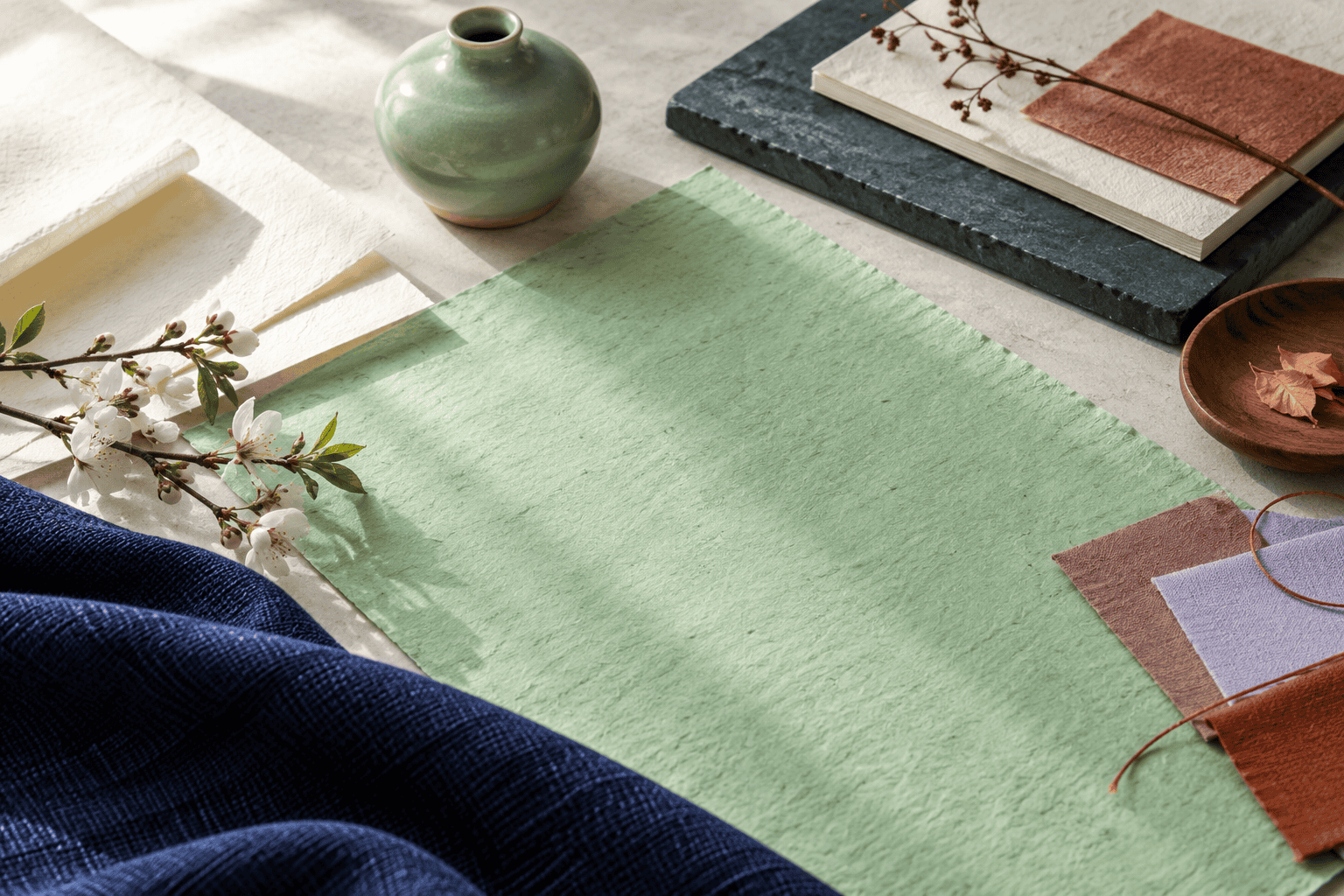 AI-generated editorial illustration; not a measured color sample.
Choosing companion colors by role
For a restrained layout or interior, let celadon cover the largest area and use Ivory to separate adjacent light surfaces. Navy or Dark Slate Gray can establish edges and hierarchy in smaller amounts. In a craft piece, Sienna can connect celadon to wood or earth-colored material, while Coral can mark a focal detail.
Lavender and Rosy Brown offer softer hue changes when a dark accent would feel too abrupt. Because both are fairly light or muted in this set, they may separate areas by hue without providing enough value contrast for small text or critical symbols. A palette can be visually pleasing and still fail a functional contrast test.
Sampling celadon in a room
For wall paint or a large painted object, obtain a sample of the actual product instead of asking a store to reproduce a web HEX value by eye. Apply it to more than one wall or movable sample board, following the product instructions. Then inspect it during the day and under the artificial lighting normally used in the room.
This step matters because the color of a physical object changes in appearance with the spectrum of the illumination. Compare the real sample beside the flooring, wood, textiles, and wall colors that will remain in the space rather than relying on an isolated phone screen.
Screen, print, and accessibility checks
Monitors and printers do not reproduce the same gamut, meaning the same range of colors. A document profile describes how color is represented, while an output profile helps translate that color for a particular printing condition. For print work, use an appropriate color-managed workflow and proof the result on the intended process and paper. A copied, unprofiled CMYK percentage cannot guarantee a celadon match.
For websites and interfaces, enter the chosen HEX value explicitly and test it on the actual display components. WCAG 2.2 calls for a contrast ratio of at least 4.5:1 for normal text and 3:1 for large text. In this context, large text is at least 18pt when regular or 14pt when bold. Essential interface graphics also need adequate contrast, and color should not be the only way that instructions, errors, or status changes are communicated.
A dependable celadon workflow is therefore simple: specify the digital value, sample physical materials, evaluate them under the intended light, proof printed output, and test functional contrast. That sequence preserves celadon’s flexible character without pretending that one screen swatch can control every material result.

Learn more about Israel Benloulou and about us.