
Champagne Color Meaning: Symbolism and Design Uses

Champagne color commonly suggests celebration, refinement, ceremony, and understated luxury, but its meaning always depends on context. The name carries the social history of Champagne wine into modern weddings, interiors, branding, and fashion. Understanding that connection makes it easier to choose the right shade, material, and color pairing without mistaking a convention for a universal psychological effect.
What Champagne Color Means
The short answer
In contemporary US and Western design, champagne color often communicates a restrained form of luxury. It can feel formal without the visual weight of black, ceremonial without the brightness of pure white, and warm without becoming an obvious yellow or orange.
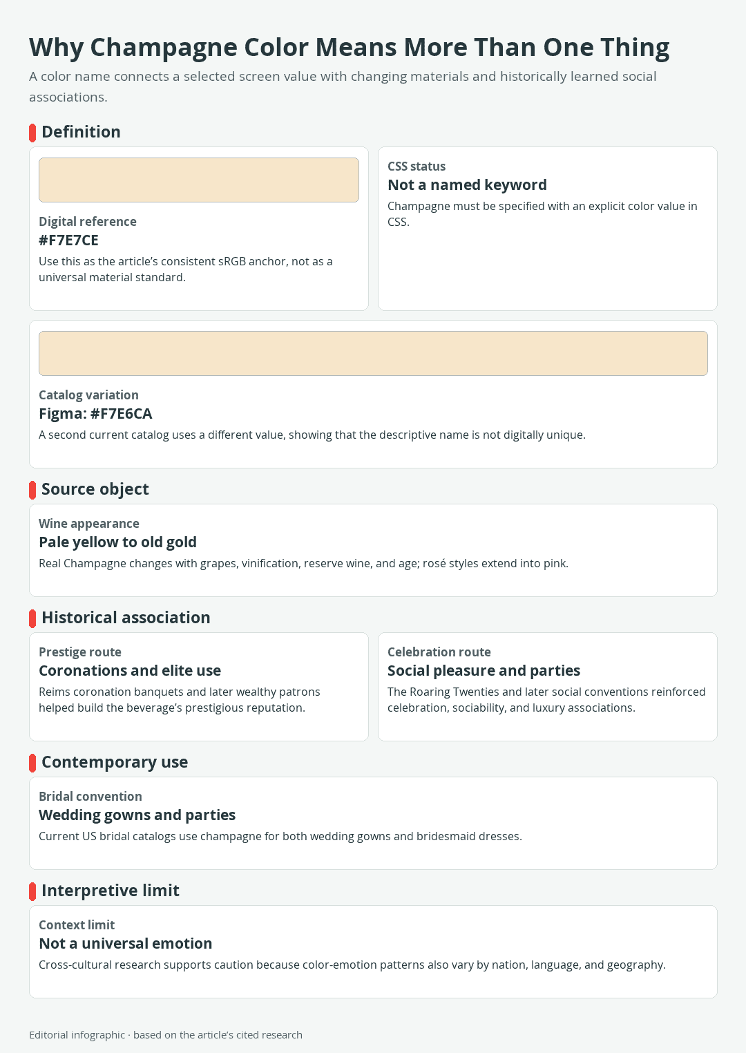
Download the complete color reference sheet (PNG): Why Champagne Color Means More Than One Thing (PNG)
Those meanings are not built into pale beige-gold light. The name draws largely on Champagne wine’s documented links with coronation banquets, wealthy and titled drinkers, and later associations with parties and social pleasure. Its contemporary bridal meaning is also reinforced by champagne-colored wedding gowns and bridesmaid dresses.
The surrounding design changes the message. Champagne beside ivory lace may read as bridal. The same color beside dark navy, restrained typography, and metallic details may suggest premium packaging. Paired with weathered wood and natural fibers, it can function simply as a soft warm neutral.
Association is not psychological certainty
Calling champagne elegant or celebratory describes a learned design association, not a guaranteed emotional response. Color-emotion research involving 4,598 people across 30 nations and 22 languages found broad shared patterns as well as meaningful differences connected with nation, language, and geography. That study considered broader color categories rather than champagne specifically, so it supports caution rather than a special psychological claim about this shade.
Champagne color cannot reveal a person’s mood, character, or spiritual condition. Nor does it carry precisely the same meaning in every community. Personal memories, religious practice, local traditions, fashion cycles, and the object being colored may all outweigh the familiar Western link with sparkling wine.
What Color Is Champagne?
The selected digital reference
Champagne is best understood as a light, warm neutral positioned among pale yellow-orange, beige, ivory, and soft gold. This guide uses the following sRGB value as a consistent digital reference:
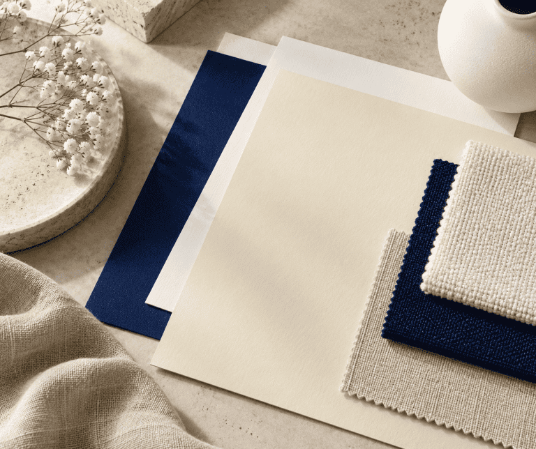
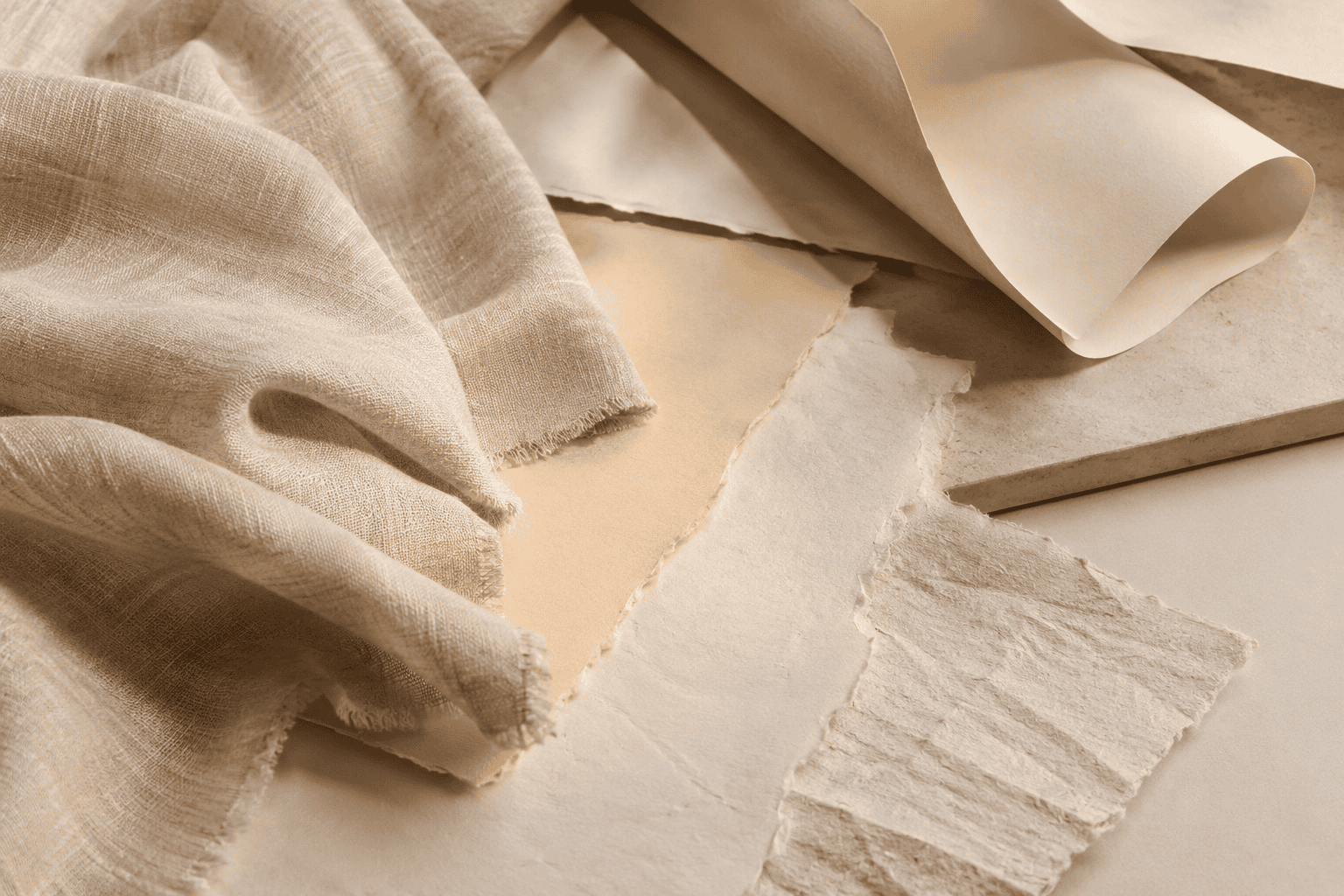 AI-generated editorial illustration; not a measured color sample.
| Name | HEX | RGB | Color |
|---|---|---|---|
| Champagne | #F7E7CE | 247, 231, 206 |
#F7E7CE is a selected screen reference, not an official universal champagne standard. It gives designers a repeatable starting point and matches Canva’s commercial definition. Another current design catalog assigns champagne the nearby value #F7E6CA. That small disagreement matters because it shows that the name describes a color family rather than one uniquely standardized coordinate.
Champagne is also absent from the standardized list of CSS named-color keywords. A web designer cannot reliably write color: champagne and expect a browser to recognize it. Use an explicit notation such as #F7E7CE instead.
Why real champagne colors vary
A screen value represents emitted light in the sRGB color space. It does not define the appearance of wine, cloth, wall paint, printing ink, or paper. Physical materials reflect light, and their appearance changes with surface texture, illumination, surrounding colors, and viewing angle. A glossy fabric can produce bright highlights and deeper folds at the same time, while matte paper tends to look flatter and quieter.
Actual Champagne wine is not confined to beige-gold. Official tasting guidance describes appearances ranging from the palest yellow to old gold. Grape composition, winemaking, reserve wine, and aging help shape what appears in the glass. Rosé Champagne expands the range into soft pink, salmon, strawberry, and raspberry tones.
This is why a digital swatch should serve as direction, not proof of a physical match. Even a carefully chosen screen color cannot predict how a textile will catch venue lighting, how paint will interact with a room, or how a printer and paper stock will reproduce the same file.
Champagne versus ivory, beige, and gold
There is no single boundary that every seller or designer follows, but a few practical comparisons make champagne easier to recognize:
- Ivory usually reads closer to warm white. Champagne commonly shows more beige or yellow-orange warmth.
- Beige is a broad neutral family. Champagne is often lighter and gains a more ceremonial identity from its name.
- Gold may describe a yellow-orange hue or a metallic surface. Champagne can lean gold, but a flat digital champagne swatch has no actual metallic reflection.
- Champagne blush or champagne pink introduces a pink influence. These are useful commercial descriptions, not standardized extensions of one official color.
When a product must coordinate with another item, compare samples rather than relying on the label alone. Two vendors may both use the word champagne for noticeably different undertones or levels of lightness.
How the Drink Shaped the Color’s Symbolism
From coronation wine to prestige
The prestige attached to champagne color begins with the beverage rather than the hue itself. Coronation banquets held in Reims helped Champagne wine develop a reputation connected with kings and courtly occasions. By the late seventeenth century, sparkling Champagne had also become popular among wealthy and titled drinkers.
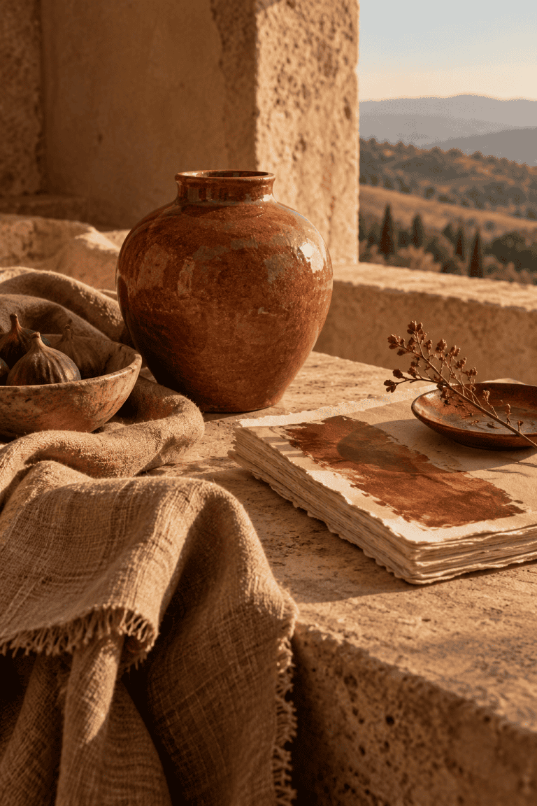
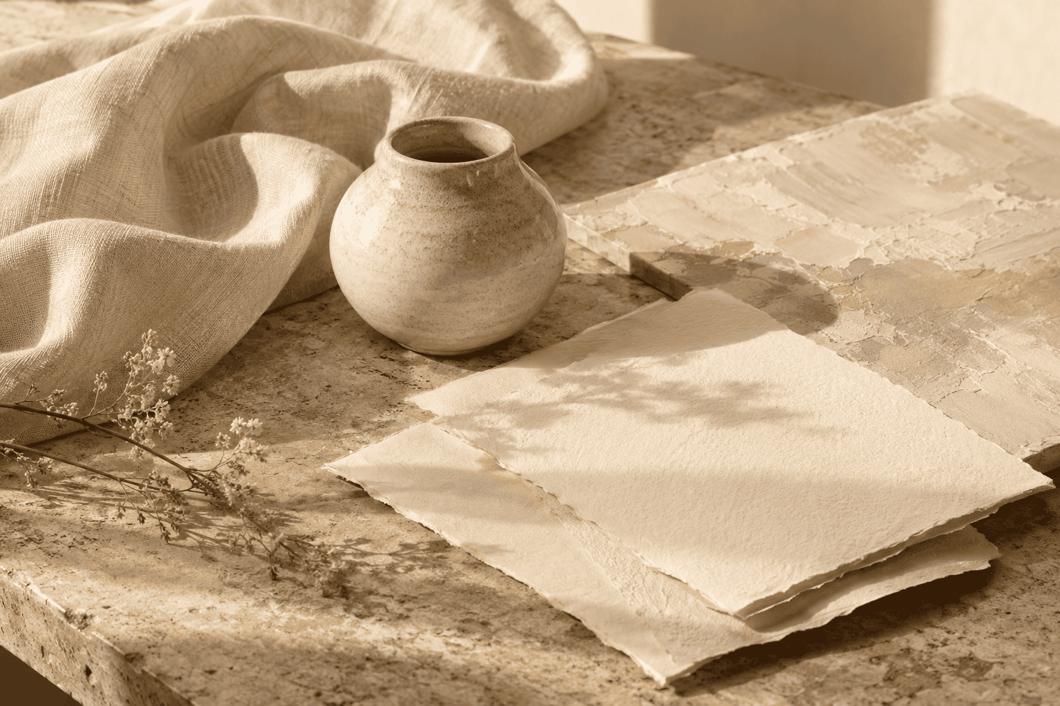 AI-generated editorial illustration; not a measured color sample.
That history helps explain why the color name can imply status even though its visible ingredients are simply pale warmth and low saturation. A similar beige without the Champagne name may look modest or neutral. Attach the name of a celebrated wine, and the same general color family acquires a story of ceremony, hospitality, and social distinction.
From social ritual to a design association
The association did not stop with royal settings. Champagne became linked with social pleasure during the Roaring Twenties, reinforcing its place at parties and fashionable gatherings. Its documented associations with partying, luxury, sociability, and pleasure continue to shape how the color name is understood.
Modern design transfers those associations from drink to color. Celebration, sociability, prestige, and luxury are therefore historically reinforced conventions. They are useful when an audience recognizes the reference, but they are not properties produced automatically by a pale beige-gold surface.
This distinction also explains why context can weaken or redirect the symbolism. A champagne wall may be chosen because it works as a warm neutral, not because the homeowner wants a room to signify celebration. On understated stationery, the color might communicate softness before it communicates luxury. Meaning emerges from the color name, object, material, surrounding palette, and audience together.
Champagne Color in Weddings, Fashion, and Design
Why champagne reads as bridal
Champagne is an established category in the current US bridal market, appearing in both wedding gowns and bridesmaid dresses. Its position near ivory, blush, beige, and soft gold lets it support several familiar wedding directions. It can act as a warm alternative to bright white, a gentle neutral for a group of attendants, or a bridge between pale fabrics and gold-colored accessories.
This is a contemporary commercial convention rather than a universal wedding rule. The same dress color can look traditional, romantic, glamorous, or understated depending on silhouette, fabric, styling, venue, and cultural setting. Anyone coordinating multiple garments should obtain samples from the relevant sellers because the shared champagne label does not guarantee a match.
Finish and lighting change the message
Material finish can shift champagne’s character more dramatically than a small change in HEX value. Matte chiffon or crepe tends to appear subdued. Satin and charmeuse catch more light and may look almost metallic under evening illumination. Folds, highlights, and shadows can make one garment appear to contain several related shades.
That difference affects meaning as well as appearance. A matte champagne surface can feel quiet and natural, while a highly reflective one may emphasize glamour and formality. Neither effect is contained in the color name by itself.
For a wedding, compare a physical swatch in daylight and under lighting similar to the venue. Place it beside the actual whites, flowers, linens, and metal finishes it must accompany.
Meaning in branding and interiors
In branding and packaging, champagne can support a premium or ceremonial position without the visual force of a bright metallic gold. It works particularly well as a spacious background or secondary surface where typography and product imagery carry the main information. The result still depends on the whole system: type style, photography, paper, finish, wording, and audience determine whether it feels luxurious, friendly, bridal, or simply neutral.
In interiors, champagne can soften the transition between warm whites, woods, stone, and brass-colored details. Check paint under the room’s intended lighting and beside the materials it must accompany. Sample it on a movable board or on more than one wall and inspect it throughout the day. A digital palette cannot substitute for the paint maker’s physical sample and application instructions.
How to Use Champagne Color
Three palettes with defined roles
Assigning each color a job creates more control than distributing every shade evenly. The following palettes use precise digital values as starting points. They are not paint recipes, fabric specifications, or guaranteed print matches.
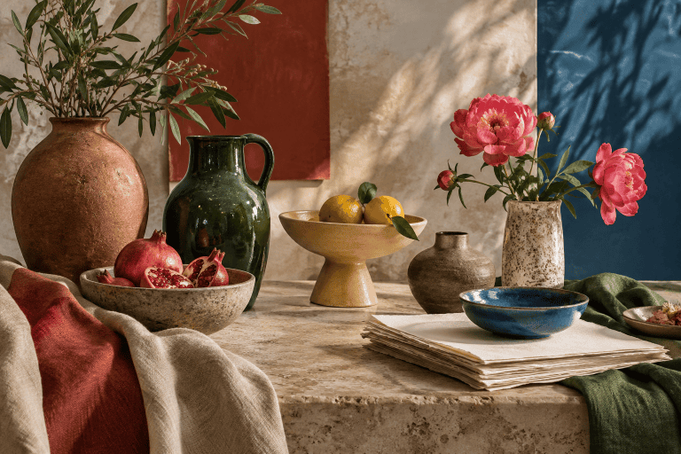
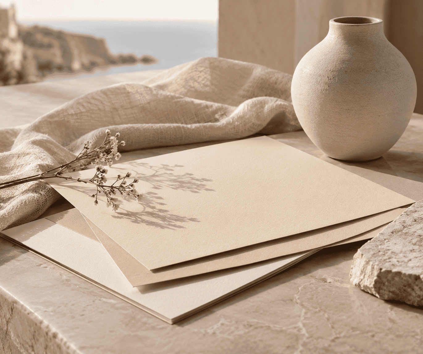 AI-generated editorial illustration; not a measured color sample.
Formal contrast
| Name | HEX | RGB | Color | Role |
|---|---|---|---|---|
| Champagne | #F7E7CE | 247, 231, 206 | Dominant | |
| Ink Navy | #1F2A44 | 31, 42, 68 | Supporting | |
| Soft Rose | #B76E79 | 183, 110, 121 | Accent |
Let champagne cover broad backgrounds, use navy for structure and typography after checking contrast, and reserve rose for selected details. This arrangement suits formal stationery or an event identity without requiring metallic effects.
Natural warmth
| Name | HEX | RGB | Color | Role |
|---|---|---|---|---|
| Champagne | #F7E7CE | 247, 231, 206 | Dominant | |
| Forest Green | #234F3E | 35, 79, 62 | Supporting | |
| Terracotta | #B9684A | 185, 104, 74 | Accent |
Forest green gives the pale neutral a grounded counterweight, while terracotta adds a controlled warm accent. Natural materials and matte finishes will make this palette read differently from glossy packaging, so judge the intended surface rather than the screen alone.
Modern neutral
| Name | HEX | RGB | Color | Role |
|---|---|---|---|---|
| Warm White | #FFF9F0 | 255, 249, 240 | Dominant | |
| Champagne | #F7E7CE | 247, 231, 206 | Supporting | |
| Charcoal | #333333 | 51, 51, 51 | Accent |
Here champagne separates warm white areas without creating a sharp boundary. Charcoal supplies visual definition and is the logical candidate for important text, subject to a final contrast check at the actual size and weight.
Contrast and accessibility
Champagne is very light, so white text can disappear against it. Dark colors generally provide a more promising starting point, but appearance alone is not enough. Test every foreground and background pair with a contrast checker after the final HEX values have been chosen.
WCAG guidance calls for a contrast ratio of at least 4.5:1 for normal text. The threshold is 3:1 for text that is at least 18pt in regular weight or 14pt in bold. Do not assume a heading qualifies merely because it looks large, and do not round the size requirement down during a CSS conversion.
Color must not be the only cue for a status, selection, warning, or required action. If champagne marks a selected button, add a label, icon, border, pattern, or other structural difference. The information should remain understandable to someone who cannot distinguish the color change.
A practical sample-checking routine
- Define the medium. Decide whether the target is a screen interface, printed piece, paint, fabric, or another material. Do not carry a digital formula into a physical medium as though it were a mixing recipe.
- Choose a reference. Use #F7E7CE when a consistent sRGB champagne is appropriate, or document another chosen value clearly. Avoid relying on the descriptive name alone.
- Test the real output. Order a fabric swatch, apply a paint sample, or request a print proof. Follow the relevant maker’s preparation, application, drying, and safety instructions.
- View it in context. Check the sample beside neighboring colors and under daylight as well as the lighting expected at the venue, in the room, or around the product.
- Check function separately. For digital work, verify text contrast and non-color cues. For physical work, examine undertone, sheen, texture, and consistency across the quantity you plan to use.
This routine preserves what makes champagne useful: it can move between warm neutrality and ceremony. Instead of asking what the color means in isolation, look at the name, material, setting, and audience. Those clues reveal whether champagne will read as bridal, premium, festive, softly natural, or simply warm and pale.

Learn more about Israel Benloulou and about us.