
Colors That Go With Beige: A Practical Palette Guide

Beige works with far more than safe neutrals. The right navy, green, brown, teal, pink, rust, gray, white, or black can make it feel crisp, earthy, warm, or graphic. These practical palettes show which combinations work and how to adapt them to the beige you actually have.
The Short Answer: What Goes With Beige
The most useful colors to pair with beige are navy and other blues, dark or olive green, brown and natural wood tones, white or cream, gray, black, dusty pink, teal, and rust orange. The best choice depends on the undertone of the beige and whether you want gentle layering or pronounced contrast.
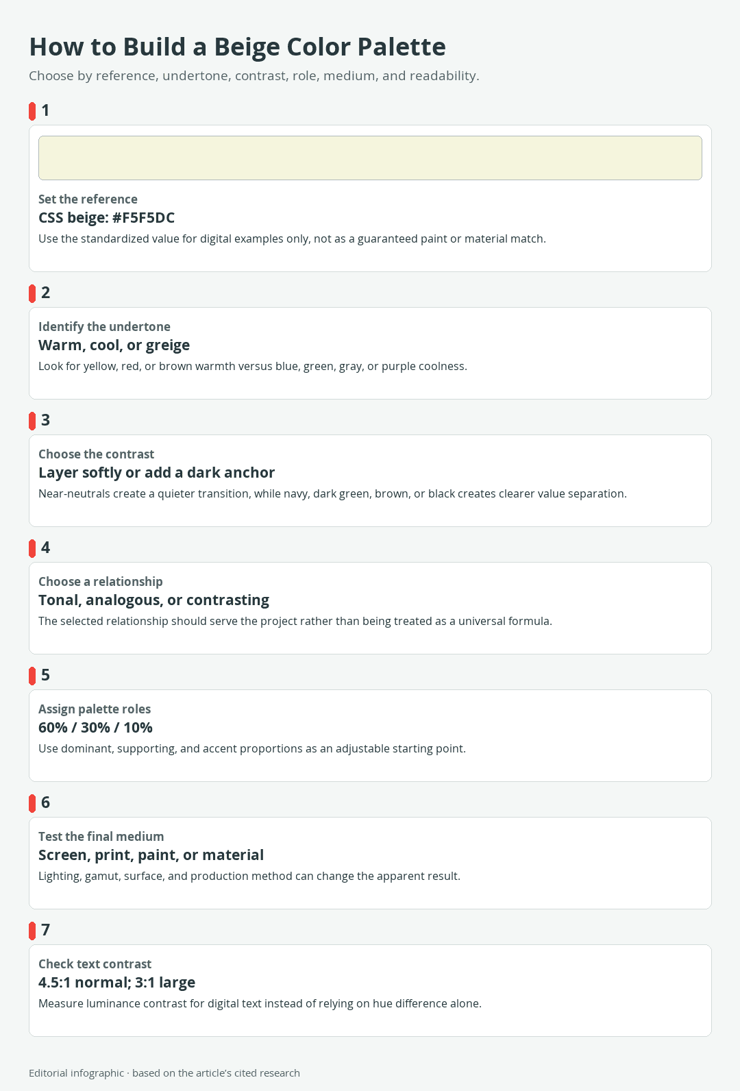
Download the complete color reference sheet (PNG): How to Build a Beige Color Palette (PNG)
Dark colors such as navy, black, and deep green give a light beige structure. White, ivory, tan, and muted gray keep the palette quiet. Teal creates a cooler counterpoint, while rosy pink, brown, and rust can reinforce warmer red, orange, or brown notes.
Best companion colors at a glance
- Navy: a strong anchor for trim, cabinetry, upholstery, graphics, or large accents.
- Olive and dark green: an earthy bridge between beige and wood or natural fibers.
- Brown and wood tones: a warm, tonal choice that benefits from visible light-dark separation.
- White, ivory, and cream: useful for a light scheme, provided the undertones do not appear mismatched.
- Gray: a quieter neutral partner, especially when its temperature relates to the beige.
- Black: a high-contrast accent that can sharpen a pale beige palette.
- Teal and blue: cool counterpoints to many warm beiges.
- Dusty pink and rosy brown: gentle accents for beige with red or pink warmth.
- Rust and orange: concentrated warm accents that suit many earthy schemes.
What the beige HEX value does and does not mean
The standardized CSS named color Beige is #F5F5DC in the sRGB color space. It provides one consistent reference for the digital examples below.
| Name | HEX | RGB | Color |
|---|---|---|---|
| Beige | #F5F5DC | 245, 245, 220 |
This value is not the single definition of beige in paint, fabric, paper, ceramic, or wood. Physical colors sold or described as beige can be warmer, cooler, darker, grayer, or more muted. The CSS name supplies a repeatable screen reference, not a paint formula or guaranteed material match.
Start With the Beige You Actually Have
Do not select an accent from the word beige alone. First identify the color already present in the room, object, artwork, or design. Commercial beige paint covers a broad family, and greige combines beige and gray characteristics.
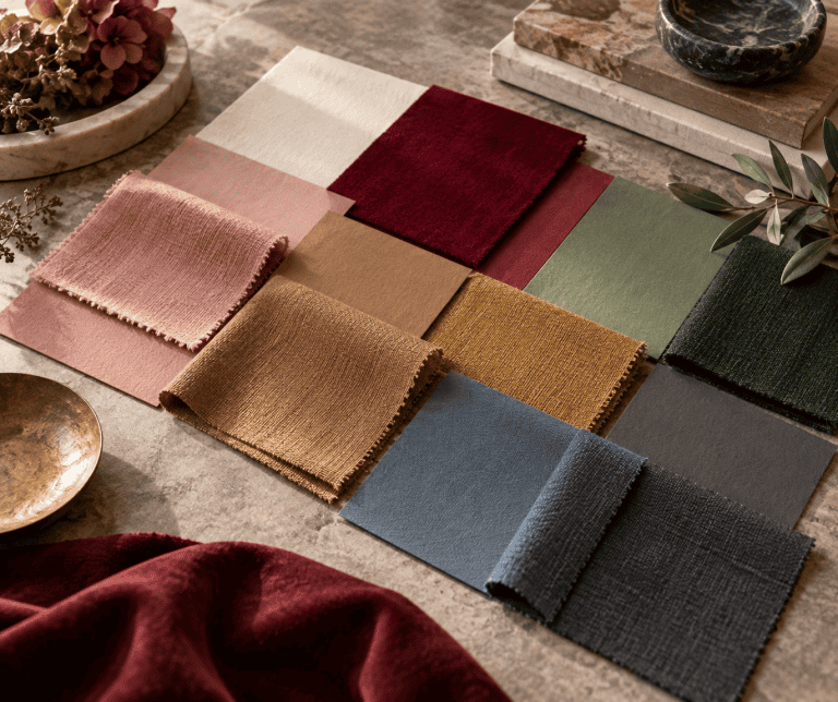
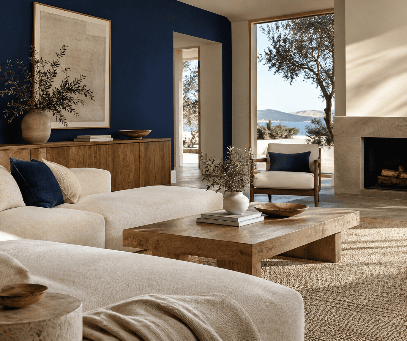 AI-generated editorial illustration; not a measured color sample.
Find the undertone
An undertone is the subtle hue that becomes noticeable when a neutral sits beside another color. Warm beige may lean yellow, red, or brown. Cooler beige and greige may lean blue, green, gray, or purple.
Place a plain white card beside the beige under the light in which it will normally be seen. The comparison can make a yellow, pink, green, or gray bias easier to notice. Then compare the beige with fixed elements you cannot easily replace, such as flooring, a countertop, tile, or a large textile.
You do not always have to match temperatures. Repeating a warm undertone creates continuity, while adding a cooler color can create intentional contrast. Trouble begins when two near-neutrals are similar enough to appear coordinated but different enough to look accidentally dirty or faded.
Choose soft layering or stronger contrast
For a soft effect, combine beige with colors close to it in lightness, such as ivory, tan, pale warm gray, or muted pink. Give the surfaces different textures or finishes so their boundaries remain visible.
For clearer separation, introduce a substantially darker companion. Navy, dark olive, brown, charcoal, and black can outline architectural details, frame a beige field, or establish a visual focal point. Darker does not automatically mean better, however. A small black detail may be enough in a quiet room, while a digital layout might need a dark foreground throughout for readable text.
Check the color in its final light and material
Lighting can materially change the appearance of a neutral. Room orientation, daylight, lamps, and the amount of light reflected by the paint all affect what you see. For a painted surface, test the actual product in the intended room and look at it under natural and artificial light at different times before committing.
Use the same principle for craft materials. Compare the real paper, fabric, paint, glaze, or thread rather than relying on a product photograph. A matte paper, glossy tile, translucent wash, and opaque textile can all render a nominally similar color differently.
Five Ready-to-Use Beige Color Palettes
These are editorial sRGB demonstrations built from standardized CSS named colors. The HEX value controls the RGB value and swatch in each table. Treat the combinations as digital planning references, not as schedules for mixing paint or promises that products with similar names will match.
The familiar 60-30-10 convention can help assign approximately 60 percent of a design to the dominant color, 30 percent to a supporting color, and 10 percent to an accent. It is a flexible starting point. Adjust the proportions to suit the scale, material, and intensity of your project.
Beige, navy, and white
This crisp combination gives pale beige a strong dark anchor. Use beige across the largest field, navy for a substantial supporting element, and white for the smallest highlights or separations. In a room, that might mean beige walls, a navy sofa, and limited white trim. In a layout, it could mean a beige background, navy typography, and white panels.
| Name | HEX | RGB | Color |
|---|---|---|---|
| Beige (dominant) | #F5F5DC | 245, 245, 220 | |
| Navy (supporting) | #000080 | 0, 0, 128 | |
| White (accent) | #FFFFFF | 255, 255, 255 |
Navy supplies the main value contrast. White is close to beige in lightness, so it works better as a highlight or boundary here than as the only element expected to stand out.
Beige, dark olive green, and saddle brown
Dark olive green and brown extend beige into an earthy palette. The green introduces a distinct hue without feeling disconnected from wood, leather, kraft paper, or natural fibers. Keep saddle brown as the smaller accent if you want the olive to remain clearly visible.
| Name | HEX | RGB | Color |
|---|---|---|---|
| Beige (dominant) | #F5F5DC | 245, 245, 220 | |
| Dark Olive Green (supporting) | #556B2F | 85, 107, 47 | |
| Saddle Brown (accent) | #8B4513 | 139, 69, 19 |
This scheme suits botanical crafts, rustic packaging, and rooms with visible wood. Check the actual brown against existing timber because wood varies in color and finish.
Beige, teal, and rosy brown
Teal supplies a cool counterpoint, while rosy brown reconnects the scheme to the warmer side of beige. Use rosy brown sparingly when you want teal to lead. Reverse their importance for a softer, less blue-green result.
| Name | HEX | RGB | Color |
|---|---|---|---|
| Beige (dominant) | #F5F5DC | 245, 245, 220 | |
| Teal (supporting) | #008080 | 0, 128, 128 | |
| Rosy Brown (accent) | #BC8F8F | 188, 143, 143 |
This balanced warm-cool relationship can work for textiles, stationery, illustrations, or decorative objects. Rosy Brown is the standardized CSS name for the digital value shown, not a promise about the color of a physical rose or brown pigment.
Beige, chocolate, and ivory
This warm tonal scheme relies more on changes in lightness than on opposing hues. Chocolate provides the needed depth, while ivory lightens edges and small details. It works well when a project needs warmth without a conspicuous cool accent.
| Name | HEX | RGB | Color |
|---|---|---|---|
| Beige (dominant) | #F5F5DC | 245, 245, 220 | |
| Chocolate (supporting) | #D2691E | 210, 105, 30 | |
| Ivory (accent) | #FFFFF0 | 255, 255, 240 |
The CSS color called Chocolate is distinctly orange-brown. If your physical beige already leans pink or gray, sample the combination before using it across a large area.
Beige, black, and tan
Black turns beige into a graphic neutral. Tan prevents the transition from being only light versus dark, adding a middle value between the two. Use black for outlines, hardware, lettering, frames, or another controlled structural element, with tan as the smaller accent.
| Name | HEX | RGB | Color |
|---|---|---|---|
| Beige (dominant) | #F5F5DC | 245, 245, 220 | |
| Black (supporting) | #000000 | 0, 0, 0 | |
| Tan (accent) | #D2B48C | 210, 180, 140 |
Because black has much more visual weight than beige or tan, it may require less than a nominal 30 percent share. Let the scale of the black element, rather than a rigid formula, determine the balance.
Use Beige in Rooms, Crafts, and Digital Design
A palette can remain consistent in concept while changing in execution. Screen colors, printed inks, paints, fibers, glazes, and naturally colored materials do not produce color in the same way.
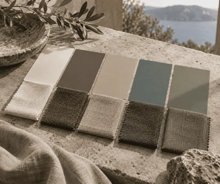
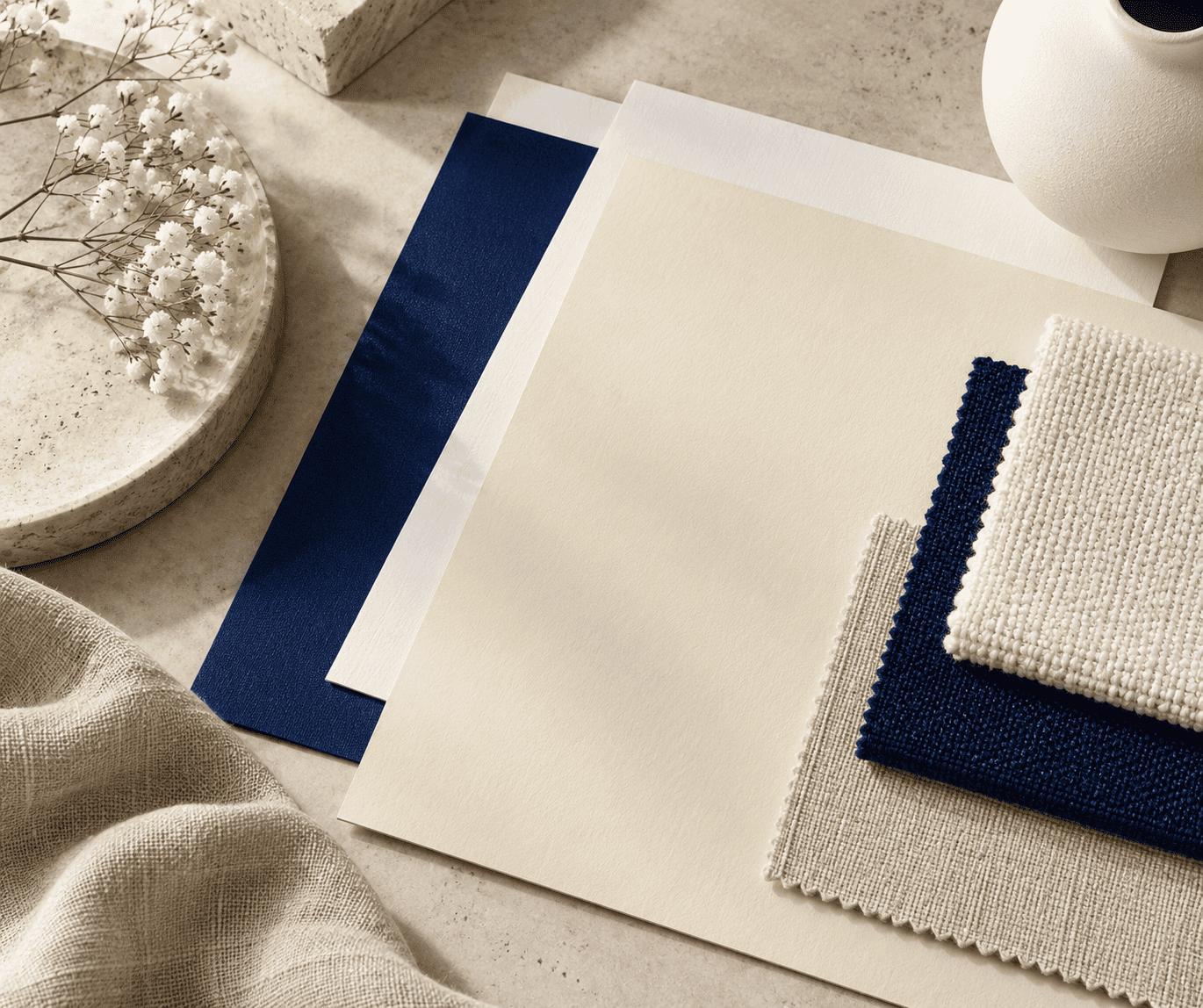 AI-generated editorial illustration; not a measured color sample.
Interior color placement
Begin with the largest fixed surfaces and materials. Flooring, countertops, stone, tile, cabinetry, and major upholstery usually impose stronger constraints than a small decorative object. Choose the supporting color after viewing it beside those elements and the actual beige surface.
Repeat the supporting color in two or three separated locations to make the choice look intentional. A navy chair might connect to a patterned cushion and a small object across the room. Repetition does not require an exact material match; it needs enough visual relationship to guide the eye.
If a dark companion feels too forceful, reduce its area before changing its hue. Narrow trim, frames, legs, hardware, or pattern details can supply definition without turning the entire scheme dark.
Craft and artwork materials
Build a physical sample grouping before cutting costly fabric, assembling a collage, glazing pottery, or painting a finished object. View the samples under the light in which the work will be displayed. Surface texture, opacity, substrate, and sheen can change the apparent relationship even when package labels sound compatible.
For paint, mix according to the product instructions and the behavior of the actual pigments. A HEX value describes emitted screen color, not a universal recipe for combining physical pigments. For print, use a proof from the intended process because a printer cannot necessarily reproduce every screen color exactly.
Website and graphic-design contrast
An attractive palette does not automatically make readable text. WCAG Level AA calls for a contrast ratio of at least 4.5:1 for normal text and 3:1 for text that is at least 18pt regular or 14pt bold. These thresholds concern relative luminance, not whether two hues appear different.
Measure the final foreground and background pair with an accessibility checker, using the exact production values. Do not round a result up to meet a threshold. Also test interactive states, labels, and text placed over images rather than checking only the main body copy.
Keep the HEX references consistent within an sRGB design system, but expect displays and printed output to differ. A calibrated workflow can reduce surprises; it cannot turn a screen swatch into a guaranteed paint, fabric, or ink match.
Common Beige Pairing Mistakes
When the undertones fight
A pairing often fails because the chosen accent was judged against an isolated online swatch rather than the real beige and its surroundings. A cool gray may make a yellow beige appear more yellow, while a pink beige can look disconnected from an orange-brown accent. Compare samples together and include the fixed finishes that will remain in the scene.
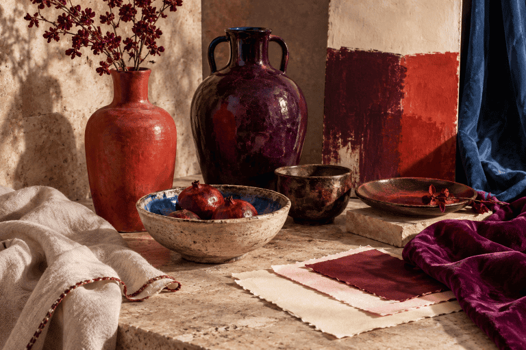
 AI-generated editorial illustration; not a measured color sample.
If the combination still feels wrong, decide whether you want coordination or contrast. For coordination, choose a companion that repeats an undertone already present. For contrast, make the difference clear enough to appear intentional instead of selecting another almost-matching neutral.
When the palette looks flat
Several pale neutrals can merge into an indistinct field when they share similar lightness and surface quality. Add a darker anchor, a clearer color accent, or meaningful material variation. Woven fabric, matte paint, smooth ceramic, and wood grain can separate related neutrals without requiring a crowded color scheme.
Conversely, too many strong accents can leave beige with no clear role. Choose one main supporting family and use additional colors in smaller, repeated details.
When a digital match fails in paint or print
Do not take #F5F5DC to a paint or craft project as though it were a universal beige formula. Displays emit light, printers deposit colorants, and paints reflect light. Each system also has a limited range of colors it can reproduce.
Use the digital palette to communicate direction, then select and test real products. For text and interface elements, perform a numerical contrast check rather than assuming that a visibly different hue is readable.
Frequently Asked Questions
What is the complementary color of beige?
Beige has no single universal complement because the name covers many colors and undertones. A complement is defined by the position opposite an exact base color on a specified color wheel. Blue or blue-violet can provide a useful visual counterpoint to many warm beiges, but the precise result depends on the beige reference and the color model being used.
Do gray and beige go together?
Yes. A muted or warmer gray can create a continuous neutral scheme, while a darker gray provides clearer separation. Compare physical samples because a blue, green, or purple gray may emphasize a beige undertone that was not obvious on its own.
What white should be paired with beige?
Compare the white and beige side by side in their final light. An ivory or warm white often produces a gentle transition beside warm beige, while a cleaner white creates a crisper edge. The correct choice is the one that relates intentionally to the beige, fixed materials, and desired level of contrast.

Learn more about Israel Benloulou and about us.