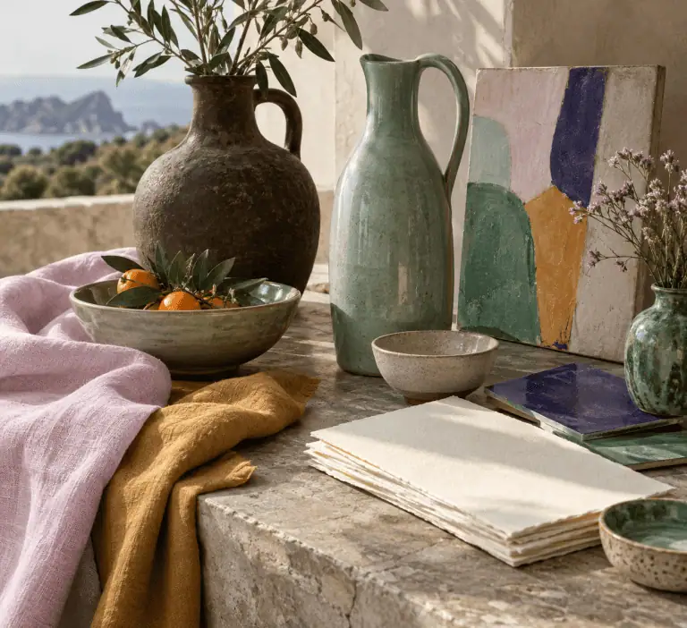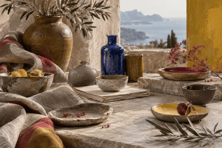

Colors That Go With Burgundy: 5 Practical Palettes

The best colors to pair with burgundy include cream, oatmeal, blush, muted olive, teal, navy, warm gray, charcoal, gold, and ochre. The right partner can make burgundy feel light and welcoming, cool and dramatic, or soft and tonal. These ready-to-use palettes show which colors should lead, support, or accent your project, plus how to adapt them for paint, crafts, screens, and print.
Best colors that go with burgundy
Burgundy works especially well with pale neutrals, subdued greens, deep blues, dusty pinks, warm metallic hues, and selected grays. Pale colors create light-dark separation, while teal and olive introduce a contrasting color direction. Blush stays closer to burgundy’s red character, producing a softer transition.
The best choice depends on the mood and medium. A cream-dominant room feels lighter than a burgundy-dominant room, even when both use the same colors. On a screen, exact HEX values provide repeatable references. Paint, fabric, ink, and other physical materials require real samples because a screen value cannot predict their appearance exactly.
This guide uses the following sRGB value as its working burgundy reference:
| Name | HEX | RGB | Color |
|---|---|---|---|
| Burgundy reference | #800020 | 128, 0, 32 |
The pairings below are starting points rather than fixed rules. Products and materials sold as burgundy can differ, and surrounding light can change how a physical color appears.
Light neutrals: cream, ivory, and oatmeal
Cream, ivory, and oatmeal give burgundy room to breathe. Their light appearance keeps a large burgundy surface from dominating a room, page, or craft. A warm cream makes the combination feel gentle, while a cleaner ivory creates a sharper result.
Use the pale neutral as the dominant field when you want an airy interior or uncluttered digital layout. Burgundy can then define furniture, borders, lettering, or small focal areas. Oatmeal also provides a muted, warm foundation for natural-looking materials and matte finishes.
Greens: teal, olive, and forest tones
Teal green is a practical, source-supported pairing for burgundy. The Deep Teal used in this guide is an original editorial selection, not a mathematically calculated opposite of the selected burgundy HEX value. A pale neutral between teal and burgundy can keep both saturated colors from competing across an entire design.
Muted olive is earthier and less forceful. It suits projects where bright green would feel overly festive. Very dark forest green can also work, but it needs cream, pale stone, or another light separator so the scheme does not collapse into one dark mass.
Blues: navy and blue-black
Navy makes burgundy look restrained and formal. Both colors are dark, so their hue difference alone may not create enough visible separation. Give each a distinct job and add a light neutral around or between them. For example, pale linen can dominate, burgundy can mark the focal area, and navy can frame it.
Blue-black is more demanding than navy because it reduces lightness even further. Reserve it for small outlines, hardware, fine patterns, or controlled accents unless the project has generous light and ample pale space.
Warm companions: blush, dusty rose, gold, and ochre
Blush and dusty rose create a lower-contrast transition into burgundy. The result works well for paper crafts, textiles, packaging, and rooms that need softness without losing a dark anchor.
Muted gold and ochre introduce yellow warmth. Use them as focused accents, then compare the actual chosen materials with burgundy before committing to a physical project. A digital gold swatch does not guarantee that paint, paper, foil, fabric, or another material will provide the same result.
Grays and dark neutrals
Warm gray quiets burgundy without making the combination stark. Charcoal creates a more dramatic scheme, but it shares burgundy’s low lightness and usually benefits from cream or pale gray nearby. Black can work in fine details, although large black and burgundy areas may appear heavy unless scale, lighting, and texture create clear boundaries.
Ready-to-use burgundy color palettes
Every companion color below is an original editorial sRGB selection. The names are descriptive labels, not standardized CSS keywords, paint matches, measured material samples, or universal pigment formulas. Use the HEX values when you need these exact digital references.
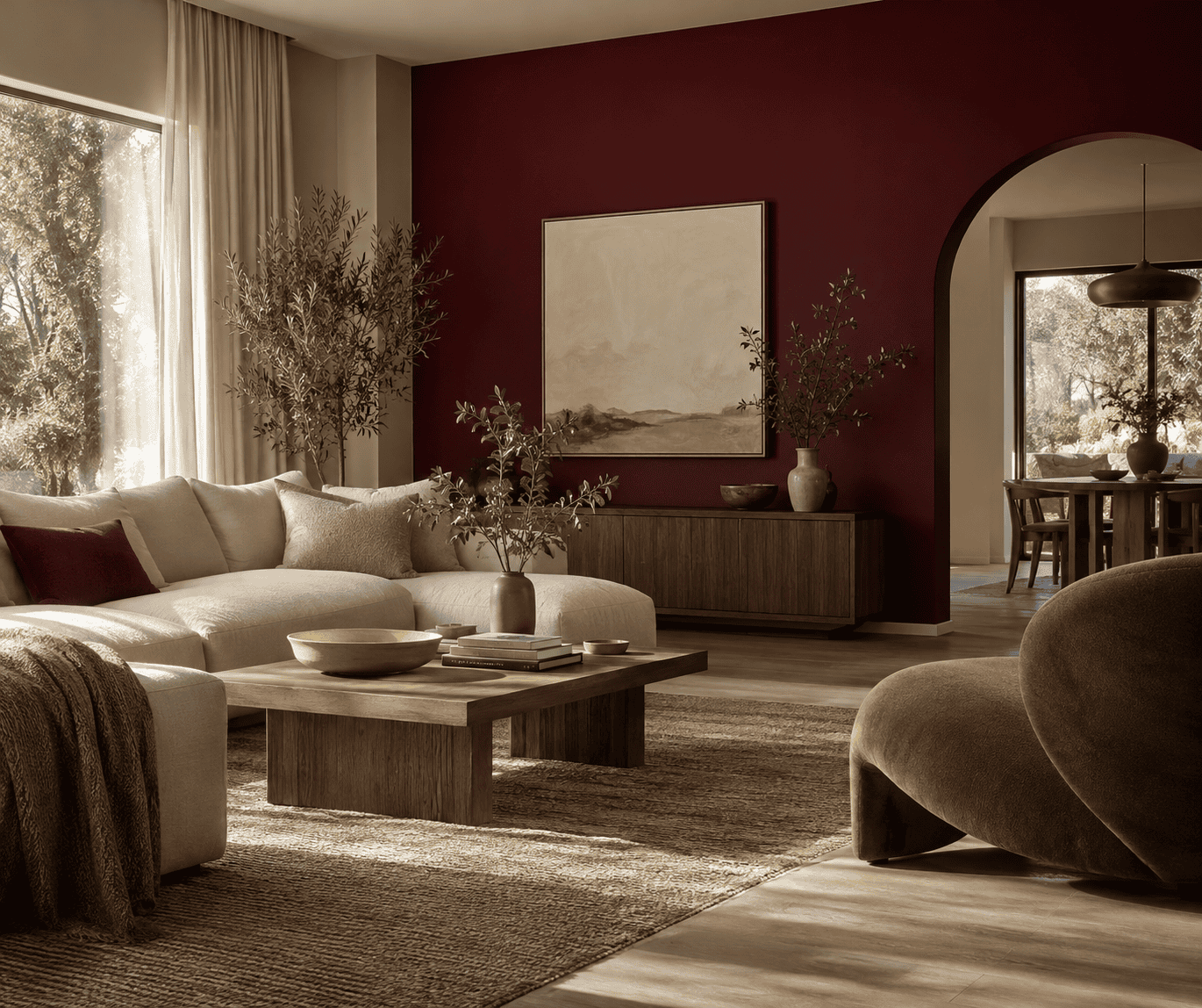 AI-generated editorial illustration; not a measured color sample.
Warm neutral palette
This light-led palette is a practical choice for walls, stationery, invitations, and calm web layouts. Warm Cream provides breathing room, Burgundy Reference establishes the focal color, and Muted Gold adds a compact warm accent.
| Name | HEX | RGB | Color |
|---|---|---|---|
| Warm Cream, dominant | #F3E8D7 | 243, 232, 215 | |
| Burgundy Reference, supporting | #800020 | 128, 0, 32 | |
| Muted Gold, accent | #B58A3A | 181, 138, 58 |
Cool teal contrast palette
This palette pairs burgundy with Deep Teal as a practical design combination rather than claiming the two HEX values are exact complements. Pale Mist gives the saturated colors a visual pause. The arrangement suits bold graphics, modern decor, and geometric craft patterns. If the teal and burgundy feel equally forceful, enlarge the Pale Mist area or let only one saturated hue dominate.
| Name | HEX | RGB | Color |
|---|---|---|---|
| Burgundy Reference, dominant | #800020 | 128, 0, 32 | |
| Deep Teal, supporting | #1F6F6D | 31, 111, 109 | |
| Pale Mist, accent and separator | #E5EEEE | 229, 238, 238 |
Soft tonal rose palette
Dusty Blush leads this lower-contrast scheme, Deep Rose bridges the transition, and burgundy supplies depth. It works for textiles, layered paper, soft furnishings, and digital designs that should feel cohesive rather than sharply contrasted.
| Name | HEX | RGB | Color |
|---|---|---|---|
| Dusty Blush, dominant | #D6A2A8 | 214, 162, 168 | |
| Burgundy Reference, supporting | #800020 | 128, 0, 32 | |
| Deep Rose, accent | #A14B61 | 161, 75, 97 |
Earthy olive palette
Oat creates a natural-looking foundation, burgundy supplies a dark warm focal point, and Muted Olive adds restrained green contrast. This is a useful route for rustic decor, woven crafts, botanical motifs, and seasonal projects that should not read as bright red and green.
| Name | HEX | RGB | Color |
|---|---|---|---|
| Oat, dominant | #E8DCC8 | 232, 220, 200 | |
| Burgundy Reference, supporting | #800020 | 128, 0, 32 | |
| Muted Olive, accent | #73764A | 115, 118, 74 |
Classic navy palette
Pale Linen keeps this dark pairing usable, burgundy contributes warmth, and Ink Navy provides a cool counterweight. Try it for tailored interiors, restrained branding, painted patterns, or fabric crafts. Avoid placing the burgundy and navy in similarly sized adjoining blocks unless their boundary remains easy to see.
| Name | HEX | RGB | Color |
|---|---|---|---|
| Pale Linen, dominant | #F5EBDD | 245, 235, 221 | |
| Burgundy Reference, supporting | #800020 | 128, 0, 32 | |
| Ink Navy, accent | #1C2A44 | 28, 42, 68 |
What burgundy means in this guide
Burgundy is a descriptive color name rather than one universally binding value. This guide selects #800020 as a clear digital reference associated with the name. Holding that reference constant makes the companion palettes comparable, but it does not make every object or color sold as burgundy identical.
Is #800020 an official burgundy?
No. #800020 is a useful six-digit HEX reference in the sRGB color space, not an official universal definition for all media. Burgundy is also not one of the standardized CSS named-color keywords. A web author who wants this reference should enter its numeric value, such as #800020, instead of expecting a browser to recognize burgundy as a named color.
A physical product sold as burgundy may not match this screen value, and printed output has its own device, ink, paper, and profile conditions. The swatches here are digital design references, not promises of a paint, textile, or print match.
Names do not guarantee the same value
Maroon is a standardized CSS keyword, whereas burgundy is not. That distinction applies to browser behavior, not to every product label or color catalog.
When accuracy matters, compare a stated numeric value for digital work or a physical sample for material work instead of relying on a descriptive name alone. A label can help identify the intended color family, but it does not guarantee an exact cross-medium match.
What is burgundy’s complementary color?
The practical color-wheel answer
Teal green is the practical complementary pairing presented for burgundy in Adobe’s cited design-wheel guidance. This is a qualitative pairing, not a model-independent calculation that assigns one exact teal HEX value to every color called burgundy. The Deep Teal value #1F6F6D in this guide is an editorial palette choice and should not be described as the exact opposite of #800020.
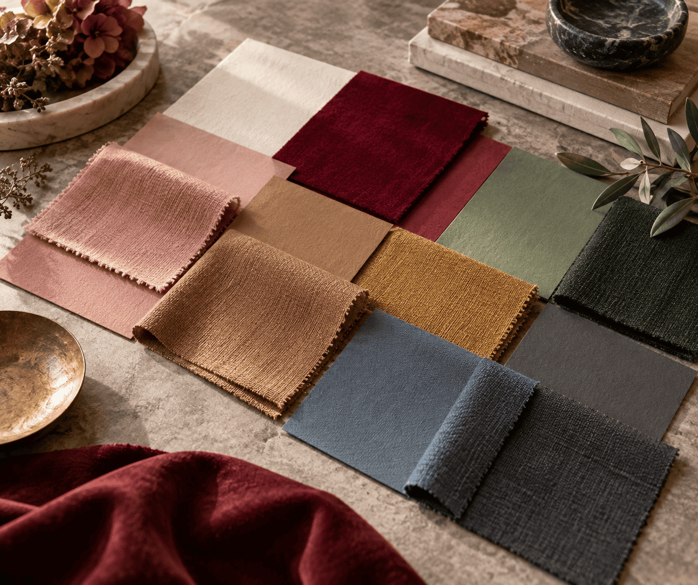 AI-generated editorial illustration; not a measured color sample.
Complementary colors are defined as opposing hues on a stated color wheel, so an exact answer depends on the reference value and the model used to calculate it. For practical design, a small teal detail can enliven a burgundy field, or burgundy can punctuate a teal-led design. For a broader introduction to primary, secondary, and opposing hues, see this color wheel guide.
Why different models can give different answers
A calculated complement is only precise when the color model or wheel is identified. RGB creates color additively with emitted red, green, and blue light on screens. CMYK printing works subtractively with inks on a surface. Physical artist materials require separate testing rather than assuming that a digital relationship predicts their behavior.
That is why teal is presented here as a practical design pairing, not a universal physical mixing instruction or a claim that the selected HEX values are diametrically opposite in every model. Do not substitute the HEX pair for a paint recipe or assume that combining physical burgundy and teal materials will produce a predictable neutral.
Complementarity also says nothing by itself about readable text. Two hues may appear striking together yet have similar relative luminance, which is the light-dark property used in accessibility contrast calculations.
How to use a burgundy palette in a real project
Choose the palette roles first
Decide what should dominate before selecting more colors. If you want a bright result, make cream, oat, linen, or mist the largest field and reserve burgundy for emphasis. If you want drama, let burgundy lead, then use a pale companion to define edges and preserve open space.
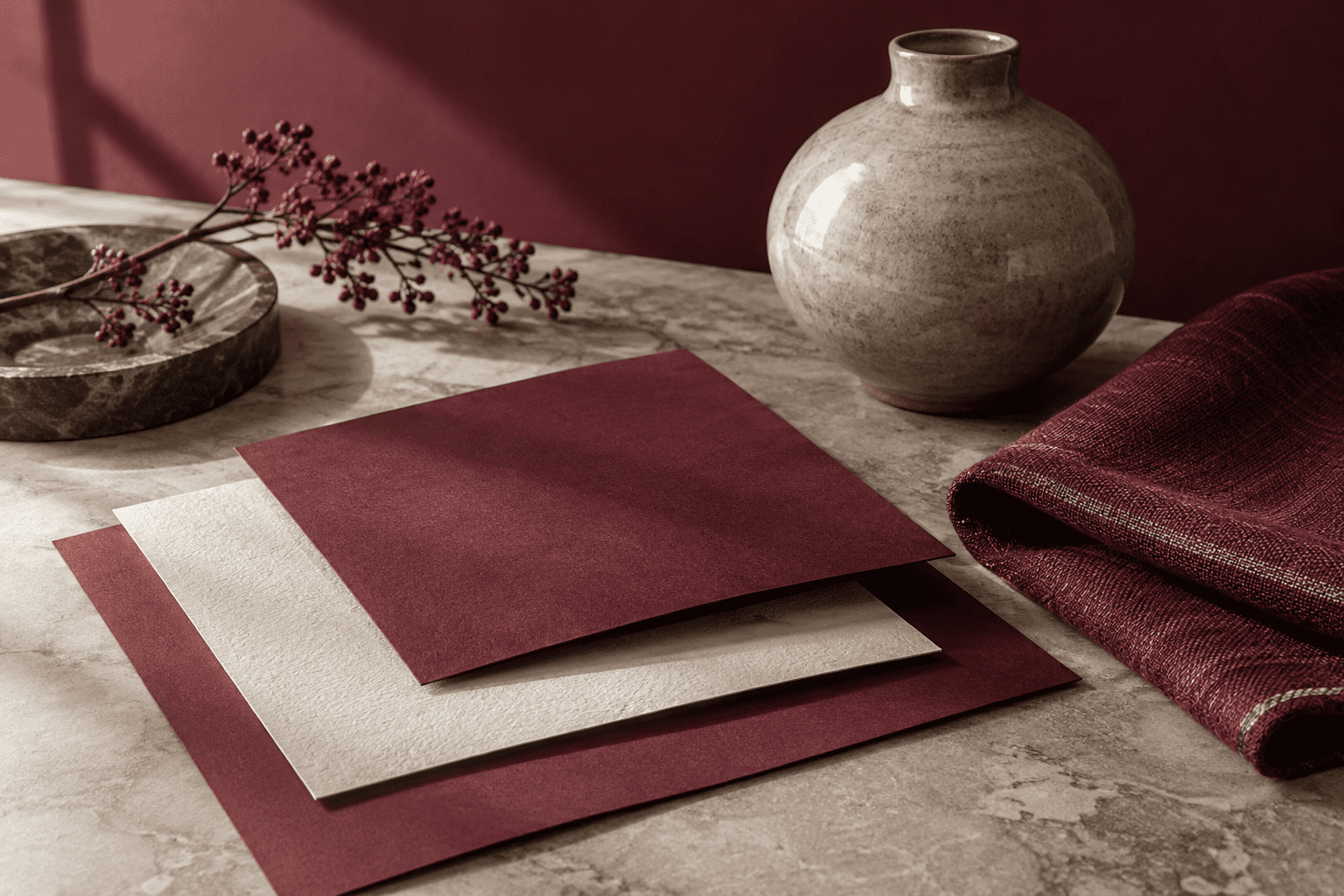 AI-generated editorial illustration; not a measured color sample.
A supporting color should connect the dominant field to the accent, not compete with both. In the rose palette, burgundy anchors the light blush while Deep Rose bridges them. In the teal palette, Pale Mist separates two saturated hues. These roles are flexible, so test several area sizes rather than treating one proportion as a universal formula.
Test paint and craft materials in context
For paint, obtain a real product sample and apply or position a generous sample area near the intended surface. Inspect it in different positions and under daylight and artificial light. A phone, monitor, or printed card may differ from the actual coating.
For crafts, compare the actual burgundy material with the proposed cream, green, blue, or metallic material in the conditions where the finished project will be used. Digital swatches are planning references, not guaranteed physical matches. Follow each product’s instructions for surface preparation, application, drying, ventilation, and protective equipment.
Prepare digital and printed color correctly
For an sRGB digital project, enter the specified HEX values and keep the document in its intended color space. Still check the design on the devices that matter, because display gamut, calibration, software, and ambient light can change its appearance.
Do not copy an unprofiled screen swatch into print and expect an identical result. Preserve appropriate color profiles, use the printer’s required workflow, and proof on the intended paper with the intended device and ink. Some screen colors lie outside a printer’s reproducible gamut, and paper and output conditions further affect the result.
Check readable text contrast
Measure the actual foreground and background pair wherever color carries text. For WCAG Level AA, normal text needs a contrast ratio of at least 4.5:1. Large text needs at least 3:1, with large text defined as at least 18 pt regular or 14 pt bold.
Do not infer a pass from a palette’s appearance or from the fact that two hues are described as complementary. If a burgundy-and-teal text pair fails, change the foreground or background lightness and calculate again. These text thresholds should not be assumed to cover non-text graphics or interface components, which are evaluated under separate accessibility requirements.
Common burgundy pairing problems and fixes
- The palette feels too dark: Enlarge the cream, oat, linen, or pale gray field before adding another hue. Reducing the area occupied by burgundy, navy, charcoal, or forest green often solves the problem more cleanly.
- Burgundy and green look too seasonal: Mute at least one hue, avoid equal red-green blocks, and introduce warm stone, oatmeal, wood, or charcoal. Olive usually feels earthier than a clear bright green.
- Burgundy and gray feel cold: Choose a warmer gray or add a restrained ochre or muted-gold accent. The accent can be as small as hardware, thread, a border, or a repeated graphic detail.
- Burgundy and navy merge together: Place pale linen or cream between them, change their relative area, or reserve one dark color for fine accents. Hue difference cannot compensate for every lack of light-dark separation.
- The physical result does not match the swatch: Return to product samples or a color-managed print proof. Do not keep altering the master HEX value blindly to compensate for one uncalibrated display or one material.
- The combination looks attractive but text is difficult to read: Treat harmony and legibility as separate checks. Adjust the foreground or background lightness, recalculate the contrast ratio, and retest every relevant text state.
A successful burgundy palette is less about collecting more companion colors than giving each selected color a clear role. Start with the desired overall lightness, choose either tonal harmony or deliberate color contrast, and verify the result in the medium where people will actually see it.

Learn more about Israel Benloulou and about us.