
Color of the Year 2026: Comparing Five Brand Selections

Pantone’s Color of the Year for 2026 is PANTONE 11-4201 Cloud Dancer, a soft near-white, but it is not the year’s only valid selection. Four paint brands chose colors ranging from warm khaki to smoky jade and deep espresso-brown. This comparison shows how five selected picks differ and helps you choose one for a real project.
What “Color of the Year” Means in 2026
The direct answer
If “Color of the Year” means the widely recognized Pantone program, the 2026 answer is PANTONE 11-4201 Cloud Dancer. It is a quiet, near-white neutral and Pantone’s first white selection since the annual program began in 1999.
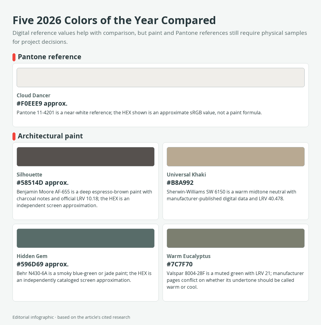
Download the complete color reference sheet (PNG): Five 2026 Colors of the Year Compared (PNG)
Cloud Dancer is a Pantone color reference, not an architectural-paint formula. The other four selections in this comparison identify paints in manufacturer catalogs, each with its own product code and physical samples.
This guide focuses on 2026 because it provides a complete comparison cycle. Several manufacturers had already announced 2027 paint choices by late September 2026, but combining those early announcements with the established 2026 group would mix two different cycles.
Why different brands name different winners
There is no governing body that awards one universal Color of the Year. Pantone, Benjamin Moore, Sherwin-Williams, Behr, Valspar, and other organizations operate separate annual selection programs.
That distinction explains why several announcements can all be legitimate. Pantone selected Cloud Dancer as its 2026 reference, while Benjamin Moore, Sherwin-Williams, Behr, and Valspar selected colors tied to their architectural-paint ranges. The useful question is not which brand is “correct,” but which color and physical product suit a particular surface, room, and lighting environment.
The 2026 Colors Compared Side by Side
Five reference colors at a glance
The swatches below provide a consistent screen comparison. The HEX values for Cloud Dancer, Silhouette, and Hidden Gem are approximate digital references. Sherwin-Williams and Valspar publish the listed HEX values for Universal Khaki and Warm Eucalyptus, but even manufacturer-supplied screen values cannot guarantee the appearance of dried paint. The final column gives suggested project roles rather than manufacturer guarantees.
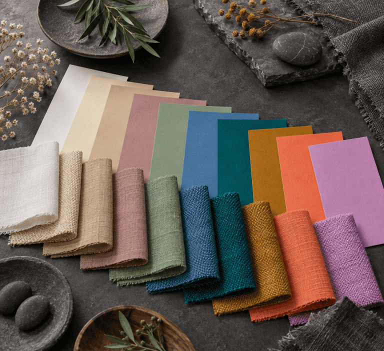
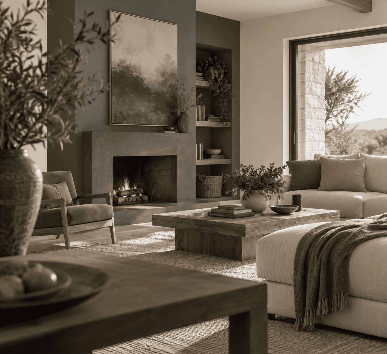 AI-generated editorial illustration; not a measured color sample.
| Organization | Name | HEX | RGB | Color | Hue direction | Manufacturer LRV used here | Medium | Suggested role |
|---|---|---|---|---|---|---|---|---|
| Pantone | Cloud Dancer11-4201 | #F0EEE9 | 240, 238, 233 | Soft near-white | Not used | Pantone reference | Light scheme reference | |
| Benjamin Moore | SilhouetteAF-655 | #58514D | 88, 81, 77 | Espresso-brown with charcoal notes | 10.18 | Architectural paint | Deep walls, doors, trim, or millwork | |
| Sherwin-Williams | Universal KhakiSW 6150 | #B8A992 | 184, 169, 146 | Warm midtone neutral | 40.478 | Architectural paint | Warm neutral wall color | |
| Behr | Hidden GemN430-6A | #596D69 | 89, 109, 105 | Smoky blue-green or jade | Not available from a reliable manufacturer record used here | Architectural paint | Blue-green statement color | |
| Valspar | Warm Eucalyptus8004-28F | #7C7F70 | 124, 127, 112 | Muted green; manufacturer sources conflict on undertone | 21 | Architectural paint | Muted green walls or accents |
What the numbers can and cannot tell you
HEX and RGB describe screen color. They make it possible to compare the five references on one display, but they do not reproduce a paint’s pigments, texture, sheen, or behavior under changing illumination. Displays also vary in brightness, calibration, color range, and viewing conditions.
The paint manufacturers also publish figures labeled Light Reflectance Value (LRV) for three selections: 10.18 for Silhouette, 40.478 for Universal Khaki, and 21 for Warm Eucalyptus. These manufacturer-listed paint figures are separate from HEX and RGB data and should not be treated as digital brightness values.
No reliable manufacturer LRV is used here for Cloud Dancer or Hidden Gem. Leaving those fields unclaimed is more useful than filling the comparison with uncertain numbers.
How Each Color Differs in Practice
Cloud Dancer versus the paint selections
Cloud Dancer is the lightest-looking member of this digital comparison. Its near-white appearance gives it less visual weight than the four architectural-paint selections, making it a useful reference for open backgrounds, restrained layouts, and light tonal schemes.
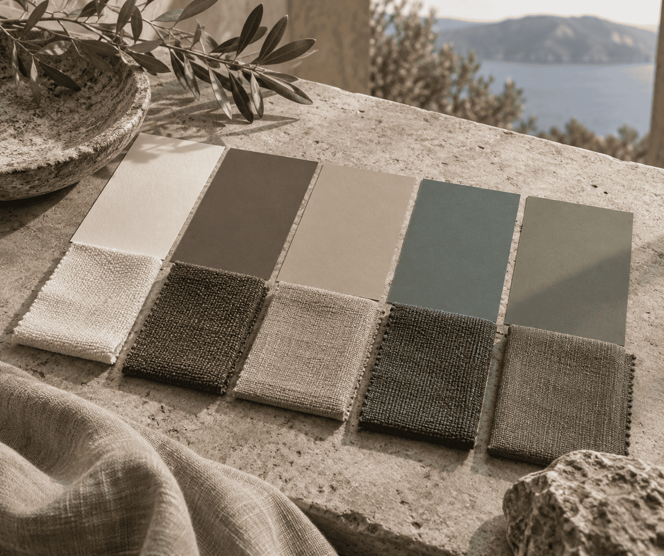 AI-generated editorial illustration; not a measured color sample.
Its identity also differs at a technical level. PANTONE 11-4201 is a Pantone reference, while the other four names identify paints in manufacturer catalogs. The approximate #F0EEE9 swatch communicates its general direction on a screen; it does not turn Cloud Dancer into a universal white-paint recipe.
Near-white paint candidates can change noticeably beside different fixed materials and under different lighting. Anyone seeking a Cloud Dancer-like effect on a wall should evaluate physical paint samples beside the room’s trim, flooring, and furnishings rather than choose from the digital swatch.
Silhouette and Universal Khaki
Silhouette AF-655 has the lowest manufacturer-confirmed LRV among the three paints for which this comparison has reliable manufacturer LRV data. Benjamin Moore describes a combination of burnt umber and charcoal notes, producing a deep espresso-brown character.
Benjamin Moore shows Silhouette across walls, doors, ceilings, trim, and millwork. Those examples demonstrate its flexibility, but surface area changes its impact. A whole room in this deep color creates a more enveloping result than a single door or built-in cabinet.
Universal Khaki SW 6150 is a warmer, lighter-looking midtone neutral. Its manufacturer-listed LRV is 40.478, compared with 10.18 for Silhouette and 21 for Warm Eucalyptus. Its beige-brown direction is easier to consider for broad wall coverage when an off-white feels too pale and a deep brown feels too dark.
The pair therefore serves different goals. Choose Silhouette when deliberate depth is central to the design. Consider Universal Khaki when you want noticeable warmth and color without the visual commitment of a very dark surface.
Hidden Gem and Warm Eucalyptus
Hidden Gem N430-6A is Behr’s smoky jade, combining blue and green in a muted, substantial color. Compared with Warm Eucalyptus, it leans more toward blue-green in the supplied digital references. Test the paint as lighting changes rather than relying on that screen comparison alone.
Warm Eucalyptus 8004-28F is a grayed green with a manufacturer-listed LRV of 21. Among the three paints with reliable manufacturer figures, that places its LRV between Universal Khaki at 40.478 and Silhouette at 10.18. Its restrained green character can work as either a broad statement color or a smaller grounding accent.
Valspar’s own descriptions require a qualification. Its current color record labels the undertone cool, while its 2026 announcement describes warm undertones. Rather than treating either label as absolute, read Warm Eucalyptus as a muted green whose apparent temperature should be evaluated beside the project’s finishes and under its actual lighting.
Between these two greens, Hidden Gem offers the bluer, smokier impression in the digital comparison. Warm Eucalyptus looks more olive and subdued. Physical samples remain the deciding evidence because the paints may behave differently from emitted screen swatches.
Choose the Right Pick for Your Project
No selection is universally best. Start with the role the color must play, then consider the surface area, available light, fixed materials, and desired level of contrast.
For a light, flexible background
Use Cloud Dancer as a direction rather than a paint specification. It suits a scheme that needs a quiet near-white background, especially when furnishings, artwork, or natural materials should carry more of the visual emphasis. Find physical paint samples with a similar character and compare them directly with the room’s trim and flooring.
Do not assume every soft white will behave alike. Small shifts become noticeable across a large wall, particularly where two whites meet.
For a warm neutral room
Universal Khaki is the clearest candidate for a warm, mid-depth neutral. As an editorial recommendation, it is the easiest of these four paints to consider for broad coverage when a near-white feels too pale and Silhouette feels too dark. Its published data provides a useful starting point, but room orientation and artificial lighting still matter.
Test it beside wood, stone, upholstery, and existing beige finishes. Similar warm neutrals may look mismatched when their color directions differ.
For a deep or color-drenched space
Silhouette offers the strongest dark-room effect in the supplied screen comparison. Applying one deep color across walls and selected architectural details can create continuity, while limiting it to one surface creates a sharper focal point. Benjamin Moore’s examples across walls, trim, doors, and millwork support both kinds of use.
Test this deep color over the intended area. In dim light, fine distinctions between espresso, charcoal, and deep brown may become less obvious. In stronger light, the warmer notes may be easier to see.
Hidden Gem provides a more chromatic alternative. Its smoky blue-green character makes a clear statement without Silhouette’s near-black appearance. It may suit a room where a neutral feels too restrained but a cleaner, more saturated green would be too assertive.
For cabinetry, doors, and smaller accents
Cabinetry, interior doors, trim, and furniture let you use a deeper color without surrounding the entire room. Silhouette can create a strong dark anchor, while Hidden Gem supplies a smoky blue-green feature. Warm Eucalyptus offers a quieter green and can bridge natural-looking materials with neutral walls.
These are recommendations, not guaranteed pairings. Cabinet substrates, primers, topcoats, and sheens influence the finished appearance. Confirm that the chosen product is intended for the surface and use, and follow its preparation and application instructions.
How to Test a Color Before You Commit
A four-step real-room test
- Record the complete identifier. Use PANTONE 11-4201, AF-655, SW 6150, N430-6A, or 8004-28F as applicable. A shared or similar name does not guarantee a cross-brand match.
- Narrow the options with physical chips. Compare them beside fixed flooring, counters, tile, trim, and major furnishings. Remove candidates that do not work with materials that will remain.
- Test the intended paint. Apply the selected product and sheen to the actual prepared surface, or use a movable sample board when appropriate. Follow the manufacturer’s directions for preparation, coverage, drying, ventilation, and protective equipment.
- Observe it through a full light cycle. Check the sample in morning and afternoon daylight, then under the lamps used at night. Move a sample board around if the color will cover walls with different orientations.
Why screens and small chips are not final proof
A phone or monitor creates color with light, while paint is viewed as light reflects from pigments and a dried surface. The displayed result can shift with screen settings before room lighting, surrounding colors, substrate, and sheen introduce further differences.
 AI-generated editorial illustration; not a measured color sample.
A small chip is more relevant than a screen, but it may not reveal how a color feels across an entire wall or cabinet bank. Larger tests show the color over more surface area and let you judge it from normal viewing distances. Keep the comparison sample in place long enough to see the lighting conditions that actually occur in the room.

Learn more about Israel Benloulou and about us.