
Burnt Sienna Color: A Practical Guide to a Warm Earth Red

Burnt sienna brings the warmth of orange, the weight of brown, and the usefulness of a natural-looking earth color into one versatile hue. Yet its appearance changes depending on whether you are choosing a HEX value, opening a tube of paint, or matching a finished object. This guide helps you identify it, mix it, pair it, and specify it without treating one swatch as a universal standard.
What Color Is Burnt Sienna?
Burnt sienna is a warm, muted color that falls between red-orange and reddish brown. For digital work, #E97451 is a useful representative value associated with the Crayola color. It is the controlling reference used throughout this guide, but it is not a universal definition of every burnt sienna paint, print, textile, or physical object.
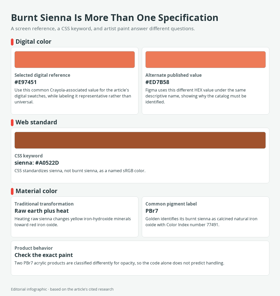
Download the complete color reference sheet (PNG): Burnt Sienna Is More Than One Specification (PNG)
Burnt sienna at a glance
| Name | HEX | RGB | Color |
|---|---|---|---|
| Burnt Sienna, representative digital reference | #E97451 | 233, 116, 81 |
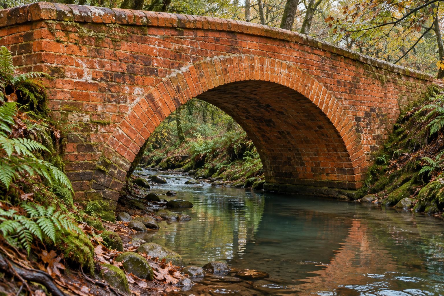
This reference leans more orange than a deep chocolate brown, but it is quieter than a vivid orange-red. That balance makes burnt sienna useful for brick, clay, leather, autumn foliage, skin undertones, wood, warm shadows, and restrained interface accents.
Why the exact appearance can change
A HEX code describes an sRGB screen color. A tube of paint contains physical pigments suspended in a binder, while printed color depends on inks, paper, and the printing process. Lighting, surface texture, paint thickness, dilution, monitor calibration, and neighboring colors can all affect what the eye sees.
Use #E97451 when a project needs a consistent digital starting point. For material matching, rely on an actual sample under the intended lighting rather than expecting a screen swatch to predict the final result.
Digital Burnt Sienna, CSS Sienna, and Paint Are Not the Same
The name burnt sienna crosses several color systems that answer different questions. Digital catalogs select representative screen values, CSS provides a fixed browser keyword, and artist paints identify products through pigment and performance information.
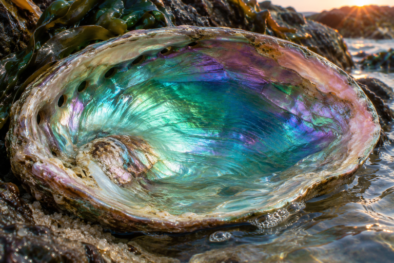
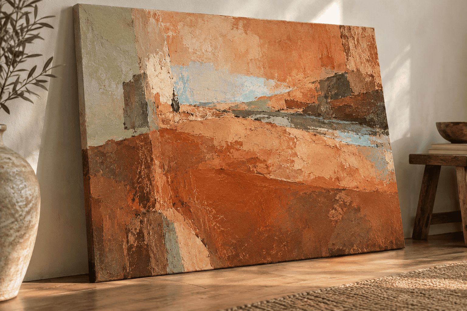 AI-generated editorial illustration; not a measured color sample.
Two published burnt sienna HEX values
Burnt sienna has no single, universally adopted HEX value. The Crayola-associated reference used here is #E97451, while another design catalog uses #ED7B58. Both are warm red-orange colors, but the second has slightly higher red, green, and blue channel values and therefore appears somewhat lighter.
| Name | HEX | RGB | Color |
|---|---|---|---|
| Burnt Sienna, Crayola-associated reference | #E97451 | 233, 116, 81 | |
| Burnt Sienna, alternate design reference | #ED7B58 | 237, 123, 88 |
The practical lesson is simple: save the HEX value in a digital project instead of specifying only “burnt sienna.” The number preserves the intended screen color when different apps or collaborators use different naming catalogs.
The CSS sienna keyword
CSS standardizes the named-color token sienna as #A0522D. It does not define a burntsienna keyword. In code, the standardized token has no space, and its darker value should not be substituted silently for #E97451.
| Name | HEX | RGB | Color |
|---|---|---|---|
| CSS Sienna | #A0522D | 160, 82, 45 |
For reliable web design, enter the desired HEX directly. Use the CSS keyword only when its standardized #A0522D value is actually the color you want.
Nearby colors and documented references
The following references help locate burnt sienna among related earth colors and useful companions. They come from different named-color catalogs, so the labels do not form one standardized shade scale.
| Name | HEX | RGB | Color |
|---|---|---|---|
| Burnt Sienna, Crayola-associated reference | #E97451 | 233, 116, 81 | |
| Burnt Sienna, alternate design reference | #ED7B58 | 237, 123, 88 | |
| CSS Sienna | #A0522D | 160, 82, 45 | |
| Raw Sienna, Crayola reference | #D27D46 | 210, 125, 70 | |
| Burnt Umber, historical Crayola reference | #805533 | 128, 85, 51 | |
| Brown, Crayola reference | #AF593E | 175, 89, 62 | |
| Sepia, Crayola reference | #9E5B40 | 158, 91, 64 | |
| Terracotta, design reference | #E2725B | 226, 114, 91 | |
| Sage Green, design reference | #98A869 | 152, 168, 105 | |
| Light Blue, design reference | #90D5FF | 144, 213, 255 | |
| Teal, design reference | #069494 | 6, 148, 148 |
Raw sienna reads yellower, while the listed burnt umber is darker and less orange. Terracotta sits close to the selected burnt sienna reference, so the two can merge visually when used in equal amounts. Sage, teal, and light blue provide clearer hue separation.
Where Burnt Sienna Comes From
From raw sienna to burnt sienna
Traditional sienna is an earth pigment containing clay and iron compounds. Raw sienna owes much of its yellow character to iron-hydroxide minerals. Heating, or calcining, changes those materials toward red iron oxide and produces the redder, deeper color called burnt sienna. Sienna earth can also contain a small amount of manganese oxides.
This transformation explains the name “burnt,” but it does not make a digital swatch a chemical description. #E97451 contains no pigment information. It only specifies the red, green, and blue light values used to reproduce a selected screen color.
What PBr7 means on a paint label
PBr7 is a Color Index pigment designation frequently found on burnt sienna paint. One manufacturer identifies its version as PBr7, Color Index number 77491, and calcined natural iron oxide. Some burnt-sienna-like paints instead use transparent red oxide identified as PR101, so the front color name alone does not tell the whole formulation story.
Even matching pigment codes do not guarantee identical paint behavior. One PBr7 fluid acrylic is classified as semi-opaque, while another manufacturer’s PBr7 heavy-body acrylic is classified as opaque. Binder, pigment source, concentration, particle characteristics, and product format can change opacity, texture, tinting strength, and handling.
Read the exact tube or jar label for the pigment code, and consult the manufacturer’s specifications for permanence, opacity, drying, ventilation, and safe use. A dried test swatch is more informative than the printed cap color or an online preview.
A short history of the name
The name comes from terra di Siena, meaning Siena earth, and refers to the Italian region associated with the material. Sienna production became important during the Renaissance. As preferred Tuscan deposits became less available, manufacturers increasingly turned to synthetic iron oxides and other controlled sources.
That history is useful because it explains why burnt sienna is both a traditional pigment category and a modern paint name. It does not mean every current tube contains earth from Siena or shares one formula.
How to Mix and Adjust Burnt Sienna Paint
A tube of burnt sienna offers the most repeatable route when that particular product’s behavior matters. If you need an approximation, treat the target as a dulled warm orange rather than trying to convert #E97451 into a paint formula.
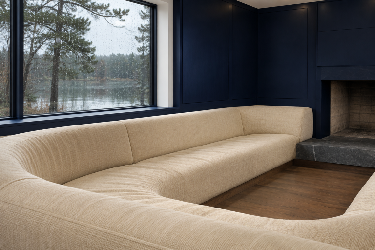
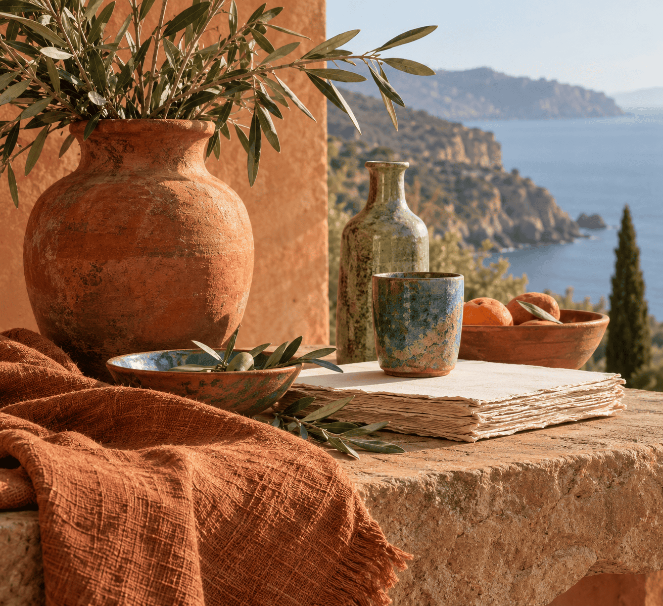 AI-generated editorial illustration; not a measured color sample.
A controlled three-color mixing exercise
- Swatch the available red, yellow, and blue separately. Record their pigment codes and the surface you are using.
- Combine red and yellow to make a warm orange. Adjust these two colors before introducing the neutralizing color.
- In subtractive paint mixing, add blue in very small increments to lower the orange’s chroma, meaning its color intensity. On a traditional RYB artist’s color wheel, blue is orange’s complement. A green paint can also mute a mixture that leans strongly red-orange, but it acts as a practical neutralizing adjustment rather than orange’s named RYB complement.
- Make separate warm, balanced, and cool versions instead of repeatedly correcting one large pile.
- Let a test swatch reach the normal dried or cured state for the medium, then compare it with the intended subject under consistent light.
There is no reliable universal ratio. A strong blue can overwhelm a weak orange quickly, while an opaque yellow behaves differently from a transparent one. The site’s guide to mixing paints and colors provides additional background on pigment bias and controlled adjustments.
Watercolor adjustments
In transparent watercolor, use water and the white paper to create lighter values. Adding opaque white paint creates a different optical result and is not equivalent to dilution.
Ultramarine blue and burnt sienna form a widely used neutralizing pair. A burnt-sienna-heavy mixture produces a warmer brown; a more balanced mixture can approach gray; additional ultramarine produces a cooler, blue-biased dark. Granulation, staining, transparency, pigment source, and dilution alter the result, so test the actual brands together.
Allow adjacent test strokes to dry before judging them, and keep notes on pigment codes and water load. These watercolor painting tips cover palette setup and light-to-dark working methods if you are new to the medium.
Acrylic and oil adjustments
For acrylic or oil paint, add white when you intentionally want a tint, but expect it to change both the value and the mixture’s covering behavior. Add a red-orange mixture to restore warmth. Add blue sparingly to cool and neutralize an overly bright result.
Keep a clean portion of the original orange beside each experiment. This makes it easier to recover from an overly cool correction. Mix enough for a test, record what you used, and follow the paint manufacturer’s instructions for handling, ventilation, drying or curing, and cleanup.
Troubleshooting the mixture
| Problem | Likely cause | Adjustment to test |
|---|---|---|
| Too orange or bright | Not enough neutralizing color | Add a minute amount of blue, mix fully, and test again. |
| Too gray | Too much blue or green | Restore color with a fresh warm orange mixture rather than adding random colors. |
| Too purple | The red-blue balance dominates | Rebuild the orange with yellow before making further neutralizing adjustments. |
| Too opaque | An opaque component or added white is covering the surface | Check each paint’s opacity and test a thinner application or a more transparent pigment option. |
| Difficult to reproduce | The pigments, amounts, water load, or support were not recorded | Label test swatches with pigment codes and working notes before scaling up. |
If the goal is a broader family of earth colors rather than a specific burnt sienna match, the guide to mixing brown paint explains how to warm, cool, lighten, and darken brown mixtures.
Colors That Work With Burnt Sienna
Three role-based palettes
Assigning roles prevents every color from competing for equal attention. The following palettes use documented digital references rather than claiming to reproduce particular paints or materials.
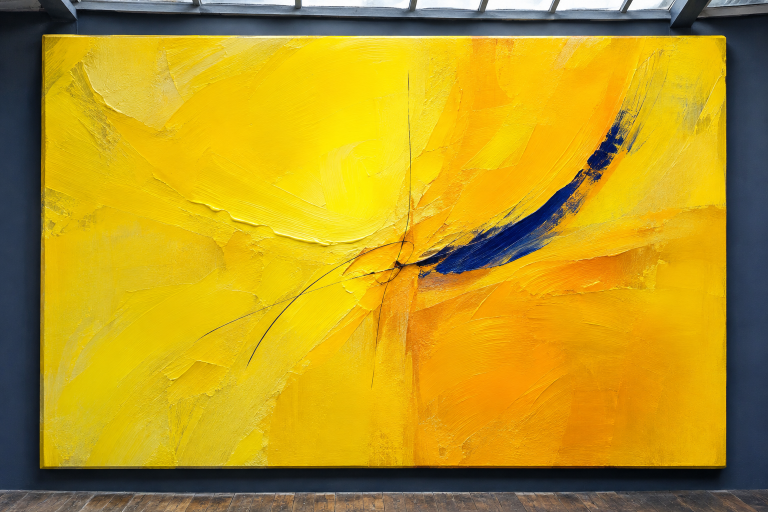
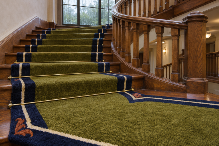
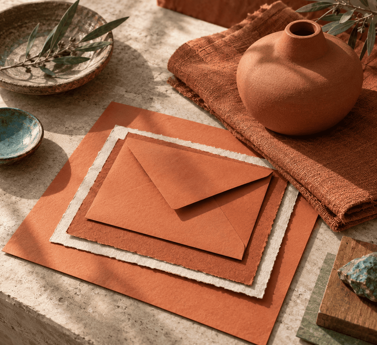 AI-generated editorial illustration; not a measured color sample.
Earth and sage: Burnt sienna provides the warm dominant field, sage softens it, and light blue supplies a small cool accent.
| Name | HEX | RGB | Color |
|---|---|---|---|
| Dominant: Burnt Sienna | #E97451 | 233, 116, 81 | |
| Supporting: Sage Green | #98A869 | 152, 168, 105 | |
| Accent: Light Blue | #90D5FF | 144, 213, 255 |
Warm clay with a cool accent: Terracotta and burnt sienna create a close warm range, while teal provides clear hue separation.
| Name | HEX | RGB | Color |
|---|---|---|---|
| Dominant: Terracotta | #E2725B | 226, 114, 91 | |
| Supporting: Burnt Sienna | #E97451 | 233, 116, 81 | |
| Accent: Teal | #069494 | 6, 148, 148 |
Layered earth tones: Dark CSS sienna anchors the palette, raw sienna introduces a yellower supporting note, and teal supplies the accent.
| Name | HEX | RGB | Color |
|---|---|---|---|
| Dominant: CSS Sienna | #A0522D | 160, 82, 45 | |
| Supporting: Raw Sienna | #D27D46 | 210, 125, 70 | |
| Accent: Teal | #069494 | 6, 148, 148 |
Complementary color versus text contrast
On a traditional RYB artist’s color wheel, blue is opposite orange. Because burnt sienna is a muted orange-red rather than one fixed hue, blue and blue-green paints may produce useful opposition or neutralization in subtractive mixing. That practical paint relationship is not the same as calculating a complement from exact RGB screen values.
For digital work, choose a color model and calculate from the project’s exact values instead of assuming that a paint-wheel pairing transfers unchanged. More importantly, hue opposition does not prove that two colors provide enough light-dark contrast for readable text.
Use color relationships to shape a palette, then test text contrast separately. A cool accent may stand out as a decorative block yet still fail when used for small lettering.
Accessible text on #E97451
Against the selected #E97451 background, black produces an approximate contrast ratio of 7.08:1. White produces about 2.97:1.
| Name | HEX | RGB | Color | Contrast on #E97451 | WCAG AA result |
|---|---|---|---|---|---|
| Black | #000000 | 0, 0, 0 | 7.08:1 | Passes normal and large text | |
| White | #FFFFFF | 255, 255, 255 | 2.97:1 | Fails normal and large text |
WCAG AA requires at least 4.5:1 for normal text and 3:1 for large text, defined here as at least 18pt regular or 14pt bold. A failing ratio must not be rounded upward, so 2.97:1 does not qualify as 3:1. Use black for ordinary text on #E97451, and test other foreground colors with the exact production values.
Choose the Right Burnt Sienna for the Job
For screens and interfaces
Save the chosen HEX value in the project’s color styles or design tokens. Use #E97451 when you want the representative color shown here, #ED7B58 when that alternate reference suits the composition, or #A0522D when you specifically want standardized CSS sienna. Do not rely on the shared name to preserve color across systems.
Check contrast wherever text, icons, focus indicators, or controls use the color. Palette harmony and interface accessibility are separate decisions.
For paint and mixed media
Choose artist paint by its pigment code, opacity, handling, and dried appearance. PBr7 is useful identification, but it does not guarantee that two brands or product lines will behave alike. Test washes, glazes, mixtures, and tints on the actual support before committing to a large passage.
If you mix an approximation, keep labeled swatches instead of chasing a screen value by eye. A repeatable working mixture is usually more useful than a one-time visual match.
For print, decor, and object matching
Proof printed work on the intended stock because an sRGB HEX value does not guarantee the same printed result. For walls, textiles, furniture, or an existing artwork, compare a physical sample under controlled light and then inspect it in the room where it will be used.
Burnt sienna can suggest warmth or earthiness in contemporary design, but those are contextual associations rather than universal psychological effects. Let the surrounding materials, culture, period, and purpose guide the final choice.

Learn more about Israel Benloulou and about us.