
Amber Color: A Practical Guide to Mixing and Pairing

Amber glows somewhere between golden yellow and warm orange, but one digital swatch cannot capture every piece of resin or mixed paint. Knowing which version you are working with makes the color much easier to reproduce, pair, and recognize. This guide gives you an exact screen reference, adaptable paint-mixing steps, practical palettes, and clear contrast advice.
What Color Is Amber?
Amber at a Glance
Amber is a warm yellow-orange color family named after natural amber, a fossilized tree resin. For digital work, #FFBF00 is a useful representative amber. It is bright and golden, with more orange warmth than a pure yellow.
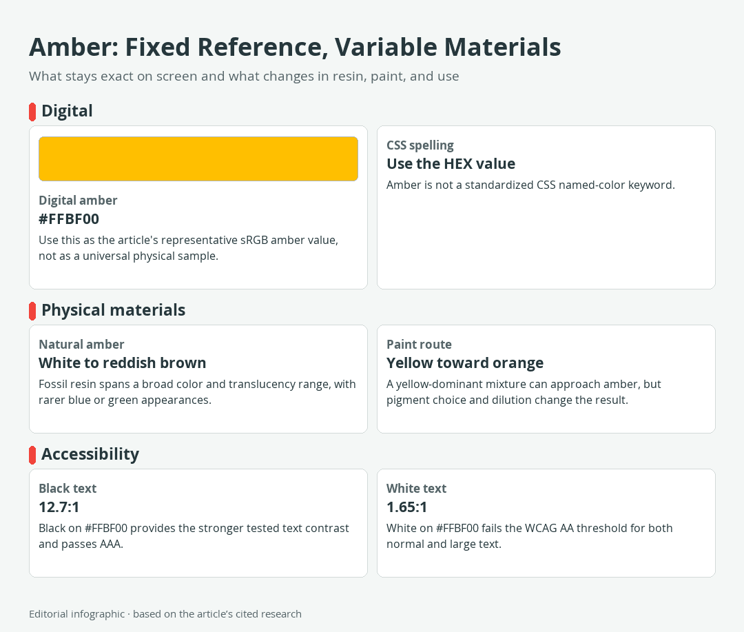
Download the complete color reference sheet (PNG): Amber: Fixed Reference, Variable Materials (PNG)
| Name | HEX | RGB | Color |
|---|---|---|---|
| Amber | #FFBF00 | 255, 191, 0 |
That value is a descriptive digital reference, not a universal definition. Natural resin, paint, ink, dyed fabric, and colored glass can all be described as amber while looking noticeably different.
Is Amber a Standardized Color?
Amber is not a standardized CSS named-color keyword. In website code, use a numeric value such as #FFBF00 or its equivalent RGB notation instead of relying on amber as a browser-recognized color name.
This distinction matters because familiar color names do not always have an official technical definition. A HEX value identifies one specific color in sRGB, a standard red-green-blue screen-color space, while the everyday word amber covers a broader family.
Amber and Seven Useful Reference Colors
The first row below is the representative amber used throughout this guide. The remaining seven are standardized CSS named colors that help place amber among nearby warm hues and useful companion colors. Their exact CSS tokens are gold, goldenrod, darkorange, navy, teal, ivory, and sienna.
| Name | HEX | RGB | Color |
|---|---|---|---|
| Amber | #FFBF00 | 255, 191, 0 | |
| Gold | #FFD700 | 255, 215, 0 | |
| Goldenrod | #DAA520 | 218, 165, 32 | |
| Dark Orange | #FF8C00 | 255, 140, 0 | |
| Navy | #000080 | 0, 0, 128 | |
| Teal | #008080 | 0, 128, 128 | |
| Ivory | #FFFFF0 | 255, 255, 240 | |
| Sienna | #A0522D | 160, 82, 45 |
Gold is lighter and more yellow than the selected amber. Dark Orange pushes farther toward orange, while Goldenrod looks more subdued. Navy and Teal create cool separation; Ivory softens a scheme; Sienna carries the warmth into an earthier brown.
Why One Amber Swatch Cannot Represent Every Material
Digital Amber Versus Natural Amber
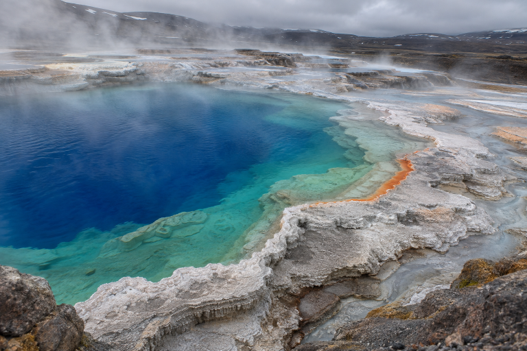
A HEX code fixes three sRGB channel values for display on a screen. Natural amber is a physical material with variable color and translucency. Documented specimens include white, yellow, golden, orange, and reddish-brown material, along with rarer blue or green appearances.
 AI-generated editorial illustration; not a measured color sample.
Color alone cannot confirm that an object is genuine amber. Other materials can resemble it, and amber itself varies too widely for a single hue to serve as an identity test.
Why Translucency, Thickness, and Aging Matter
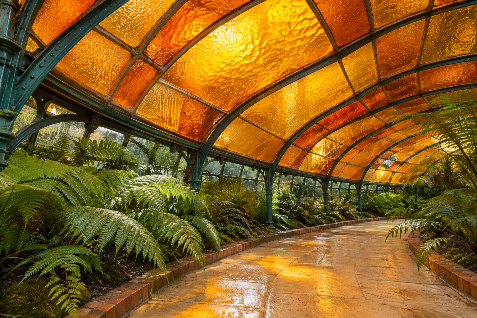
Light travels through translucent amber instead of merely reflecting from a flat surface. One documented group of blue amber specimens showed yellow body color in thin areas, shifting through orange to reddish orange where the material became thicker. That variation can occur within the same specimen.
Age and treatment add further uncertainty. Oxidation can darken amber, while heat treatments and dyes can modify its appearance. A screen swatch can suggest a general color family, but it cannot reproduce these optical and material effects.
Screen and Paint Are Different Color Problems
A HEX value sets a specific sRGB screen color. Paint depends on physical pigments, each with its own undertone, opacity, and tinting strength, meaning how strongly one pigment changes a mixture. The digital reference and a physical paint sample are different kinds of color information.
Use #FFBF00 as a consistent starting point for digital layouts. For paint, resin, fabric, or decor finishes, judge a physical sample under the lighting in which it will be seen. Do not expect a screen preview to provide an exact material match.
How to Mix Amber Paint
Acrylic Mixing Workflow
There is no universal amber paint ratio because pigment choices can change the hue, chroma, value, and opacity of a mixture. Chroma means the color’s intensity or purity. A reliable workflow is more useful than a fixed recipe:
- Place a yellow with a suitable warm undertone on the palette as the dominant color.
- Add a warm orange in very small increments. If you do not have orange, introduce a small amount of warm red to the yellow.
- Mix thoroughly and paint a labeled test swatch.
- Let the swatch reach the paint maker’s stated drying stage before making a final judgment.
- Record the paint names, pigment codes, and approximate proportions if you need to repeat the result.
Red and yellow make orange in traditional paint mixing, but different reds and yellows do not create identical oranges. Start with the lighter, less forceful color and add the stronger color gradually. This gives you more control over tinting strength and reduces wasted paint. Follow the manufacturer’s instructions for handling, ventilation, cleanup, and compatible mediums.
Watercolor and Transparent Amber Effects
In documented manufacturer tests, Nickel Azo Yellow mixed with Pyrrole Orange produced orange-amber mixtures. Greater dilution shifted the mixture toward yellow.
Treat that pairing as a tested route, not a guaranteed formula. Paper, water level, pigment separation, granulation, where pigment particles settle visibly into the paper texture, and drying can all change the result. Make a dilution strip that moves from a concentrated mixture to a pale wash, then let it dry before choosing the most useful passage.
How to Adjust a Mix That Is Too Orange, Pale, or Dull
- Too orange: Add more of the original yellow in small steps, then swatch again.
- Too yellow: Introduce a tiny amount of the chosen warm orange or warm red.
- Too pale: Reduce dilution where the medium permits, or rebuild a more concentrated mixture instead of adding a large correction at once.
- Too intense: Use a transparent warm earth or a minute amount of an appropriate complementary color to lower the chroma. Complements can neutralize quickly, so test before applying the mixture to the project.
- Too dull: Stop adding the neutralizing color and rebuild from cleaner yellow and orange components. Muddy mixtures are often easier to replace than rescue.
Always compare the dry swatch with the intended surface. A convincing amber on white watercolor paper may appear heavier on toned paper or less luminous on an opaque craft surface.
Colors That Go With Amber
Color-wheel language depends on the model being used. Digital design commonly uses an RGB-based wheel, while traditional paint instruction often uses an RYB wheel. In either context, complementary colors occupy opposing regions and create strong separation, while analogous colors sit next to one another and produce a closer relationship. The following palettes emphasize practical roles rather than claiming that every pair is a mathematically exact complement.
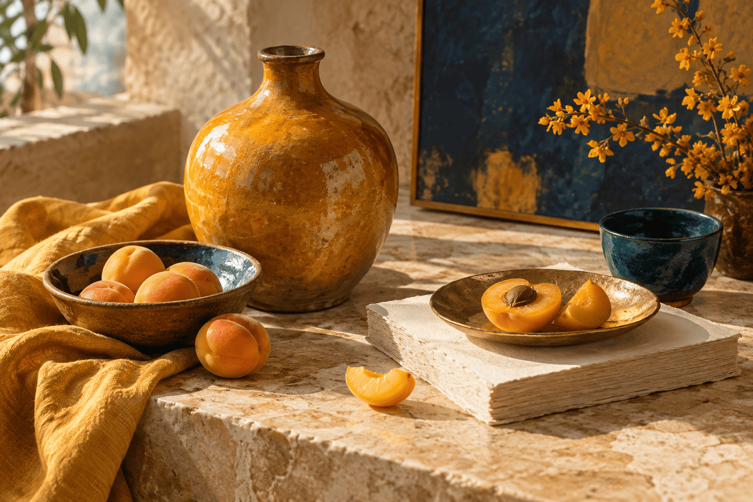 AI-generated editorial illustration; not a measured color sample.
A Navy, Ivory, and Amber Palette
This scheme makes amber a focused accent against a deep dominant color. Ivory supplies breathing room without the starkness of bright white.
| Name | HEX | RGB | Color |
|---|---|---|---|
| Navy, dominant | #000080 | 0, 0, 128 | |
| Ivory, supporting | #FFFFF0 | 255, 255, 240 | |
| Amber, accent | #FFBF00 | 255, 191, 0 |
Use navy for large fields, cabinetry, packaging, or a digital header. Let Ivory carry open space, then reserve amber for handles, borders, buttons, stitching, or a small painted detail.
A Teal, Ivory, and Amber Palette
Teal provides a cooler blue-green counterpoint while Ivory keeps the two saturated colors from competing across the entire composition.
| Name | HEX | RGB | Color |
|---|---|---|---|
| Teal, dominant | #008080 | 0, 128, 128 | |
| Ivory, supporting | #FFFFF0 | 255, 255, 240 | |
| Amber, accent | #FFBF00 | 255, 191, 0 |
This combination suits graphic layouts, painted storage, textiles, and handmade paper projects. Repeat the amber in a few small locations rather than giving it equal area with Teal.
An Earthy Amber Palette
Sienna connects amber to clay, leather, wood, and other warm material colors. Keeping Ivory dominant prevents the result from becoming visually heavy.
| Name | HEX | RGB | Color |
|---|---|---|---|
| Ivory, dominant | #FFFFF0 | 255, 255, 240 | |
| Sienna, supporting | #A0522D | 160, 82, 45 | |
| Amber, accent | #FFBF00 | 255, 191, 0 |
Try this distribution for woven crafts, rustic signs, collage, or a room with natural wood. Match physical samples in place because wood stain, glaze, and textiles will not reproduce the listed screen values exactly.
A Warm Analogous Palette
Gold, amber, and Dark Orange occupy neighboring warm regions, so hue alone does not provide much separation. Assign each a clear role and add a sufficiently dark neutral wherever readability or edge definition matters.
| Name | HEX | RGB | Color |
|---|---|---|---|
| Amber, dominant | #FFBF00 | 255, 191, 0 | |
| Gold, supporting | #FFD700 | 255, 215, 0 | |
| Dark Orange, accent | #FF8C00 | 255, 140, 0 |
This close warm range works well for painted gradients, autumnal paper crafts, or layered illustration. Check it in grayscale when separate shapes must remain easy to distinguish, since neighboring warm hues can have similar perceived lightness.
How to Use Amber Legibly
Black Text or White Text on Amber?
For the representative #FFBF00 background, black text produces a contrast ratio of 12.7:1. White text produces only 1.65:1. Black is therefore the clear choice between the two: it passes the highest WCAG text threshold, while white fails the minimum threshold for both normal and large text.
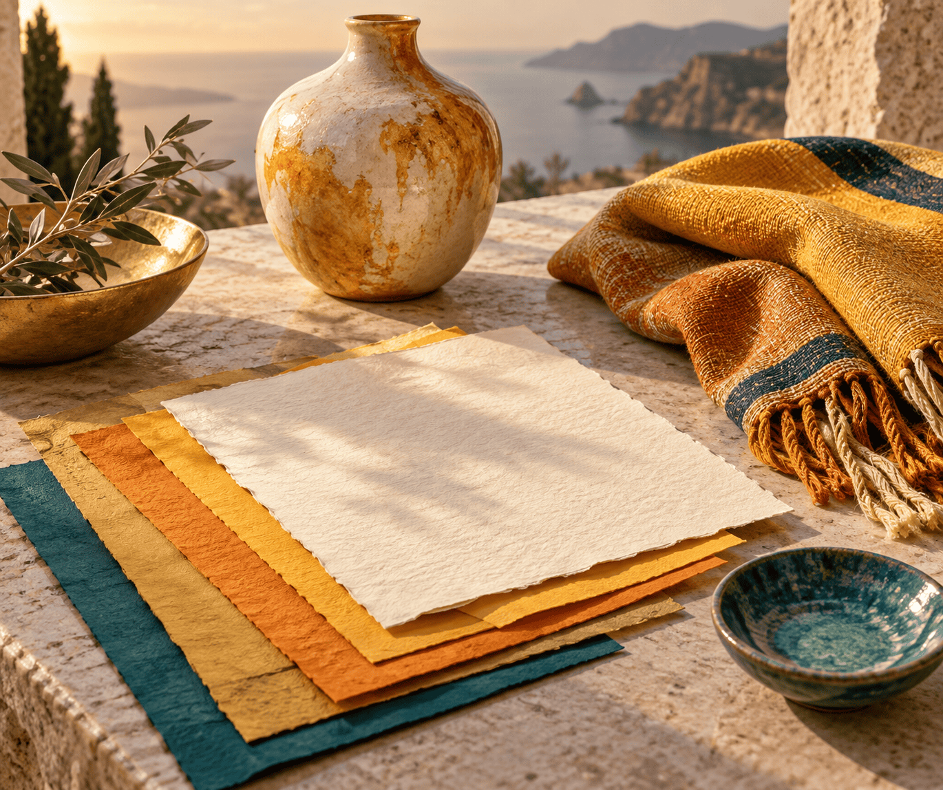 AI-generated editorial illustration; not a measured color sample.
WCAG 2.2 sets a minimum contrast ratio of 4.5:1 for normal text and 3:1 for large text. Large text is defined as at least 18pt for regular type or 14pt for bold type. Do not round a near-miss into a pass.
These results apply specifically to #FFBF00 paired with pure black or pure white. A deeper or paler amber changes the calculation, and an arbitrary dark color is not guaranteed to pass. Test every actual foreground and background pair.
Do Not Use Amber as the Only Signal
Color must not be the sole way to communicate a status, instruction, or distinction. A warning label can combine amber with a written warning and an icon. A required form field can use text and a visible marker. Craft instructions can pair colored diagram areas with numbers, patterns, or labels.
This redundancy helps people who cannot distinguish the colors, view the project in poor lighting, use a low-quality print, or encounter a screen with altered color settings.
Practical Uses in Digital Design, Crafts, and Decor
In digital interfaces, amber can serve as a highlight when the design calls for emphasis. Use black text on the representative value, provide a non-color cue, and test interactive states separately.
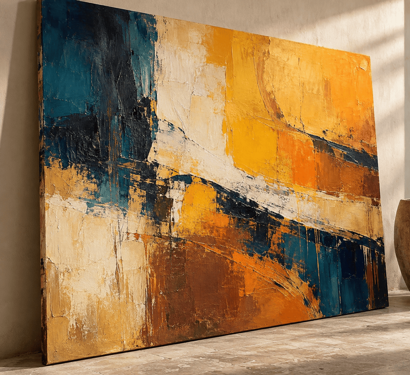
In crafts and illustration, amber can suggest warmth and translucency through layered washes, glazing, or contrasts between golden lights and orange-brown shadows. The technique creates an impression of amber; it does not turn the artwork into a measured sample of natural resin.
In decor, test amber-colored paint, fabric, or glass in daylight and artificial light before committing to a large area. Place the sample beside permanent materials such as flooring, tile, and wood. Their undertones may pull the amber toward yellow, orange, or brown.
Where the Name and Meanings Come From
From Fossil Resin to a Color Name
The English word amber developed from terminology associated with ambergris and later became attached to fossil resin. The consulted etymological record places adjectival use around 1500 and use as a color name in 1735.
That material origin explains why the color name has flexible boundaries. It describes the family of yellows, golds, oranges, and browns associated with variable resin, not one historically fixed paint formula.
Treat Amber Symbolism as Context, Not Science
Any symbolic meaning assigned to amber is context-dependent rather than an inherent psychological effect. Meaning can shift with culture, location, period, upbringing, personal experience, and the object carrying the color.
Look at the complete setting before assigning symbolism. Amber on a traffic indicator, an antique-style package, a translucent bead, and an autumn illustration performs four different jobs. The most reliable way to recognize and use the color is to identify the medium first, choose a precise digital or physical reference second, and then test it in its final context.

Learn more about Israel Benloulou and about us.