
Anthracite Color: Codes, Mixing, and Practical Pairings

Anthracite occupies the border between dark gray and near-black, but choosing it is not as simple as copying the first color code you find. Physical references can vary in appearance with texture, material thickness, and viewing light, while digital values belong to a different reference context. This guide provides a documented digital reference, a practical paint-mixing process, and ready-to-use color combinations.
What Color Is Anthracite?
Anthracite is a family of very dark grays associated with anthracite coal. It commonly appears neutral or slightly cool, with enough gray character to remain distinguishable from black.
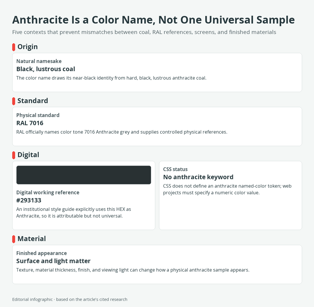
Download the complete color reference sheet (PNG): Anthracite Is a Color Name, Not One Universal Sample (PNG)
For digital work, this guide uses #293133 as its anthracite reference. That value is documented under the name Anthracite in an institutional style guide, but it is not the one official code for every paint, product, or color system bearing the name.
| Name | HEX | RGB | Color |
|---|---|---|---|
| Anthracite digital working reference | #293133 | 41, 49, 51 |
RAL 7016 is officially named Anthracite grey. It is a standardized physical color reference, whereas #293133 is a selected digital value. These references are useful in their respective settings, but they should not be treated as interchangeable.
The Coal Behind the Color Name
Anthracite is the highest rank of coal. Its hard, brittle, black, and lustrous appearance explains why the color name suggests a deep gray that can look almost black. The word ultimately comes through the Greek anthrakites, derived from a word for coal.
The namesake also helps with recognition. Anthracite generally describes a gray darker than a middle gray, although an exact boundary is not standardized across products and color references.
Anthracite Gray Versus Black
The working reference #293133 contains red, green, and blue values above zero, so it is not digital black. Its slightly higher green and blue components give this particular value a restrained cool tendency, but that tendency does not define every material sold as anthracite.
For a practical comparison, place the selected anthracite beside the black and surrounding colors intended for the project. Comparing exact digital values or approved physical samples is more reliable than deciding from the color names alone.
Anthracite Color Codes and Reference Systems
The phrase “anthracite color” can identify a descriptive family, a standardized RAL color, a digital brand color, or a proprietary product finish. Conflicting codes do not necessarily mean that one publisher made an error. They often indicate that different references were selected for different contexts.
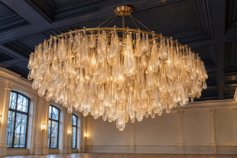
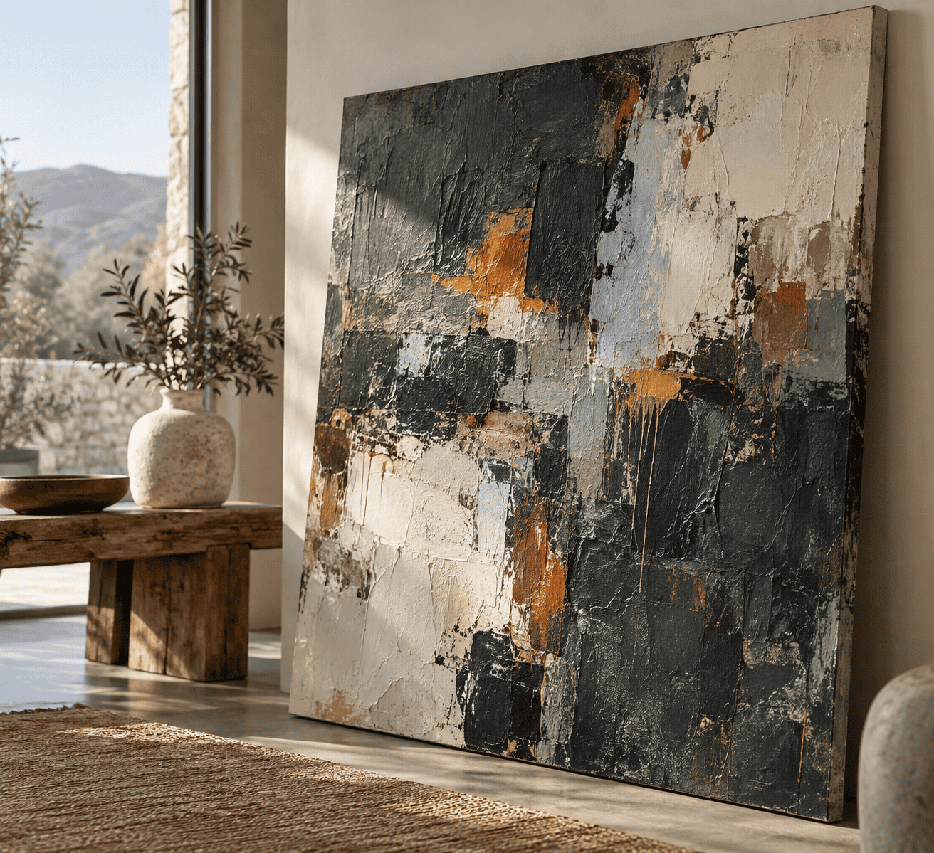 AI-generated editorial illustration; not a measured color sample.
- Descriptive anthracite: A dark gray to near-black family inspired by the appearance of anthracite coal. The name alone does not fix a numerical value.
- RAL 7016 Anthracite grey: An official name and number within the RAL Classic system, supported by controlled physical references.
- #293133: An attributable digital use of the Anthracite name and the working value used throughout this guide.
- Product-specific anthracite: A color or finish defined within a particular paint, plastic, furnishing, or building-product system.
Charcoal and anthracite overlap as descriptive names for dark grays, but the names alone do not guarantee a match. Compare exact numeric values for digital work and specified physical references or dry samples for material work.
Is #293133 the Official RAL 7016 HEX Code?
No. RAL officially identifies 7016 as Anthracite grey, but that does not make #293133 an exact or official HEX conversion of the physical standard. RAL provides physical presentations of 7016, including a semi-matte sheet and plastic samples. HEX notation provides a numeric digital color specification, not a physical material sample.
If a building component, cabinet, or coating must conform to RAL 7016, specify the RAL number and use an appropriate physical reference or the product system required for the job. A webpage swatch can help with planning, but it cannot certify a material match.
Why Anthracite Codes Differ Online
Current digital references assign several values to the anthracite name, including #293133, #2F3437, and #383E42. This variation shows that anthracite has no single web-wide HEX identity.
Anthracite is also not a CSS named-color keyword. A browser will not recognize color: anthracite; as a standardized named color, so web designers must provide a numeric value such as #293133.
A numeric digital value and a physical color reference serve different purposes. For RAL physical samples, texture, material thickness, and viewing light can change the visible nuance, which is why an appropriate physical reference matters when materials must coordinate.
How to Mix an Anthracite-Like Gray
A digital HEX value is not a physical paint formula. Pigments differ in hue, opacity, transparency, and tinting strength, so no universal black-to-white ratio can guarantee #293133 or RAL 7016. The useful goal is an anthracite-like dark gray that works under the lighting and on the surface intended for your project.
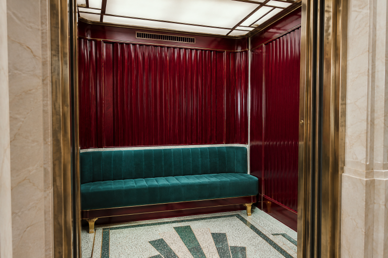
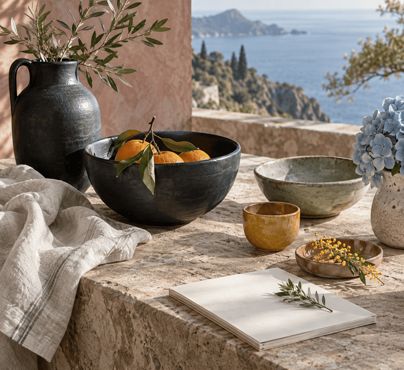 AI-generated editorial illustration; not a measured color sample.
Use compatible paints from the same medium, follow their product instructions, and record what you add. For broader fundamentals before starting, consult this guide to mixing paint colors.
Black-and-White Route
- Place a modest amount of white paint on the palette and add your chosen black in small increments. Dark pigments can have strong tinting power, so gradual additions provide more control.
- Mix thoroughly and brush a sample onto the same type of surface you plan to use.
- Assess the hue as well as the darkness. Black and white make gray, but the pigments involved may produce a gray that leans warm or cool rather than perfectly neutral.
- If the mixture is too pale, add another small amount of black. If it loses all visible separation from black, add white cautiously until its gray character returns.
This is the simplest route when consistency and easy adjustment matter more than creating a complex chromatic neutral.
Complementary-Color Route
A chromatic gray is a neutral-looking gray mixed from colored pigments rather than only black and white. Complementary colors can reduce each other’s chroma, meaning color intensity, and move a mixture toward gray or black. They can also change its value, or relative lightness.
- Choose a compatible complementary pair already available in your paint line.
- Begin with the darker or weaker component, then introduce the stronger-tinting color a little at a time.
- Stop when the mixture looks muted and balanced rather than clearly favoring one component.
- Use a compatible white to raise the value if needed. Add it gradually because lightening the mixture also makes its underlying hue easier to see.
This route can produce a more subtly colored anthracite, but it requires testing. Pigments have unequal tinting strengths, so a ratio that works with one pair of paints may fail with another formulation.
Test the Dry Paint Before Committing
Paint and label a test card with the pigments or product names used. Apply the mixture at a thickness similar to the final project, then let it dry for the period specified by the manufacturer. Acrylic mixtures can darken as the milky wet binder becomes transparent, while film thickness, formulation, and environmental conditions also affect drying behavior.
Judge the dry sample beside any surrounding colors and under the intended light. Make one controlled adjustment at a time, repeat the dry test, and only then scale the mixture up. Keep the approved sample as a visual reference because a digital value cannot replace a physical paint sample.
Colors That Go With Anthracite
Anthracite can act as a dominant field, a structural neutral, or a compact dark anchor. Pale colors provide value separation, warm colors can balance this reference’s cool tendency, and muted colors produce gentler transitions. The seven companions below are standardized CSS named colors; Anthracite remains this guide’s non-CSS working reference.
Eight Exact Digital References
| Name | HEX | RGB | Color |
|---|---|---|---|
| Anthracite | #293133 | 41, 49, 51 | |
| Floral White | #FFFAF0 | 255, 250, 240 | |
| Dark Orange | #FF8C00 | 255, 140, 0 | |
| Dark Sea Green | #8FBC8F | 143, 188, 143 | |
| Goldenrod | #DAA520 | 218, 165, 32 | |
| Light Blue | #ADD8E6 | 173, 216, 230 | |
| Rosy Brown | #BC8F8F | 188, 143, 143 | |
| Sienna | #A0522D | 160, 82, 45 |
In CSS, the exact tokens are written without spaces, such as floralwhite, darkorange, and darkseagreen. These companions are practical editorial choices, not official anthracite harmonies.
Three Role-Based Anthracite Palettes
Crisp contrast: Use Anthracite for the dominant field, Floral White for broad supporting areas, and Dark Orange for a restrained accent. The pale support keeps the composition open, while the orange creates a clear warm focal point.
| Name | HEX | RGB | Color |
|---|---|---|---|
| Dominant: Anthracite | #293133 | 41, 49, 51 | |
| Supporting: Floral White | #FFFAF0 | 255, 250, 240 | |
| Accent: Dark Orange | #FF8C00 | 255, 140, 0 |
Earthy warmth: Combine an Anthracite dominant with Sienna as the supporting brown and Goldenrod as the brighter accent. This palette suits designs that need warmth without giving up a firm dark structure.
| Name | HEX | RGB | Color |
|---|---|---|---|
| Dominant: Anthracite | #293133 | 41, 49, 51 | |
| Supporting: Sienna | #A0522D | 160, 82, 45 | |
| Accent: Goldenrod | #DAA520 | 218, 165, 32 |
Softened cool balance: Keep Anthracite dominant, use Dark Sea Green as the main support, introduce Light Blue as a secondary light color, and reserve Rosy Brown for accents. The muted green and rose soften the dark foundation, while the blue provides greater value separation.
| Name | HEX | RGB | Color |
|---|---|---|---|
| Dominant: Anthracite | #293133 | 41, 49, 51 | |
| Supporting: Dark Sea Green | #8FBC8F | 143, 188, 143 | |
| Secondary: Light Blue | #ADD8E6 | 173, 216, 230 | |
| Accent: Rosy Brown | #BC8F8F | 188, 143, 143 |
How to Use Anthracite in Digital and Physical Projects
A pleasing palette does not automatically produce readable text or a reliable material match. Digital and physical projects therefore require different checks.
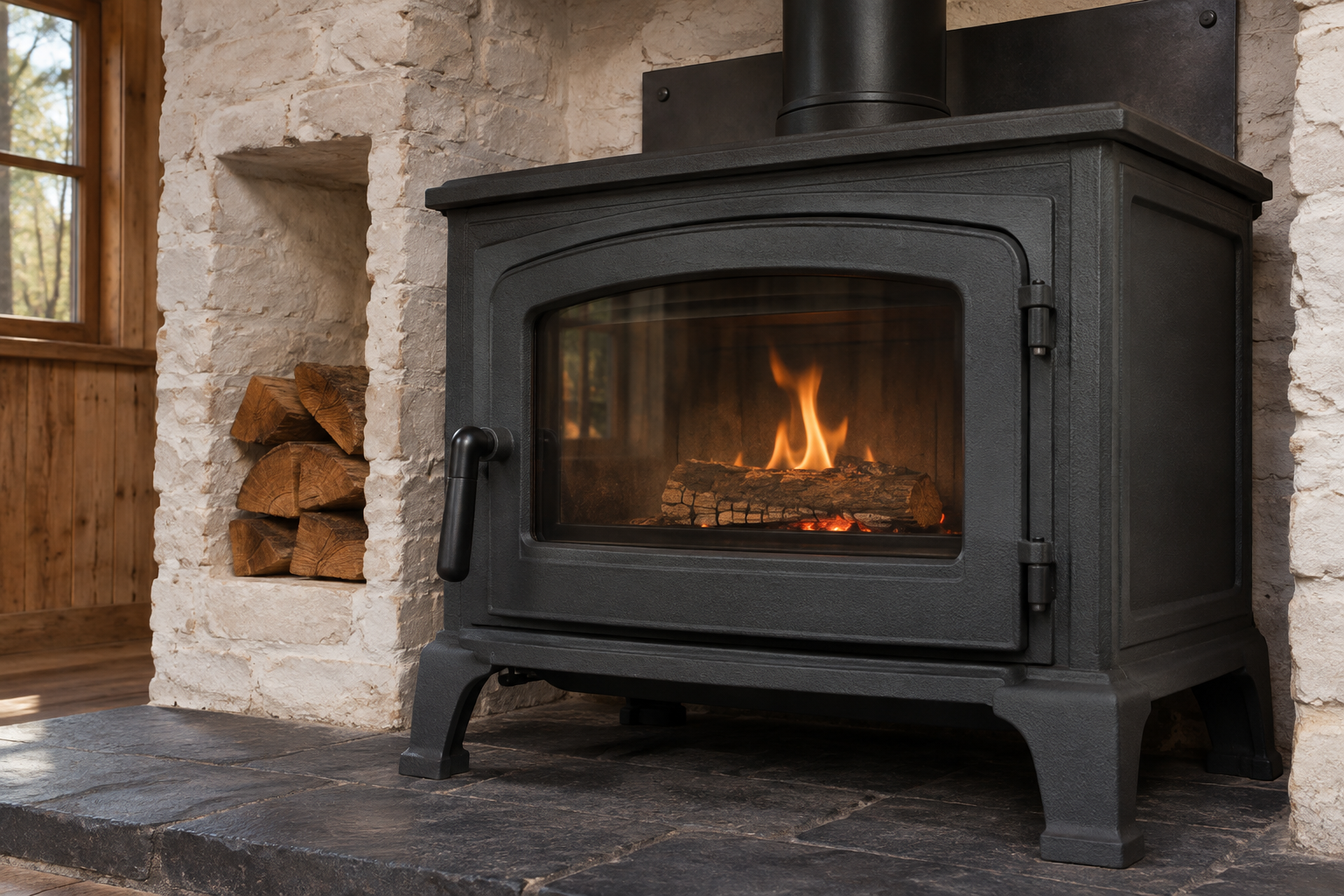
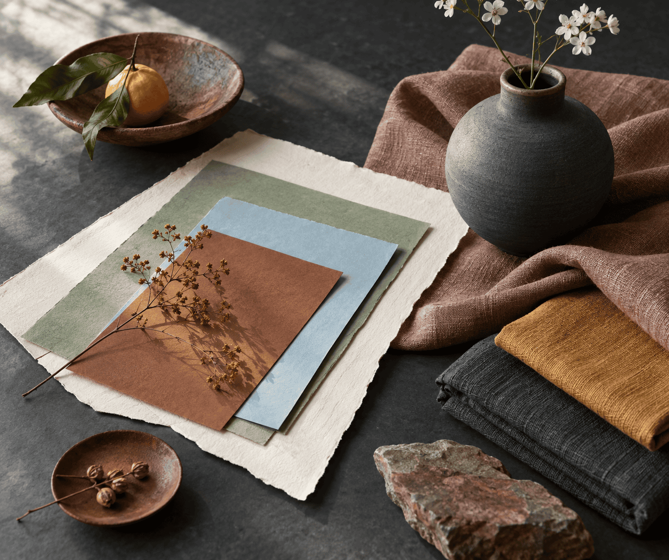 AI-generated editorial illustration; not a measured color sample.
Digital Contrast and Readability
WCAG 2.2 Level AA calls for a contrast ratio of at least 4.5:1 for ordinary text and 3:1 for large text. Large text is at least 18pt when regular or 14pt when bold. Test the exact foreground and background values rather than relying on color names.
Against #293133, the palette values produce these approximate contrast ratios:
- Floral White: 12.8:1
- Light Blue: 8.7:1
- Dark Sea Green: 6.2:1
- Goldenrod: 5.9:1
- Dark Orange: 5.7:1
- Rosy Brown: 4.7:1
- Sienna: 2.4:1
The first six pairs meet the 4.5:1 numerical threshold for ordinary text at these exact values. Sienna does not reach the 3:1 large-text threshold against Anthracite, so use that pair for decorative areas or separate the colors with a lighter value rather than relying on it for text.
For a dark interface, Anthracite works as a background with Floral White or Light Blue text. In a light interface, it can serve as body text, borders, or navigation against Floral White. Recheck contrast whenever either value changes, including hover, disabled, and selected states.
Paint and Material Limitations
For painted crafts, compare a fully dry sample under the light in which the object will normally be seen. Follow the paint manufacturer’s preparation and drying instructions for the intended surface. For a wood project, the guide to acrylic paint on wood covers surface preparation and application.
For plastic, powder coating, architectural paint, or coordinated fixtures, request the manufacturer’s physical sample and confirm the specified color system. Material texture, sample thickness, and viewing light can affect the appearance of a physical reference.
If exact RAL 7016 coordination is required, compare the products with an appropriate physical reference rather than a screenshot or home-printer output. Keep an approved sample with the project so later color decisions are based on the required physical reference.

Learn more about Israel Benloulou and about us.