

Achromatic Colors: A Practical Guide to Black, White, and Gray

Achromatic colors do more than remove color from a composition: they reveal whether its light, middle, and dark shapes actually work. Black, white, and neutral gray form the core palette, but many paints and materials sold as gray carry a subtle hue. This guide shows you how to recognize the difference, select exact digital grays, organize values, test paint mixtures, and avoid weak contrast.
What Are Achromatic Colors?
Achromatic colors have no perceptible hue and, in an idealized color model, no chroma. The core set consists of black, white, and neutral grays. Instead of moving around a color wheel from red to yellow, green, or blue, these colors change along a light-to-dark axis.
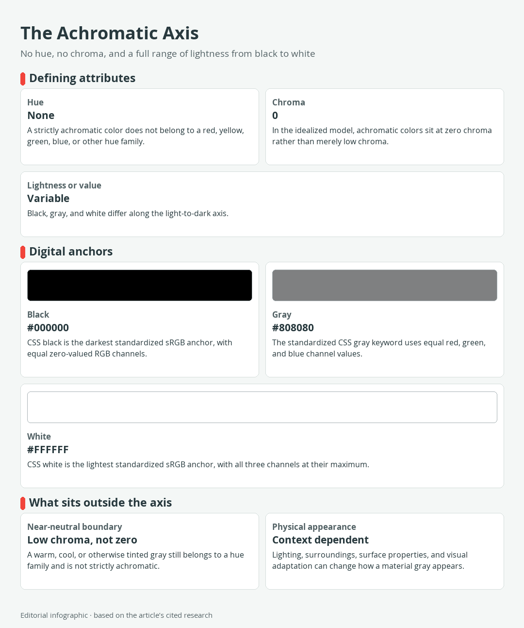
Download the complete color reference sheet (PNG): The Achromatic Axis (PNG)
Value describes the relative lightness or darkness of a color. White sits at the light end of the achromatic axis, black at the dark end, and gray occupies the range between them. A lighter or darker gray therefore changes value without acquiring a hue.
This definition describes an ideal. A digital gray can meet a precise mathematical condition, while a painted wall, sheet of paper, or tube color may reveal a warm or cool bias under particular lighting. Real-world appearance depends on the material, illumination, surrounding colors, and the viewer’s state of visual adaptation.
The achromatic axis: lightness without hue
Picture the achromatic axis as a straight path rather than a circular hue wheel. Traveling along it changes only the lightness, from black through progressively lighter grays to white. Moving away from it introduces chroma and a recognizable hue family.
This model makes achromatic color useful for evaluating structure. If a drawing remains clear without hue, its value pattern is doing meaningful work. If important forms merge into one another, adding more colors may disguise the weakness without fixing it.
Three standardized digital references
The following values are standardized CSS color keywords in sRGB, the color space commonly used for web content. The HEX value controls each entry, and the RGB channels agree with it exactly.
| Name | HEX | RGB | Color |
|---|---|---|---|
| Black | #000000 | 0, 0, 0 | |
| Gray | #808080 | 128, 128, 128 | |
| White | #FFFFFF | 255, 255, 255 |
These are screen specifications, not measured samples of paint, ink, fabric, paper, or another material. In particular, CSS gray is a standardized browser value. It is not a universal middle gray for painting, photography, printing, or human perception.
Achromatic vs. Monochromatic, Grayscale, and Neutral
Several related terms are often treated as interchangeable, but they answer different questions. The distinctions become clear once you ask whether a palette contains a hue, how much chroma it has, and how its values are organized.
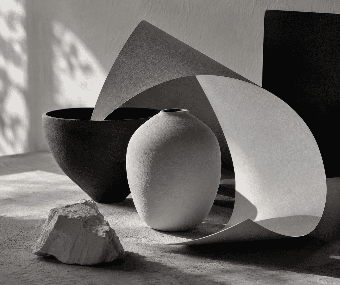 AI-generated editorial illustration; not a measured color sample.
Achromatic and monochromatic are not synonyms
An achromatic palette contains no hue. A monochromatic palette develops variations of one hue. Pale blue, middle blue, and navy can form a monochromatic blue scheme, but they are still chromatic because blue remains present.
A grayscale is an ordered progression of achromatic values from dark to light or light to dark. It can serve as a calibration tool, a value reference, or the tonal structure of an image. An achromatic design does not have to display every step of a grayscale. It might use only white, one middle gray, and black.
Why most real-world neutrals are only near-neutral
A strictly achromatic gray has no hue. A near-neutral has low chroma but still leans toward a hue family. Warm gray may lean yellow, orange, or red; cool gray may lean blue, green, or violet. Beige, cream, brown, greige, and most tinted charcoals are therefore broad design neutrals rather than strictly achromatic colors.
For a digital color in sRGB, inspect its RGB channels. Equal channel values identify an achromatic gray. For example, rgb(96, 96, 96) is achromatic, while rgb(96, 94, 90) has unequal channels and a slight hue bias.
A physical sample needs a different test. Place it beside a trusted neutral reference, keep the illumination consistent, and compare it under the light in which the finished work will be viewed. Also check nearby colors. A neutral-looking sample can appear warmer or cooler when its surroundings change, so visual classification remains conditional rather than absolute.
Achromatic Colors on Screens
Digital achromatic colors are easy to define numerically but not necessarily easy to arrange well. Equal channels establish neutrality in sRGB. They do not guarantee visual hierarchy or readable text.
The equal-channel test for digital gray
A six-digit HEX color contains paired values for red, green, and blue. A digital gray is achromatic when all three pairs match, such as #333333, #808080, or #E6E6E6. In RGB notation, the same rule appears as three equal numbers.
- #666666: achromatic because the three channel pairs are equal.
- #66636A: near-neutral rather than achromatic because its channels differ.
- #F5F1E8: a light warm neutral, not an achromatic white or gray.
Do not infer brightness from a CSS keyword alone. CSS color names are historical labels rather than a perceptually ordered gray scale. For example, the standardized color darkgray is #A9A9A9, which is lighter than gray at #808080.
If you are building a gray ramp for an interface or illustration, inspect the result at its intended size and adjust each step according to its function.
Contrast matters more than the absence of hue
A black, white, and gray interface is not automatically accessible. Text readability depends on relative luminance contrast between foreground and background, not simply on whether both colors lack hue.
For WCAG 2.2 Level AA, normal text needs a contrast ratio of at least 4.5:1. Large text needs at least 3:1 and is defined here as 18 pt or larger for regular text, or 14 pt or larger for bold text. A borderline result must meet the stated threshold without being rounded upward.
Check every functional pairing, including body text, muted labels, buttons, form hints, and text placed over images. A pale gray label may look refined on white while still failing to provide enough separation. Color names such as “charcoal” or “light gray” cannot substitute for an actual contrast calculation.
How to Use an Achromatic Palette in Art and Design
Without hue differences, value must carry more of the composition. Strong achromatic work uses clear grouping, deliberate edges, scale, spacing, surface variation, and texture to direct attention.
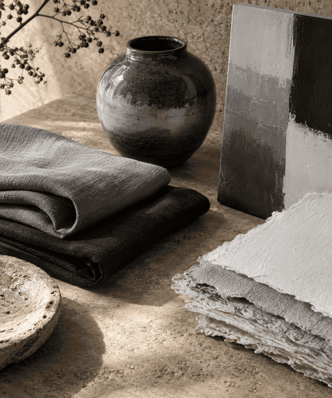 AI-generated editorial illustration; not a measured color sample.
Start with three value groups
Begin with a small thumbnail and reduce the subject to three groups: light, middle, and dark. Squint at the reference or view it at a small size so minor details recede. Assign each major shape to the closest group, then ask whether the silhouette and focal area remain understandable.
- Draw a row of three boxes and assign one to light, one to middle, and one to dark.
- Reduce your subject to a thumbnail that is small enough to discourage detail.
- Fill every major shape with one of the three values.
- Check whether adjacent important shapes merge. If they do, regroup them before refining the image.
- Expand to a longer grayscale only when the extra steps clarify form or light.
Once the three groups communicate the main structure, add intermediate values only where they help describe form or light.
Create emphasis without adding hue
Place a clear light-dark change near the intended focal point and use quieter value differences in supporting areas. Edge sharpness, object size, texture density, and empty space provide additional ways to separate and organize elements without introducing hue.
In home decor, the same logic applies at a larger scale. If walls, upholstery, rugs, and furniture occupy similar values, compare them as light, middle, and dark masses. Adjusting those groups, materials, or textures can create clearer separation without requiring a colorful object.
When an accent color changes the scheme
A colored accent can make a focal point unmistakable, but it changes the classification. Black, white, gray, and a red accent may reasonably be described as an accented achromatic design. It is no longer strictly achromatic because the palette now contains a hue.
Decide based on purpose rather than terminology alone. Keep the palette fully achromatic when the exercise is about value, tonal unity, or material contrast. Add a controlled accent when the design needs a clear signal, category marker, or point of emphasis that value alone cannot provide.
How to Mix and Test Achromatic Grays in Paint
A HEX code is not a paint recipe. Screen color is produced by emitted red, green, and blue light, while paint appearance depends on its formulation, illumination, surrounding colors, and viewing conditions. A mathematically neutral screen gray cannot guarantee a visually identical physical mixture.
Black and white are not a universal paint formula
Mixing black and white is a practical starting point, but different black pigments have different undertones and tinting strengths. One may produce a cooler gray, another a browner gray, and a strong-tinting black may overwhelm white with a very small addition. Commercial gray paints may also use formulations other than a simple black-and-white blend.
Follow the product instructions and begin with a small sample. Add the stronger color incrementally, mix thoroughly, and record the paints used. If neutral appearance matters, compare the result with a neutral reference instead of trusting the name printed on the tube.
Neutralizing with complements
Complementary colors can be mixed toward a neutral because each reduces the other’s chromatic intensity. With real pigments, however, the result often retains a subtle hue and is better described as a chromatic or near-neutral gray. The outcome depends on the particular pigments, not merely on broad labels such as red and green.
First identify your goal. If a mixture is too intense, you may need to reduce its chroma without making it much darker. If it is too light, you need a value adjustment. Those are different problems, and adding a generic gray may change both chroma and value at once.
Test the dry sample under its final light
Apply the mixture to the intended support and let it dry or cure according to the product instructions. Acrylic mixtures in particular should be evaluated after drying because their apparent value can change during that process. Label each test so you can reproduce the useful mixture.
Inspect the dry sample under the lighting planned for the finished work. Then place likely neighboring colors beside it. If the gray begins to look blue, brown, green, or violet, treat that bias as part of the final result. It may be useful, but it is not strictly achromatic.
Common Achromatic Palette Problems and Fixes
The values are too close
Symptom: Shapes merge, type recedes, or the composition looks flat even though it contains several grays.
Fix: Convert the work mentally or digitally into three broad groups. Move the focal element into a clearly different group and simplify minor variations. In an interface, calculate the relevant foreground-background contrast rather than judging the names or swatches in isolation.
 AI-generated editorial illustration; not a measured color sample.
The neutral has an undertone
Symptom: A gray looks blue beside warm wood, brown under cool lighting, or green next to a reddish surface.
Fix: Determine whether the bias comes from the material, the light, or the adjacent colors. Compare the sample with a neutral reference under consistent conditions. If the bias remains visible, classify and use it as a near-neutral rather than forcing the achromatic label.
The grayscale feels uneven
Symptom: Some steps appear to jump dramatically while others are difficult to distinguish.
Fix: View the scale at its final size and under realistic display conditions, then adjust the intermediate values by appearance and function. Preserve sufficient contrast wherever a step carries text or essential information.
The paint mixture becomes muddy
Symptom: Repeated additions make the mixture darker and duller without producing the gray you wanted.
Fix: Stop and define the target in terms of value and chroma. Make a fresh test mixture, add strong pigments in small increments, and retain labeled samples. This gives you a controlled comparison instead of asking one overworked mixture to solve several problems at once.
Frequently Asked Questions
Is every black-and-white image achromatic?
A digital image file is encoded achromatically in sRGB when every pixel has equal red, green, and blue channel values. Its appearance on a physical display still depends on the display and viewing conditions. A physical black-and-white print can also show a tint from its ink, paper, lighting, or surrounding colors, so its perceived neutrality remains conditional.

Learn more about Israel Benloulou and about us.