


Burgundy Color: A Practical Guide to This Dark Red

Burgundy is a dark purplish red rather than one universal physical sample. This guide gives you a dependable digital reference, an adjustable acrylic paint-mixing method, and ready-to-use color combinations. You will also learn how burgundy differs from maroon and which text color works on a burgundy background.
What Color Is Burgundy?
Burgundy is a dark purplish red. The name covers a range of red-brown, wine-red, and blackish-purple colors rather than one immutable physical sample. For digital work, #800020 is a widely used representative sRGB value and serves as the controlling burgundy reference throughout this guide.
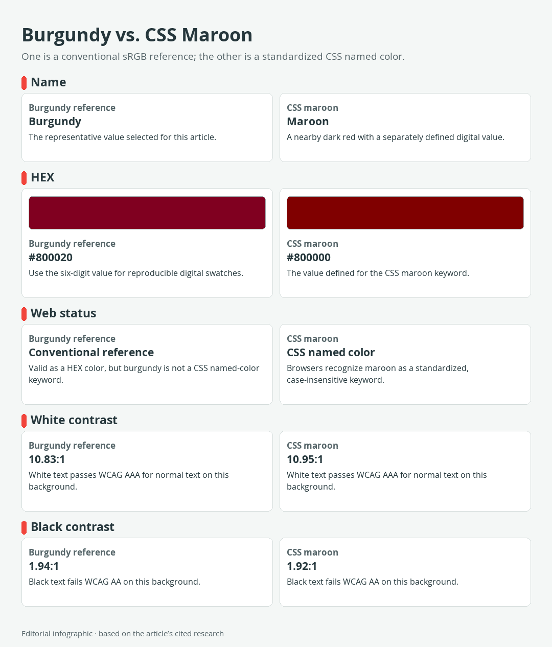
Download the complete color reference sheet (PNG): Burgundy vs. CSS Maroon (PNG)
| Name | HEX | RGB | Color |
|---|---|---|---|
| Burgundy | #800020 | 128, 0, 32 |
This value is a reproducible screen color, not a universal standard for every object called burgundy. It is neither a paint formula nor a measurement of Burgundy wine.
Burgundy, maroon, dark red, and firebrick compared
Burgundy and maroon are often treated as interchangeable in casual descriptions, but their selected digital values differ. The representative burgundy reference adds blue to its dark red base, producing a more visible purple lean. The standardized CSS color maroon has no blue component in its RGB value and appears closer to a pure dark red.
| Name | HEX | RGB | Color |
|---|---|---|---|
| Burgundy | #800020 | 128, 0, 32 | |
| Maroon | #800000 | 128, 0, 0 | |
| Dark Red | #8B0000 | 139, 0, 0 | |
| Firebrick | #B22222 | 178, 34, 34 |
Maroon, darkred, and firebrick are standardized CSS named colors. Burgundy is not. Dark red is slightly brighter than maroon but remains strongly red, while firebrick is lighter and less subdued. These differences are useful when a design needs a specific dark red rather than a loosely applied color name.
Why one burgundy HEX code is only a digital reference
A HEX value specifies an sRGB color through red, green, and blue channels. It does not identify a paint pigment or prescribe how an acrylic mixture will behave. Acrylic appearance can vary with its pigment, transparency, sheen, dilution, film thickness, substrate, and application.
Use #800020 when you need a clear digital starting point. For acrylic work, compare a dried paint-out with the physical target under the light in which the finished piece will be viewed.
Using Burgundy in Digital Design
Burgundy can work as a large background, a restrained accent, or a text color on a sufficiently light surface. Its depth gives it visual weight, so small amounts may command more attention than the same area of a pale neutral. Exact contrast, however, matters more than an aesthetic impression when text must remain readable.
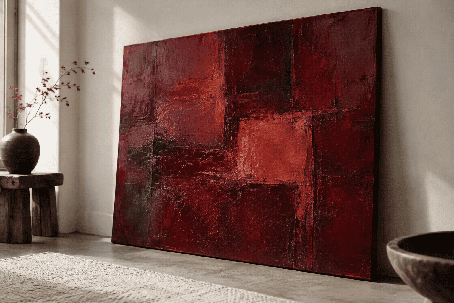 AI-generated editorial illustration; not a measured color sample.
CSS syntax and standardized color names
CSS accepts the hexadecimal declaration #800020. It does not define burgundy as a named-color keyword. If dependable browser rendering matters, write the HEX value rather than relying on the informal name.
By contrast, maroon, darkred, and firebrick are recognized CSS keywords with the values shown above. A browser will render maroon as #800000, not as the selected burgundy value. This distinction prevents a subtle but noticeable color substitution.
Text contrast on a burgundy background
White and #800020 have a contrast ratio of 10.83:1. Black and #800020 reach only 1.94:1. White therefore passes the WCAG AA requirement for normal text on this burgundy background, while black fails it.
WCAG AA requires at least 4.5:1 for normal text and 3:1 for large text. In this context, large text is at least 18 points when regular or 14 points when bold. A result just below a threshold cannot be rounded up to claim a pass.
Use white for essential copy, labels, and controls placed directly on #800020. Do not assume that cream, beige, pink, gold, or another attractive companion automatically provides enough contrast. Test the exact foreground and background values in the final interface, including hover, disabled, and focus states.
Where the digital reference stops
The swatches in this guide are sRGB references. CSS defines digital colors, while acrylic paint depends on physical pigments and application variables. Use the HEX value for a reproducible digital starting point, but use a dried paint-out when judging an acrylic result.
How to Mix a Burgundy-Like Paint Color
A screen code cannot supply a universal paint recipe. Begin instead with three observable properties: hue, the basic color family; value, how light or dark it is; and chroma, how intense or subdued it appears. Judging these separately makes corrections more controlled than simply adding colors until the mixture looks dark enough.
Quinacridone Crimson is one useful acrylic starting point. GOLDEN describes it as having a deep burgundy mass tone, meaning its appearance in a relatively thick concentration, and a bright rosy undertone when spread thinly. It is transparent, so the ground, film thickness, and colors beneath it can noticeably affect the result.
A repeatable test-and-adjust method
- Choose a physical target. Use a paint chip or another object that represents the burgundy you want. View it under the intended room or studio light.
- Start with a small amount of crimson. Work on a palette and reserve some unmixed paint so you can recover if an adjustment goes too far.
- Evaluate hue before darkness. Decide whether the target leans more toward red or violet. Make any shift with tiny additions of an appropriate modifier from your known palette.
- Check value and chroma separately. A mixture may need to become darker, or it may merely need less intensity. Those are different corrections.
- Make a paint-out. Apply the mixture to the intended or a comparable substrate at a representative thickness.
- Let the sample dry as directed. Compare the dried paint with the target, record the colors used, and repeat in small steps.
This testing process matters because pigment identity, tinting strength, transparency, sheen, dilution, medium, substrate, and film thickness all influence the result. Follow each product’s label and safety data for mediums, solvents, ventilation, protective equipment, cleanup, and drying requirements.
Troubleshooting purple, brown, or nearly black mixtures
If the mixture looks too purple, return some red influence in small increments rather than attempting to correct the entire batch at once. If it looks too red, a restrained violet-leaning adjustment can move the hue toward the target. Paint another sample after each meaningful change.
A brown result often means the mixture has become too neutral for the target. Compare its chroma with the sample before adding more dark color. Adding black by habit can lower both value and chroma so quickly that the wine-red character disappears.
If a mixture looks almost black, spread a thin sample beside the target before changing it. Transparent dark paint can appear much deeper in a pooled mass than in a normal film. If the dried application is genuinely too dark, rebuild from a reserved portion of the lighter mixture instead of trying to rescue a large over-darkened batch.
Why a HEX code cannot be a paint recipe
#800020 defines an sRGB color, while acrylic results depend on pigment, transparency, sheen, dilution, film thickness, substrate, and application. The code can identify a digital target, but it cannot specify a universal physical mixture.
Even a virtual paint mixer can only seek the closest result available from its selected physical palette. Its calculated proportions do not convert the HEX value into a universal formula, and simplifying a proposed ratio may produce a visible change. Use digital matching as a planning aid, then confirm the result with a dried paint-out.
Colors That Go With Burgundy
The following palettes are practical editorial recommendations for screen design, not standardized declarations of universal harmony. Each uses exact values so you can reproduce the starting point. Assigning colors by role also keeps burgundy from overwhelming layouts simply because it is the darkest or most saturated element.
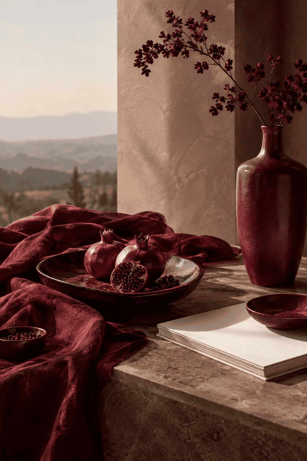 AI-generated editorial illustration; not a measured color sample.
Warm neutral palette
Use ivory as the dominant background, beige for supporting panels or surfaces, and burgundy for accents such as headings, borders, or selected controls. This arrangement gives the dark accent room to stand out while preserving a light overall composition.
| Name | HEX | RGB | Color |
|---|---|---|---|
| Ivory | #FFFFF0 | 255, 255, 240 | |
| Beige | #F5F5DC | 245, 245, 220 | |
| Burgundy | #800020 | 128, 0, 32 |
Low-key burgundy and navy palette
Let burgundy dominate, use navy as a supporting color, and reserve ivory for text, spacing, and small accents. Burgundy and navy are both dark, so placing them directly beside each other may blur their boundary. Separate them with ivory, spacing, or a clear border, and test every text pair independently.
| Name | HEX | RGB | Color |
|---|---|---|---|
| Burgundy | #800020 | 128, 0, 32 | |
| Navy | #000080 | 0, 0, 128 | |
| Ivory | #FFFFF0 | 255, 255, 240 |
Earthy burgundy and olive palette
Start with beige as the dominant field, add burgundy as the supporting color, and use dark olive green as an accent. Limiting the olive to smaller elements keeps the palette organized and lets burgundy remain the principal colored surface.
| Name | HEX | RGB | Color |
|---|---|---|---|
| Beige | #F5F5DC | 245, 245, 220 | |
| Burgundy | #800020 | 128, 0, 32 | |
| Dark Olive Green | #556B2F | 85, 107, 47 |
These palette tables provide exact digital anchors, but they do not prove that every pairing is suitable for small text. Palette compatibility and accessible contrast are separate decisions.
Where the Burgundy Name Came From
From wine name to color term
The color name follows Burgundy wine and ultimately the Burgundy region of France. English use of burgundy for wine dates to the 1670s, while use for a color resembling the wine is documented from 1881. The transition reflects a familiar naming pattern: a recognizable material or object lends its name to a broader visual category.
 AI-generated editorial illustration; not a measured color sample.
A 1930 color dictionary by Aloys John Maerz and Morris Rea Paul indexes a Burgundy usage from 1915 and directs readers to plate 56, sample E8. That record helps document the development of the color term, but it does not make every later burgundy object identical to the printed sample.
Why a historical sample is not a modern formula
The indexed sample documents how Burgundy appeared in that historical color reference. It does not establish an exact modern sRGB value or a universal acrylic paint mixture.
The wine connection explains the origin of the name without turning wine into a technical color standard. Digital designers and painters still need references suited to their respective media.
How to Choose the Right Burgundy
For a website or digital graphic, begin with #800020 when the conventional dark purplish red suits the design. Specify the value directly, then test the final text, icons, controls, and interactive states for contrast. Choose CSS maroon, darkred, or firebrick only when its documented value is a better visual match, not because the names seem interchangeable.
For acrylic paint, compare a dried sample with a physical target under the intended light. Diagnose any mismatch by hue, value, and chroma, then adjust a small mixture and make another paint-out.
The useful reference depends on the task: an exact sRGB value for digital work or a tested, dried mixture for acrylic painting. Keeping those references separate prevents a precise screen code from being mistaken for a universal material formula.

Learn more about Israel Benloulou and about us.