
Champagne Color: HEX Code, Palettes, and Acrylic Mixing

Champagne is a light, warm neutral poised between pale yellow-orange and beige, with #F7E7CE serving as a practical digital reference. Its restrained warmth works across graphics, decor, and crafts, but the code does not define every physical material sold under the Champagne name. Use the color data, role-based palettes, contrast guidance, and acrylic mixing method below to choose a Champagne that fits your project.
What Color Is Champagne?
Champagne color is generally understood as a very pale, softly muted yellow-orange near beige. It is warmer than a neutral off-white, less saturated than a typical gold, and usually more yellow than pink. For consistent digital work, this guide uses the following sRGB value:
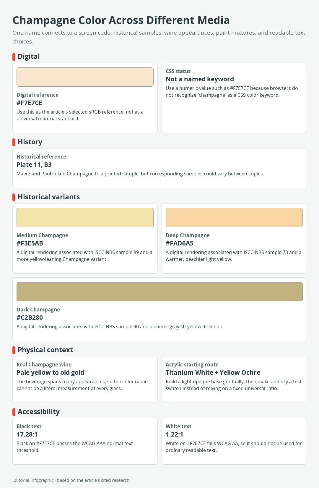
Download the complete color reference sheet (PNG): Champagne Color Across Different Media (PNG)
| Name | HEX | RGB | Color |
|---|---|---|---|
| Champagne | #F7E7CE | 247, 231, 206 |
The Common Digital Reference
HEX #F7E7CE is a commonly used screen reference for Champagne, not an official definition that governs every use of the name. Other current design references use nearby values, which reflects the broader reality: Champagne is a color-name family rather than one universal digital standard.
The word champagne is not a recognized CSS named-color keyword. In a website stylesheet, use an explicit value such as #F7E7CE instead. Six-digit HEX notation identifies red, green, and blue channel values in sRGB, which is why #F7E7CE corresponds to RGB 247, 231, 206.
That makes the code dependable for communicating a chosen screen color. It does not make it a physical paint formula, fabric specification, printer target, or measurement of Champagne wine.
Why Champagne Does Not Have One Universal Physical Value
The selected HEX value describes an sRGB screen color rather than a physical formula for paint, ink, fabric, paper, or wine. Use a physical sample when matching a material instead of assuming that #F7E7CE defines every product labeled Champagne.
How the Name Became a Color Family
From Sparkling Wine to a Color Name
The color name comes from Champagne wine, but the beverage itself does not provide one fixed sample. Real Champagne can range from very pale yellow through old gold. Rosé Champagne adds pink and orange-leaning appearances, so a glass of wine may differ substantially from the pale beige-yellow used in contemporary digital palettes.
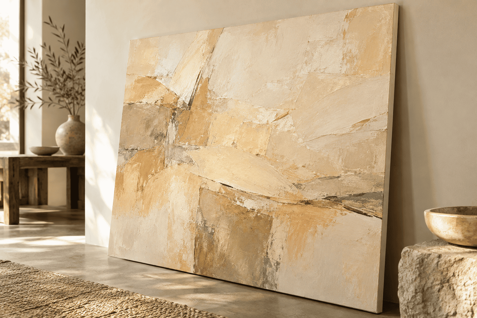 AI-generated editorial illustration; not a measured color sample.
Champagne was recorded as an English color name by 1915. A later color-dictionary association connected it with sample B3 on Plate 11 of Maerz and Paul’s A Dictionary of Color. That history helps explain the name, but it does not turn an old printed chip into an unchanging modern specification.
Printed color dictionaries were important references for connecting names with physical samples. However, corresponding samples differed between copies, so a historical printed reference should not be treated as an invariant physical standard.
Medium, Deep, and Dark Champagne
The following values are modern digital renderings associated with documented historical Champagne names. They are useful for comparing visual directions, but they are not measurements taken directly from the original printed chips.
| Name | HEX | RGB | Color |
|---|---|---|---|
| Champagne | #F7E7CE | 247, 231, 206 | |
| Medium Champagne | #F3E5AB | 243, 229, 171 | |
| Deep Champagne | #FAD6A5 | 250, 214, 165 | |
| Dark Champagne | #C2B280 | 194, 178, 128 |
Medium Champagne leans more clearly toward muted yellow. Deep Champagne is warmer and peachier, while Dark Champagne moves toward a subdued khaki-gold. These are distinct references, not interchangeable labels for the same swatch. Choose one for its actual appearance rather than because its name sounds more or less intense.
Colors That Go With Champagne
Champagne can act as a dominant background, a quiet supporting neutral, or a bridge between warmer and cooler colors. The most useful palette depends on assigning each color a job. An attractive accent does not automatically make readable text, so evaluate foreground and background pairs separately.
A High-Contrast Digital Palette
This palette gives interfaces, invitations, and simple graphics a warm surface with crisp hierarchy. Black supplies dependable body text, teal creates a cool focal accent, and white can separate areas without competing with the Champagne field.
| Role | Name | HEX | RGB | Color |
|---|---|---|---|---|
| Dominant surface | Champagne | #F7E7CE | 247, 231, 206 | |
| Text | Black | #000000 | 0, 0, 0 | |
| Accent | Teal | #008080 | 0, 128, 128 | |
| Secondary surface | White | #FFFFFF | 255, 255, 255 |
Use teal for controls, rules, icons, or small focal shapes rather than scattering it evenly. Keeping Champagne dominant allows the cool accent to remain distinctive.
A Warm Earthy Palette
For paper crafts, textiles, natural-material displays, and relaxed decor, Saddle Brown adds depth while Rosy Brown brings a dusty red note. Old Lace supplies a lighter neighbor that remains warmer than stark white.
| Role | Name | HEX | RGB | Color |
|---|---|---|---|---|
| Dominant | Champagne | #F7E7CE | 247, 231, 206 | |
| Grounding support | Saddle Brown | #8B4513 | 139, 69, 19 | |
| Soft accent | Rosy Brown | #BC8F8F | 188, 143, 143 | |
| Light companion | Old Lace | #FDF5E6 | 253, 245, 230 |
A practical proportion is to let Champagne cover the broadest area, use Saddle Brown to define edges or anchors, and reserve Rosy Brown for a smaller repeated detail. Old Lace works best where a slight surface change is needed without introducing a cool white.
A Cool Editorial Palette
Navy gives Champagne a structured, formal edge without the absolute contrast of black. Steel Blue supplies a quieter accent, while Snow creates a nearly white surface with a faintly softened appearance.
| Role | Name | HEX | RGB | Color |
|---|---|---|---|---|
| Dominant | Champagne | #F7E7CE | 247, 231, 206 | |
| Text or strong support | Navy | #000080 | 0, 0, 128 | |
| Accent | Steel Blue | #4682B4 | 70, 130, 180 | |
| Clean surface | Snow | #FFFAFA | 255, 250, 250 |
This combination suits editorial layouts, stationery, and decor that needs warmth without an entirely earthy character. Let Navy carry typography and major outlines. Use Steel Blue as an accent unless you have tested its precise size and background for sufficient contrast.
Readable Text on Champagne
Black on #F7E7CE has an approximate contrast ratio of 17.28:1. It exceeds the WCAG AAA requirement for ordinary text. White on the same background measures only about 1.22:1 and fails the WCAG AA requirement, so white should not carry meaningful ordinary text on this pale Champagne.
WCAG calls for at least 4.5:1 contrast for normal text and 3:1 for large text. In this context, large means at least 18pt for regular type or 14pt for bold type. Do not round a borderline result upward, and do not assume that every dark-looking accent will pass. Check the exact foreground, background, font size, and font weight used in the finished design.
Color contrast also applies beyond body copy. Labels, instructions, prices, and meaningful interface text must remain legible. Decorative white lines can sit on Champagne, but they should not be the only way essential information is conveyed.
How to Mix Champagne Paint
Acrylic paint cannot be mixed by translating RGB numbers into pigment amounts. A dependable approach is to build a pale, muted warm base, make controlled adjustments, and judge a fully dried sample under the light where the work will be seen.
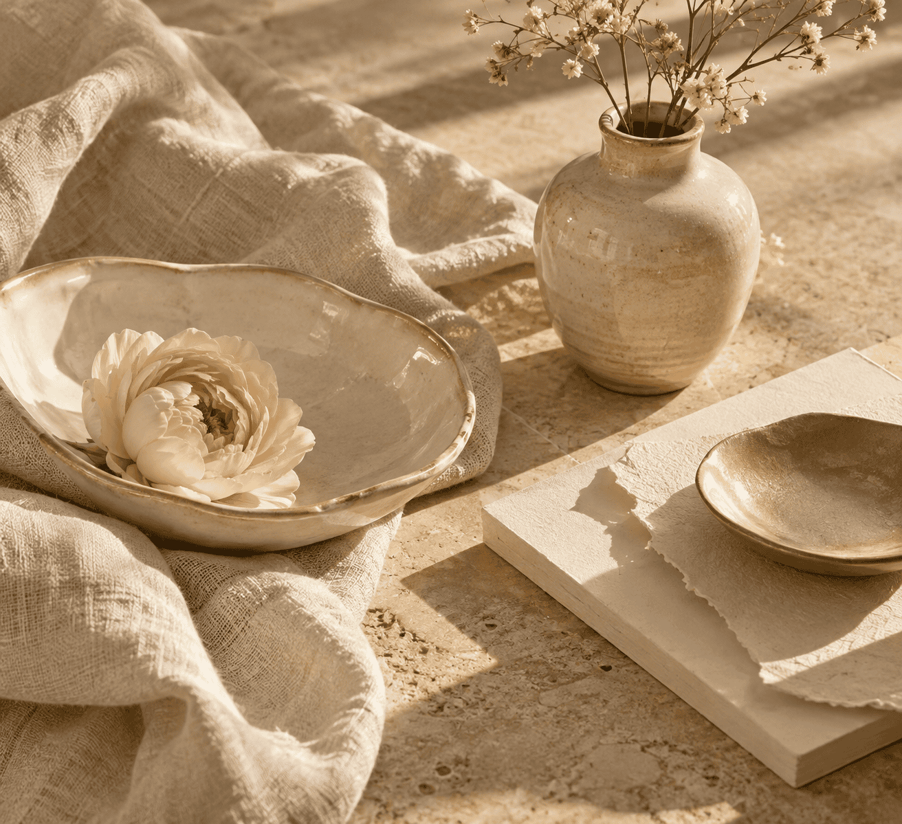 AI-generated editorial illustration; not a measured color sample.
An Acrylic Mixing Route
Begin with Titanium White and add Yellow Ochre gradually. Titanium White raises the value and increases coverage, while Yellow Ochre supplies subdued warmth. Together they offer a practical route to an opaque, warm pastel close to the general Champagne family.
- Place enough Titanium White on the palette for the area you intend to cover.
- Add a small amount of Yellow Ochre and mix completely before deciding whether more is needed.
- Spread a thin test stroke on the same type of surface planned for the project.
- Label the mixture and let it dry fully according to the paint manufacturer’s instructions.
- Compare the dry swatch with your target under the intended lighting, then adjust a fresh portion.
There is no universal mixing ratio. Pigments differ in tinting strength and opacity, and acrylic mixtures can change in value as they dry. If you are new to the medium, a basic guide to acrylic paint ingredients and types can help explain the available paint types.
Adjust Hue, Value, and Chroma
Evaluate the dried mixture in three separate ways. Hue describes its color direction, value describes how light or dark it is, and chroma describes its intensity.
- If it is too dark, add more white in small steps.
- If it is too pale and lacks warmth, add a little more Yellow Ochre.
- If it looks too orange or intense, use only a trace of an appropriate complementary color to subdue it. Excess complement can quickly make a light mixture muddy.
Make one change at a time. This keeps the result diagnosable and makes it easier to recreate. Keep a small dried sample and record the paint names used, but treat your notes as a recipe for those specific products, not for every brand.
Why Pigments Do Not Behave Like Screen Codes
On a screen, #F7E7CE identifies a particular sRGB color. Acrylic matching instead depends on physical pigment mixtures with unequal tinting strengths and opacity, so the screen code cannot supply a paint ratio.
Acrylic mixtures can change in perceived value as they dry. Judge the dry swatch rather than relying on the wet palette.
For project-specific surface guidance, see the instructions for painting fabric with acrylics or painting acrylic on wood. Follow the chosen product’s preparation, drying, and safety instructions.
Using Champagne Across Screens, Print, and Decor
Champagne in Web and Graphic Design
Use #F7E7CE when collaborators need one reproducible sRGB reference. Store the value consistently in the design system rather than choosing a slightly different pale beige on every screen. If a component changes on hover, focus, or selection, make that state distinguishable through more than a subtle shift between similar light neutrals.
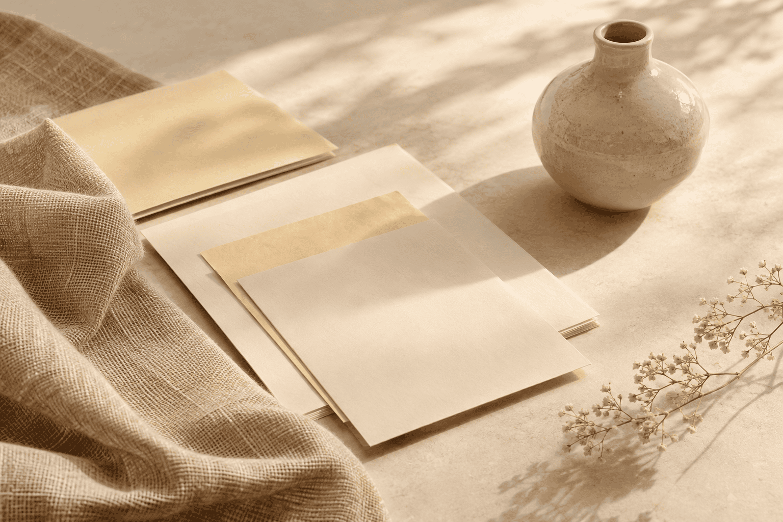 AI-generated editorial illustration; not a measured color sample.
Champagne works well for broad surfaces because it is light enough to leave room for dark text and stronger accents. Its warmth can soften layouts dominated by black, navy, or cool blue. Always verify the actual contrast pair in the finished component rather than treating palette compatibility as proof of readability.
Champagne in Print
Do not rely on an unprofiled CMYK conversion as an exact equivalent of #F7E7CE. Treat any generic conversion as an approximation and use the color workflow specified for the print project.
Review a physical production sample when the Champagne tone is important to an invitation, package, label, or art print. A screen preview is useful for planning, but it does not establish the final physical result.
Champagne in Rooms and Crafts
For a wall, textile, resin project, paper craft, or other physical application, choose from actual material or product samples rather than matching solely to a phone or monitor.
Compare the sample in the setting where it will be used. When possible, make the test on a scrap of the intended substrate and follow the product instructions for application, drying, and finishing.
Choose the Right Champagne for Your Project
Quick Decision Guide
| Project need | Best starting point | Essential check |
|---|---|---|
| A shared digital color | Use #F7E7CE as the selected sRGB reference | Test every foreground and background pair for contrast |
| A yellower, peachier, or darker variation | Compare Medium, Deep, and Dark Champagne by their actual values | Do not treat the variant names as interchangeable |
| Printed work | Begin with the digital reference in the project’s specified color workflow | Review a physical production sample |
| Acrylic artwork or craft | Start with Titanium White and gradually add Yellow Ochre | Judge a fully dried swatch |
| Fabric, wall, resin, or decorative finish | Select a physical product sample | Inspect it in the setting where it will be used |
The simplest recognition test is to look for a very light warm neutral with restrained yellow-orange character. If it reads as bright yellow, strong peach, neutral gray, or reflective gold, it has moved away from the #F7E7CE reference even if a seller still uses the Champagne name. For digital work, the code settles the choice. For physical materials, the sample does.

Learn more about Israel Benloulou and about us.