

Bright Color Palette Ideas: Four Role-Based Schemes

A bright color palette can make a poster, interface, craft layout, or decor mockup feel instantly energized, but four loud colors shouting at once rarely produce a useful scheme. The trick is to give each hue a job, then test the pairings that must carry text or meaning. These four palettes are ready to use and easy to adapt without confusing screen color with paint or print.
What Makes a Bright Color Palette Work?
Bright colors work well together when they have a clear hierarchy. Choose one color to set the direction, let a second support it, reserve the strongest contrast for an accent, and use a dark or light anchor to create structure. This role-based approach is usually more useful than giving every vivid hue equal space.
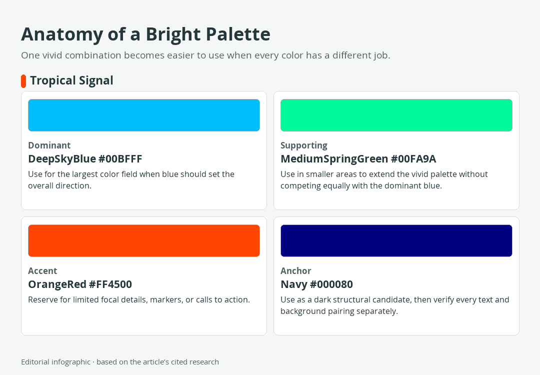
Download the complete color reference sheet (PNG): Anatomy of a Bright Palette (PNG)
“Bright” is a descriptive design label, not an official CSS color category with a fixed numerical cutoff. In everyday design language, it may describe intense saturation, high lightness, strong contrast, or some combination of those qualities. The exact effect also depends on how much of each color appears and which colors surround it.
Bright Does Not Always Mean Light or Neon
Hue identifies a color family, such as blue or orange. Saturation describes how colorful a color is relative to a gray of similar lightness, while lightness describes its position between black and white in the HSL model. A vivid navy can look visually forceful without being light, and a pale yellow can be light without looking intensely saturated.
HSL is useful for describing these differences, but its numerical spacing is not perceptually uniform. Two equal changes in an HSL value will not necessarily look equally large to the eye. Treat the controls as adjustment tools, then judge the result in its actual layout.
All color tables below use six-digit HEX values as the controlling digital references. The corresponding names are standardized CSS named colors, and the RGB values describe the same sRGB colors. Palette titles, roles, and suggested uses are editorial recommendations rather than standards.
Give Each Color a Clear Role
A dominant color occupies the largest field and establishes the overall direction. A supporting color adds variety without demanding equal attention. An accent marks a focal point, while an anchor supplies visual structure or breathing room. An anchor can be dark, light, neutral, or simply quieter than the surrounding colors.
These proportions need not follow a rigid formula. A poster may use a large blue field with a tiny orange-red callout, while a craft layout may reverse those roles. Changing area often reshapes the palette more effectively than adding another hue. Color is also contextual, so a swatch can appear more intense, lighter, or darker when its neighbors change.
Four Bright Palettes With Clear Roles
Each combination below contains four standardized CSS colors. The names shown in the tables are readable forms of the CSS keywords; when used in code, named-color tokens contain no spaces and are case-insensitive. Copy the HEX values when you need an unambiguous digital reference.
 AI-generated editorial illustration; not a measured color sample.
Tropical Signal
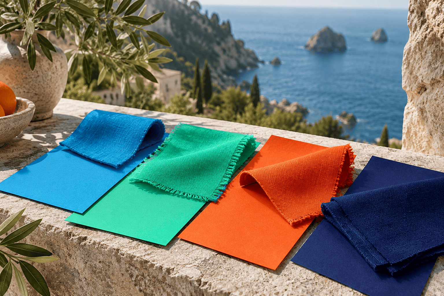
This cool-led combination is a practical starting point for travel graphics, energetic craft layouts, dashboards, and event materials. DeepSkyBlue establishes the main field, MediumSpringGreen extends the lively cool range, and OrangeRed creates a sharply separated focal color. Navy gives the composition a dark structural candidate.
| Name | HEX | RGB | Color |
|---|---|---|---|
| DeepSkyBlue | #00BFFF | 0, 191, 255 | |
| MediumSpringGreen | #00FA9A | 0, 250, 154 | |
| OrangeRed | #FF4500 | 255, 69, 0 | |
| Navy | #000080 | 0, 0, 128 |
- Dominant: DeepSkyBlue for the largest color field
- Supporting: MediumSpringGreen for secondary panels or shapes
- Accent: OrangeRed for selected markers and focal details
- Anchor: Navy for structure, outlines, or tested text pairings
If the result feels too busy, reduce the area of MediumSpringGreen before changing the colors. OrangeRed will retain more impact when it appears in a few deliberate locations rather than throughout the composition.
Citrus Current
Gold and DarkTurquoise make this palette suitable for bold packaging concepts, summer-themed graphics, playful signage, or geometric decor mockups. Crimson supplies a small warm focal point, while Black offers a strong visual boundary. Because several colors are intense, generous empty space can keep the result from feeling crowded.
| Name | HEX | RGB | Color |
|---|---|---|---|
| Gold | #FFD700 | 255, 215, 0 | |
| DarkTurquoise | #00CED1 | 0, 206, 209 | |
| Crimson | #DC143C | 220, 20, 60 | |
| Black | #000000 | 0, 0, 0 |
- Dominant: Gold for the principal surface or illustration mass
- Supporting: DarkTurquoise for large secondary elements
- Accent: Crimson for a limited point of emphasis
- Anchor: Black for borders, structure, or verified text uses
For a cooler version, let DarkTurquoise dominate and move Gold into the supporting role. This changes the visual emphasis without adding another color or altering any reference value.
Candy Studio
HotPink, BlueViolet, and Chartreuse create an intentionally playful combination for stickers, party graphics, creative portfolios, and youth-oriented craft concepts. White supplies breathing room rather than another competing hue. Keep Chartreuse limited if you want HotPink and BlueViolet to remain the main relationship.
| Name | HEX | RGB | Color |
|---|---|---|---|
| HotPink | #FF69B4 | 255, 105, 180 | |
| BlueViolet | #8A2BE2 | 138, 43, 226 | |
| Chartreuse | #7FFF00 | 127, 255, 0 | |
| White | #FFFFFF | 255, 255, 255 |
- Dominant: HotPink for the principal visual field
- Supporting: BlueViolet for depth and larger secondary shapes
- Accent: Chartreuse for small highlights or directional details
- Breathing room: White for open areas and separation
White is not automatically readable text on every vivid background. Test each foreground and background pair instead of assuming that a visually different color supplies enough contrast.
Festival Poster
This palette suits music graphics, digital invitations, motion-design frames, and poster studies that need several strong hues. Fuchsia supplies the main identity, DodgerBlue supports it, and DarkOrange adds a warm interruption. MidnightBlue can contain the brighter colors and provide a quieter perimeter.
| Name | HEX | RGB | Color |
|---|---|---|---|
| Fuchsia | #FF00FF | 255, 0, 255 | |
| DodgerBlue | #1E90FF | 30, 144, 255 | |
| DarkOrange | #FF8C00 | 255, 140, 0 | |
| MidnightBlue | #191970 | 25, 25, 112 |
- Dominant: Fuchsia for the largest expressive element
- Supporting: DodgerBlue for secondary blocks and repeated motifs
- Accent: DarkOrange for selected highlights
- Anchor: MidnightBlue for framing and tested functional elements
When all three vivid colors occupy similar areas, the eye may lack a clear entry point. Enlarge one, reduce another, and confine the accent to the places that deserve immediate attention.
How to Build Your Own Bright Palette
Start With Function and Hierarchy
Begin with the medium and the job. A decorative illustration can tolerate different relationships from a navigation system, a warning label, or body text. Decide what the viewer should notice first, what information must remain readable, and where the composition needs visual rest.
 AI-generated editorial illustration; not a measured color sample.
- Choose the dominant color. Give it enough area to establish the palette rather than letting every hue compete.
- Add a supporting hue. Use it to divide sections, extend an illustration, or build repetition.
- Select one limited accent. Apply it to the most important focal details, not every decorative element.
- Add an anchor or breathing-room color. This may be black, white, gray, a dark hue, or a quieter color already related to the scheme.
- Test the design at its real size. A tiny swatch strip cannot reveal whether a large saturated panel overwhelms the content.
Name the Color Wheel You Are Using
On a traditional artist’s wheel, complementary colors sit opposite each other. Familiar examples include red and green, blue and orange, and yellow and violet. Analogous colors sit next to one another, while a triadic structure draws from three separated areas of the wheel.
These structures are starting points, not guarantees of a successful combination. Digital RGB specifications, print processes, and physical artist’s wheels do not all organize color in the same way. State the model or wheel before calling two colors complementary, especially when exact technical relationships matter.
A complement can create separation, but you still control the result through area, saturation, lightness, placement, and context. A tiny orange accent on blue behaves differently from equal blocks of orange and blue.
Change Emphasis Before Adding More Colors
If a palette feels chaotic, diagnose the competition first. Reduce the accent’s area, create more space between intense regions, or let the anchor surround the brightest element. You can also lower the saturation of one supporting color or move it lighter or darker while preserving the overall hue relationship.
For a physical artwork, make these adjustments with the actual materials rather than translating digital controls into assumed paint ratios. A small test on the intended surface is more informative than a screen swatch.
Check Contrast Before Calling a Palette Readable
Check Actual Text and Background Pairs
A palette does not pass or fail accessibility as a single unit. Contrast belongs to a specific foreground and background pair used at a particular text size and weight. Test every pair that carries text, icons, controls, or essential information in the finished layout.
For WCAG 2.2 Level AA, normal text requires a contrast ratio of at least 4.5:1, while large text requires at least 3:1, subject to the standard’s exceptions. Large text is at least 18-point regular or 14-point bold, or an equivalent size. Do not round a borderline result in your favor or assume that a dark-looking color automatically passes against every bright one.
Use the final HEX values in a contrast checker, then repeat the check after changing colors, opacity, gradients, or background images. Decorative palette swatches are not evidence that a live interface will be readable.
Do Not Communicate by Color Alone
Different hues can still be difficult to distinguish for some viewers or under poor viewing conditions. Reinforce meaning with labels, shapes, patterns, position, or icons. An error field, for example, can combine a colored outline with explanatory text and an error symbol instead of relying on red alone.
Hover and selected states also need more than a subtle hue shift when that change carries important meaning. Add an underline, border, checkmark, weight change, or another visible cue appropriate to the interface.
Keep Screen, Print, and Paint Separate
Why Vivid Screen Colors Can Shift in Print
CSS HEX values and named colors specify sRGB colors for digital use. Displays and printing systems reproduce different ranges of color, called gamuts, so a bright screen reference does not promise an identical printed result. Highly saturated RGB blues, greens, and oranges are among the colors that may shift during conversion for CMYK printing.
 AI-generated editorial illustration; not a measured color sample.
For print-critical work, ask for the intended output profile, convert or proof within a color-managed workflow, and inspect a physical proof under suitable lighting. The printer, ink, paper, profile, display condition, and viewing environment can all affect the result. An unprofiled CMYK conversion is not a reliable substitute for that workflow.
Why HEX Is Not a Paint Recipe
A HEX code describes a digital sRGB reference, not quantities of physical pigments. Paint behavior depends on the actual pigments and material system, so there is no universal mixing ratio that will reproduce one of these screen colors across acrylic, oil, watercolor, gouache, wall paint, or printing ink.
Use the digital palette as a visual target, identify the pigments available in your chosen medium, and make small test mixtures. Record the paints and approximate proportions that work in that specific system. For foundational techniques, the site’s guide to mixing paint colors explains how the medium and selected pigments affect practical mixing.

Learn more about Israel Benloulou and about us.