
Bordeaux Color: HEX Codes, Paint Mixing, and Palettes

Bordeaux is the kind of deep red that can shift from wine-dark to violet-leaning as the medium and light change. That flexibility makes it useful, but it also explains why one search can return several different color codes. This guide gives you a dependable digital starting point, a cautious paint-mixing method, and practical palette ideas for real projects.
What Color Is Bordeaux?
Bordeaux is a deep red-violet color family. Its name comes from the French city and its wine, and the color adjective has been recorded since the nineteenth century. The useful part of that definition is the relationship between hues: Bordeaux remains recognizably red while leaning toward violet.
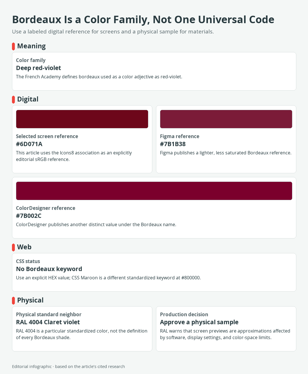
Download the complete color reference sheet (PNG): Bordeaux Is a Color Family, Not One Universal Code (PNG)
The short answer
For digital work, this guide uses #6D071A as its controlling Bordeaux reference. It is an editorial choice drawn from a current design catalog, not an official or universal definition.
| Name | HEX | RGB | Color |
|---|---|---|---|
| Bordeaux, selected sRGB reference | #6D071A | 109, 7, 26 |
HEX describes a digital color through red, green, and blue values. It does not specify a paint mixture, printing formula, fabric dye, wine color, or physical color standard. Treat the swatch as a consistent screen reference within this guide rather than a material sample.
Why Bordeaux has more than one HEX code
Ordinary color names do not always identify a single measured value. Three current design catalogs label #6D071A, #7B1B38, and #7B002C as Bordeaux. All three occupy the same general deep red-violet territory, but they differ in lightness, saturation, and violet bias.
That disagreement does not make the values unusable. It means a specification must pair the name with its exact code. “Use Bordeaux” leaves room for interpretation; “use Bordeaux #6D071A in sRGB artwork” gives a designer a reproducible digital instruction.
Bordeaux, burgundy, maroon, and claret
Burgundy and maroon are neighboring dark-red names, not guaranteed numeric substitutes for Bordeaux. Maroon has one special advantage in web development: it is a standardized CSS named color with the value #800000. Bordeaux is not a CSS keyword, so typing color: bordeaux; will not produce a valid named color. Use an explicit HEX or RGB value instead.
Claret also needs context. RAL CLASSIC 4004 carries the official English name “Claret violet” and the German name “Bordeauxviolett,” but that designation identifies one standardized physical color. It does not make RAL 4004 the official definition of every object or digital swatch described as Bordeaux.
Bordeaux Color Codes and Reference Systems
The following table separates three catalog-specific Bordeaux references, one standardized CSS neighbor, and four working palette colors. The qualified names matter because none of the three Bordeaux rows claims universal authority.
 AI-generated editorial illustration; not a measured color sample.
Published references and useful palette colors
| Name | HEX | RGB | Color |
|---|---|---|---|
| Icons8 Bordeaux, selected reference | #6D071A | 109, 7, 26 | |
| Figma Bordeaux | #7B1B38 | 123, 27, 56 | |
| ColorDesigner Bordeaux | #7B002C | 123, 0, 44 | |
| CSS Maroon | #800000 | 128, 0, 0 | |
| Gold | #D4AF37 | 212, 175, 55 | |
| Beige | #F5F5DC | 245, 245, 220 | |
| Charcoal | #2C3E50 | 44, 62, 80 | |
| Olive | #556B2F | 85, 107, 47 |
The first Bordeaux reference is the darkest of the three shown here. Figma’s version is lighter and more muted, while ColorDesigner’s value has a stronger magenta-violet direction. These are useful variants for choosing an appearance, but their catalog labels do not turn them into separate standardized colors.
Is Bordeaux a CSS named color?
No. CSS provides a defined list of named-color keywords, and Bordeaux is not among them. Use a numeric declaration such as color: #6D071A; or store the selected value in a project design token. If a team chooses another Bordeaux reference, change the number and preserve the qualified label in the design documentation.
CSS Maroon is different because the browser keyword maroon resolves to #800000 in sRGB. That technical status does not mean maroon and Bordeaux look identical; it only makes maroon a standardized web keyword.
Where RAL 4004 fits
RAL CLASSIC is an industrial color collection, and RAL 4004 is its specific Claret violet color. Use that designation when a supplier, coating system, or production brief calls for RAL 4004. Do not attach an unofficial HEX value to it and assume the screen result is binding.
RAL explains that digital color images only approximate physical samples. Display settings, software, and the available color space can all affect what appears on screen, while some physical colors cannot be reproduced accurately in every digital space. Final production decisions therefore require an appropriate physical reference sample.
Screen color versus physical materials
A HEX value encodes a specific RGB triplet for digital use, but it does not directly control the color produced by every display. Monitor settings, software, and color-space limits can change the displayed result.
A digital Bordeaux reference also does not define a universal paint, fabric, or print formula. When a project depends on a standardized physical color, use the applicable physical sample for the final decision rather than treating a monitor preview as binding.
How to Mix a Bordeaux-Like Paint Color
A Bordeaux-like paint mixture should be approached as a visual match, not as a translation of the HEX code. Start with the actual paints and support you intend to use, work in small test quantities, and follow the manufacturers’ instructions for handling, ventilation, cleanup, and drying.
 AI-generated editorial illustration; not a measured color sample.
A controlled mixing route
- Choose a violet-friendly red. A cool red or magenta gives you room to move toward red-violet without first fighting a strong orange bias. Quinacridone Magenta is one documented example.
- Add blue incrementally. Ultramarine Blue is a documented violet-friendly partner. Add a very small amount to the red, mix thoroughly, and compare before adding more.
- Make a test swatch. Apply the mixture to the intended support. Label the paints and note each adjustment.
- Judge the dried result. Compare it with the target under consistent lighting after the product’s stated drying time. Keep the successful swatch as the physical reference for the project.
These pigments provide a sensible direction, not a mandatory formula. For more background on pigment selection and mixing behavior, see the guides to mixing magenta-colored paint and mixing paint colors.
How to correct the mixture
- Too violet: add more of the starting red or magenta in a separate test portion.
- Too red: introduce another minute amount of the violet-friendly blue.
- Too bright: test a tiny neutralizing adjustment on a sample rather than changing the entire batch at once.
- Too dark: prepare a separate lighter test according to the paint manufacturer’s instructions before changing the main batch.
Change one variable at a time. A row of labeled swatches provides more useful guidance than trying to remember how a wet mixture looked several adjustments earlier.
Why fixed ratios can mislead
Pigments have unequal tinting strengths, so equal quantities do not necessarily create a balanced secondary color. Different supplies of a pigment can also vary in strength and color bias. Golden’s documented watercolor tests further show that dilution, mixtures, glazes, and unmixed color need to be judged visually rather than assumed to match.
Test the actual paints you plan to use and record each adjustment. The documented pigment pair provides a direction toward red-violet, not a universal Bordeaux formula. Never present a digital tint ramp as a physical mixing recipe.
Colors That Work With Bordeaux
Beige, gold, charcoal, and olive are published companion suggestions for the selected #6D071A reference. The palettes below turn those suggestions into usable roles. They are editorial starting points rather than universal harmony laws, so adjust the proportions to suit the object, room, painting, or interface.
Bordeaux with beige and charcoal
| Name | HEX | RGB | Color |
|---|---|---|---|
| Dominant: Beige | #F5F5DC | 245, 245, 220 | |
| Supporting: Bordeaux | #6D071A | 109, 7, 26 | |
| Accent: Charcoal | #2C3E50 | 44, 62, 80 |
This quiet neutral palette works when Bordeaux needs visual weight without occupying the entire composition. Let beige provide breathing room, use Bordeaux for a focused area, and reserve charcoal for small structural details. Because Bordeaux and charcoal are both dark, place a lighter divider between them when clear separation matters.
Bordeaux with beige and gold
| Name | HEX | RGB | Color |
|---|---|---|---|
| Dominant: Beige | #F5F5DC | 245, 245, 220 | |
| Supporting: Bordeaux | #6D071A | 109, 7, 26 | |
| Accent: Gold | #D4AF37 | 212, 175, 55 |
Gold supplies a warm, lighter accent against the deep red-violet. Keep it to small highlights if the goal is emphasis rather than an evenly balanced three-color field. The #D4AF37 value specifies the solid digital palette color only; it is not a physical metallic-color specification.
Bordeaux with beige and olive
| Name | HEX | RGB | Color |
|---|---|---|---|
| Dominant: Beige | #F5F5DC | 245, 245, 220 | |
| Supporting: Olive | #556B2F | 85, 107, 47 | |
| Accent: Bordeaux | #6D071A | 109, 7, 26 |
Olive gives the palette a muted green direction while Bordeaux acts as the concentrated accent. For a broader framework for arranging palette relationships, consult this color wheel guide. Test the relative areas and boundaries of these specific colors instead of relying on a general relationship alone.
Using Bordeaux in Digital Design, Art, and Decor
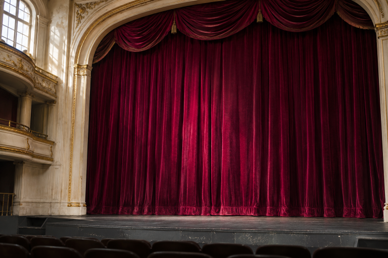
The most dependable way to use Bordeaux is to define its role before choosing the medium. A small accent, a large colored field, body text, and a physical finish impose different demands even when they begin with the same color idea.
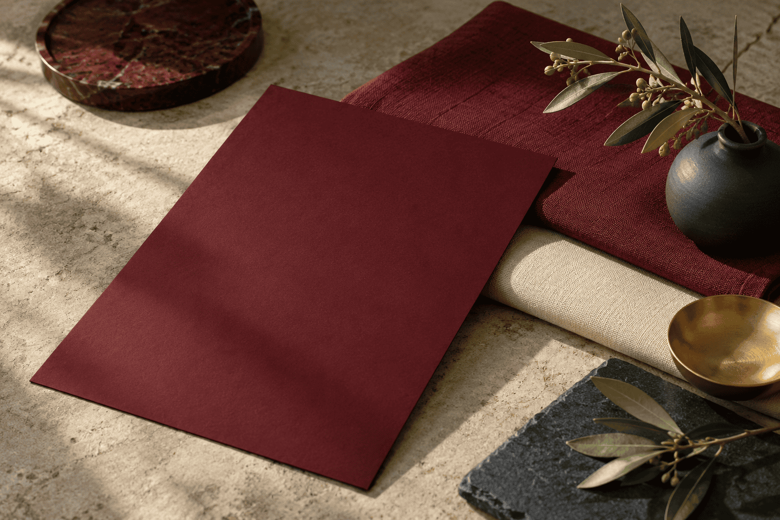 AI-generated editorial illustration; not a measured color sample.
Choosing the color’s role
As an accent, Bordeaux can direct attention without turning the whole composition into a dark field. For a larger area, place it beside light neutrals so edges, objects, and typography remain easy to distinguish. In paintings, repeat the hue selectively rather than mixing it into every shadow, which can flatten the color structure.
For a physical project, compare an appropriate sample in the intended setting rather than approving the result from a monitor preview alone.
Contrast and readable text
Text legibility depends on the measured contrast between the exact foreground and background values, not on the label “Bordeaux.” WCAG 2.2 Level AA requires a contrast ratio of at least 4.5:1 for ordinary text and 3:1 for large text. Large text means at least 18pt for regular weight or 14pt for bold text, and a calculated result must not be rounded up to claim a pass.
White is a strong starting point for text on the selected #6D071A reference, while black does not provide sufficient separation for normal text. Test the actual pair with a contrast checker, including hover, focus, disabled, and visited states where applicable. Do not assume that the two alternative Bordeaux codes produce the same result.
Matching Bordeaux across screens and materials
Begin with the right kind of reference for the job. Use the precise sRGB value for digital artwork. If a project specifies a physical standard such as RAL 4004, use the corresponding physical sample for the final decision rather than relying on its screen preview.
- Record the qualified color name and exact digital code or physical standard.
- Keep the selected color space with digital production files.
- For mixed paint, label the colors and adjustments used for each test.
- Retain the approved physical reference with the project specification.
- Follow the relevant product or supplier instructions before approving a material result.
This layered specification preserves what “Bordeaux” means in each context. The name communicates the color family, the numeric or physical reference narrows the target, and the approved sample confirms the intended physical standard when one is required.

Learn more about Israel Benloulou and about us.