
Chakra Colors: Meanings, Order, and Modern History

Chakra color meaning depends on the tradition, period, and purpose behind the chart. The familiar climb from red to violet offers a useful visual vocabulary, but it is a modern Western convention rather than a universal code preserved unchanged from ancient India. Understanding that distinction makes the colors easier to use thoughtfully in art, meditation, and design.
Chakra colors are a modern symbolic map
In the familiar seven-chakra system, the colors run upward in rainbow order: red, orange, yellow, green, blue, indigo, and violet. Some modern charts replace violet with white at the crown. The associated themes commonly progress from grounding and survival through creativity, agency, compassion, communication, insight, and spiritual connection.
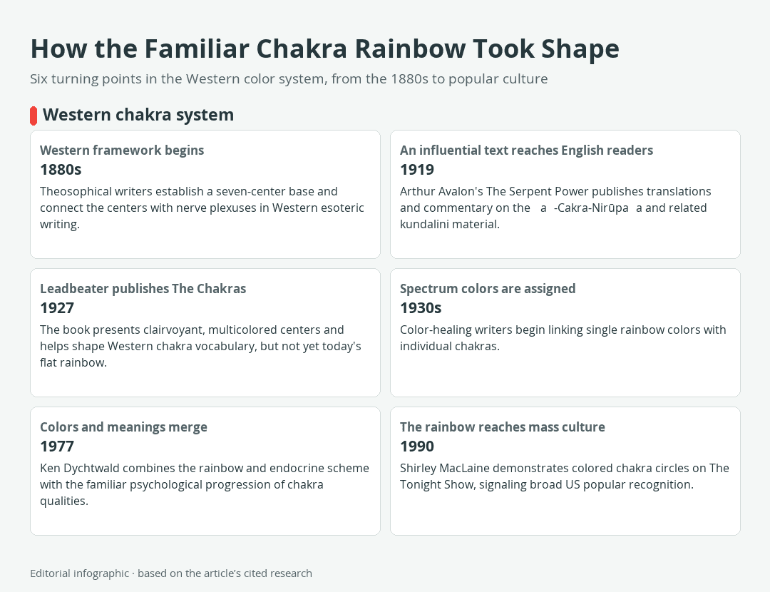
Download the complete color reference sheet (PNG): How the Familiar Chakra Rainbow Took Shape (PNG)
These associations are best understood as a shared modern convention. They can organize a poster, journal page, meditation image, or piece of symbolic art, but they are not measurements of physical structures or universal statements about what each color must mean.
What “chakra” means in this guide
The Sanskrit word chakra means “wheel” or “circle.” In the religious and contemplative systems from which the concept comes, chakras belong to a subtle, or nonphysical, body. They are discussed in relation to prana, understood as vital energy in these traditions; nadis, channels through which that energy is believed to move; and kundalini, a spiritual power described in some yoga and tantric traditions.
This guide focuses on the popular seven-center Western arrangement: Muladhara at the root, Svadhisthana at the sacral area, Manipura at the solar plexus, Anahata at the heart, Vishuddha at the throat, Ajna at the brow or “third eye,” and Sahasrara at the crown. Other historical systems have used different numbers, descriptions, and visual relationships.
Why the rainbow is newer than the chakra concept
The concepts behind chakras are much older than the familiar rainbow poster. Historical researcher Kurt Leland traces the Western system through several stages rather than to one ancient seven-color chart:
- 1880s: Writers in Theosophy, a modern Western esoteric movement, developed a Western seven-center framework and connected the centers with nerve plexuses.
- 1919: Arthur Avalon, the pen name of Sir John Woodroffe, published The Serpent Power, bringing English translations and commentary on influential chakra and kundalini texts to a wider readership.
- 1927: C. W. Leadbeater published The Chakras, which described multicolored centers through claimed clairvoyant observation. His imagery was neither identical to older Indian descriptions nor the flat rainbow used today.
- 1930s: American and British color-healing writers began assigning individual spectrum colors to particular chakras.
- 1977: Ken Dychtwald joined the rainbow and proposed endocrine correspondences, or links between chakras and hormone-producing glands, with a human-potential progression of psychological themes.
- 1990: Shirley MacLaine demonstrated colored chakra circles on The Tonight Show, a sign that the system had entered broad US popular culture.
The result is a layered Western synthesis. It draws on South Asian religious concepts, English translations, Theosophy, color healing, and twentieth-century human-potential writing.
The seven chakra colors and meanings at a glance
The HEX values below are exact CSS named-color references in the sRGB color space. They provide reproducible screen swatches for a modern chakra chart. They are not official chakra codes, sacred measurements, paint formulas, or reconstructions of historical materials.
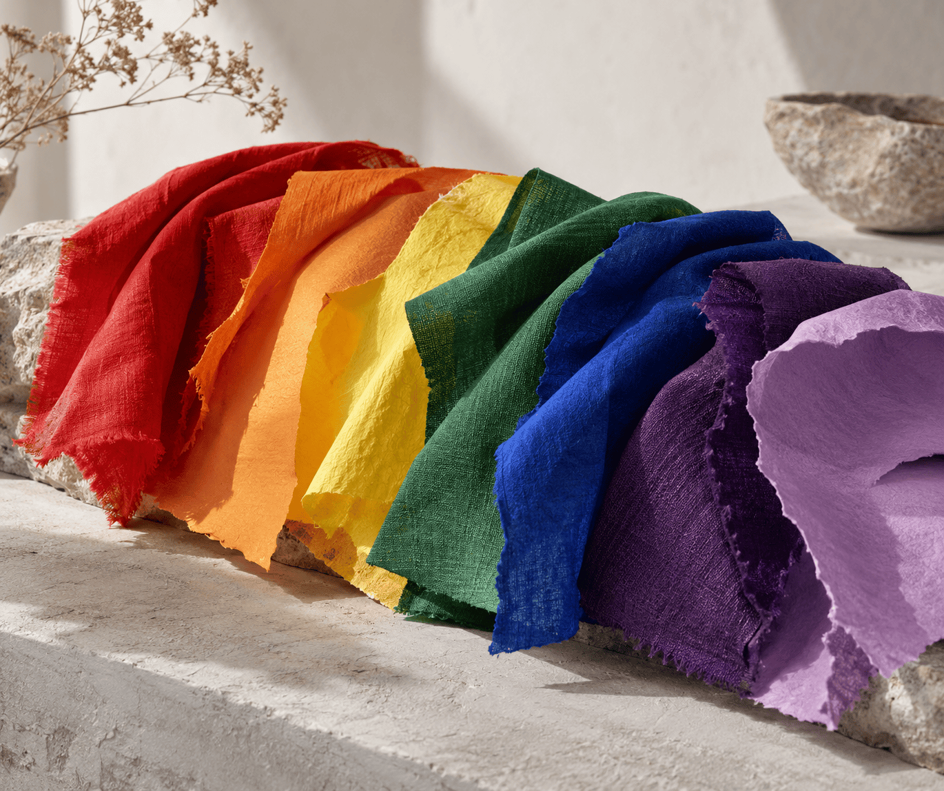 AI-generated editorial illustration; not a measured color sample.
| Name | HEX | RGB | Color |
|---|---|---|---|
| Root chakra (Muladhara) | #FF0000 | 255, 0, 0 | |
| Sacral chakra (Svadhisthana) | #FFA500 | 255, 165, 0 | |
| Solar plexus chakra (Manipura) | #FFFF00 | 255, 255, 0 | |
| Heart chakra (Anahata) | #008000 | 0, 128, 0 | |
| Throat chakra (Vishuddha) | #0000FF | 0, 0, 255 | |
| Third-eye chakra (Ajna) | #4B0082 | 75, 0, 130 | |
| Crown chakra (Sahasrara) | #EE82EE | 238, 130, 238 |
Lower centers: red, orange, and yellow
Red at the root commonly represents grounding, survival, security, and connection with ordinary physical life. In the modern body map, the root chakra is placed at the base of the spine. Red works as the visual starting point of the sequence, but seeing or preferring red does not reveal whether someone is secure, anxious, or “blocked.”
Orange at the sacral center is commonly linked with sexuality, creativity, pleasure, and emotional movement. The center is usually positioned in the lower abdomen. For an art or journaling prompt, orange can mark a theme of creative permission without turning that association into a claim about personality or health.
Yellow at the solar plexus commonly signifies agency, confidence, personal power, and purposeful action. Modern charts generally locate this center in the upper abdomen. Bright yellow can become visually dominant on a page, so its symbolic position does not require it to occupy the largest area of a composition.
Heart and throat: green and blue
Green at the heart commonly represents compassion, love, connection, and balance. It occupies the midpoint of the seven-color sequence, between the three lower and three upper centers. This visual midpoint helps explain why contemporary graphics often give the heart a bridging role.
Blue at the throat is associated with communication, expression, and truthful speech in modern chakra teaching. Labels or distinct symbols keep the throat and heart centers identifiable without relying on hue alone.
Third eye and crown: indigo, violet, and white
Indigo at the third eye commonly stands for intuitive insight, perception, and inward attention.
Violet at the crown commonly represents spiritual consciousness, transcendence, or connection beyond the individual self. Some modern charts use white for the crown instead. Neither choice is the single historically universal answer.
| Name | HEX | RGB | Color |
|---|---|---|---|
| Crown alternative: White | #FFFFFF | 255, 255, 255 |
If a design uses white for the crown, give the swatch a visible boundary when it sits on a white page. The boundary is a design aid, not part of the color’s spiritual meaning.
Traditional sources do not use one fixed rainbow
Modern chakra charts often place one flat color inside each circle. Earlier tantric visualization texts can work very differently. A single chakra image may contain petals, letters, geometric regions, deities, clothing, and other components, each with its own color description.
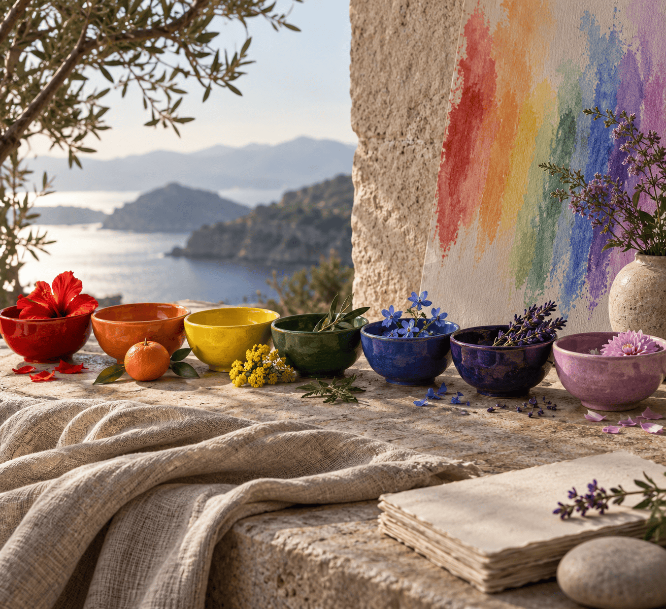 AI-generated editorial illustration; not a measured color sample.
What the Sanskrit visualization colors
The Ṣaṭ-Cakra-Nirūpaṇa, an influential Sanskrit chakra text translated in The Serpent Power, illustrates the difference clearly. Its Muladhara lotus is described with four crimson petals and gold-colored letters. The image therefore contains several colored elements rather than a single modern “root red” disk.
Descriptions of other centers likewise assign colors to separate parts of the visualization. A petal color does not necessarily match the center, deity, lettering, clothing, or geometric form. Turning poetic comparisons such as lightning, cloud, smoke, or flowers into exact HEX codes would create a precision the text does not supply.
Why chakra diagrams disagree
Chakra diagrams differ because they may represent different traditions, texts, historical periods, or modern teaching systems. Even the number of centers is not identical across every Hindu and Buddhist source. A seven-center diagram can therefore be appropriate for one purpose without serving as a master key to every chakra tradition.
Some charts also differ within the modern Western convention. One may use a lighter cyan-like blue at the throat, another may blur blue and indigo, and another may make the crown white. Such choices usually reflect a particular teacher, publication, or design vocabulary, not an error that can be settled by finding an official international chakra palette.
A chart should state its convention plainly. “Modern seven-chakra rainbow” tells the viewer much more than presenting the colors as an unnamed ancient standard.
Using chakra colors in art, crafts, and design
The rainbow system works well as a visual key because it gives seven concepts a memorable sequence. Careful labeling and material choices preserve that usefulness without overstating what the colors represent.
Build a readable seven-color key
Begin by deciding whether your project follows the modern rainbow convention or a particular historical source. Write that choice into a legend, subtitle, or project note. This small step prevents a decorative decision from looking like a universal historical claim.
For a poster, journal spread, mandala, embroidery pattern, or set of painted objects, keep the order consistent. Place the root first and the crown last, whether the sequence runs vertically, around a circle, or across a page. If the orientation is unusual, add numbers from one through seven.
Use the table values when you need repeatable digital colors. A design program that accepts HEX can reproduce them directly. If a softer composition suits the project, choose your own coordinated shades and identify them as a custom palette rather than changing the values while retaining claims of standardization.
Use labels and shapes as well as hue
Color should not carry essential information by itself. Pair each swatch with its chakra name, number, position, or a distinct symbol. Patterns can also help in a monochrome printout, an embossed craft, or a design viewed by someone who does not distinguish every hue in the same way.
Check every text color against the background on which it actually appears. Accessibility guidance calls for a contrast ratio of at least 4.5:1 for ordinary text and 3:1 for qualifying large text. Do not assume one lettering color will remain readable over red, yellow, green, blue, and violet. Test each pairing, especially text over yellow, deep blue, indigo, or a multicolored background.
Meaning can survive a palette change when the structure remains explicit. A seven-part ceramic piece, for example, can combine color with engraved numbers. A fiber project can use different stitch patterns, and a digital diagram can place a written name beside every colored circle.
Treat HEX as a screen reference, not a paint formula
The listed CSS HEX values encode sRGB screen-color references. They do not provide guaranteed matches for paint, ink, dye, pencil, or ceramic glaze.
For a physical project, compare the chosen material directly rather than treating a screen swatch as a material specification. Record the actual product color or mixture if you need to repeat it later.
There is no universal pigment ratio for a chakra red or crown violet. Follow the product maker’s mixing and safety directions rather than treating the digital references as recipes.
Spiritual meaning, personal use, and limits
Chakra colors can support reflection without becoming a diagnostic system. The distinction matters whenever symbolic language begins to sound like a factual claim about someone’s body, health, or personality.
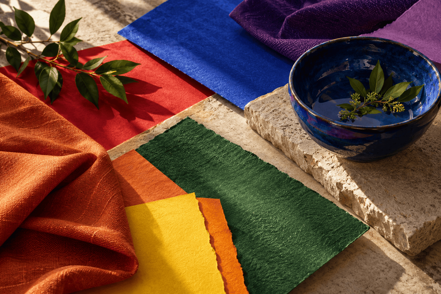 AI-generated editorial illustration; not a measured color sample.
A simple reflective color exercise
Choose one theme from the modern chart, such as grounding, creativity, communication, or insight. Use its associated color as a prompt in a sketch, collage, journal border, or quiet visualization. Then write what the theme means in the specific situation you are considering.
The useful information comes from the reflection you do, not from assuming the color has uncovered a hidden condition. You may also choose a different hue if it expresses the theme more honestly for you. Personal symbolism does not have to match a standardized screen swatch.
What chakra colors cannot diagnose
Western medicine does not recognize chakras as physical anatomical structures. Liking a color, avoiding it, or using it repeatedly cannot establish a blocked chakra, medical condition, trauma history, or personality type. Chakra imagery and meditation may be used as optional spiritual or reflective practices, but they should not replace appropriate medical evaluation or treatment.
The modern rainbow remains useful when its scope is clear. It provides artists and practitioners with a recognizable seven-part language while historical sources show that chakra imagery has never been limited to seven flat swatches. Treating the colors as a convention rather than a universal diagnosis leaves room for both practical design and cultural accuracy.

Learn more about Israel Benloulou and about us.