
Beige Color: Exact HEX, Paint Mixing, and Palettes

Beige can be an exact browser color, a broad family of warm neutrals, or a physical material color that changes with pigment, light, and surface. This guide gives you a dependable digital reference, a practical way to recognize nearby colors, and an adjustable method for mixing beige acrylic paint. You will also find ready-to-use palettes and contrast guidance for designs that need to remain readable.
What color is beige?
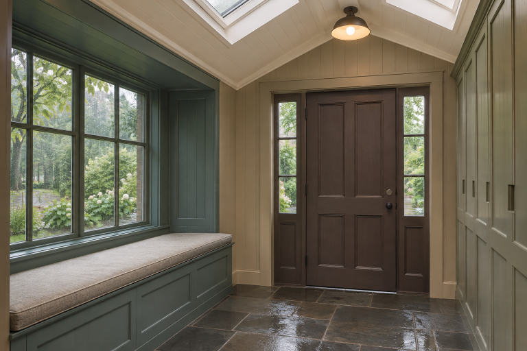
In everyday English, beige describes a range of light grayish-brown, yellowish-brown, and grayish-yellow colors. It is usually perceived as a pale neutral with some warmth, but the word does not identify one unique piece of fabric, paint sample, or printed patch.
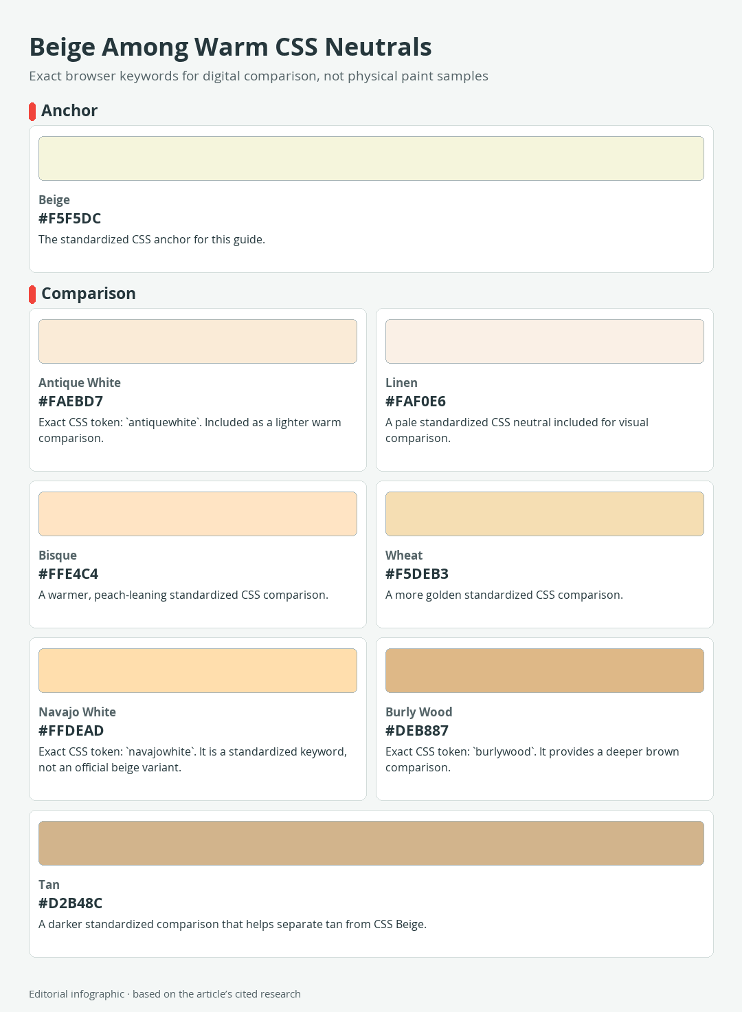
Download the complete color reference sheet (PNG): Beige Among Warm CSS Neutrals (PNG)
Digital design offers a more precise answer. The standardized CSS named-color token beige resolves to #F5F5DC in the sRGB color space. That is the controlling digital beige reference used throughout this guide.
| Name | HEX | RGB | Color |
|---|---|---|---|
| CSS Beige | #F5F5DC | 245, 245, 220 |
The exact CSS Beige reference
Entering beige in CSS produces the same sRGB reference as #F5F5DC. The six hexadecimal digits encode the red, green, and blue channel values shown in the table, so the HEX value, RGB numbers, and displayed swatch agree.
This precision has a defined boundary. It describes a digital color value, not a physical formula. A screen renders light, while paint, fabric, paper, and printing inks interact with light through material colorants and surfaces. Two correctly labeled beige products can therefore look different without either being an incorrect version of beige.
Why the same word covers more than one real-world color
Beige is useful precisely because it describes a recognizable region rather than one universal material sample. One beige may lean creamy yellow, another may contain more gray, and a third may approach pale brown. Surface texture, illumination, surrounding colors, and the material itself also affect what the eye sees.
Use #F5F5DC when you need the standardized CSS color. For a wall, textile, craft material, or printed piece, use a physical sample made for that medium. A HEX value can serve as a visual starting point, but it cannot guarantee a material match.
Beige vs. cream, tan, and other warm neutrals
The following comparison uses eight standardized CSS named colors. Only Beige is the anchor for this article. The other seven are useful digital references, not official shades of beige and not a scientifically ordered color scale.
 AI-generated editorial illustration; not a measured color sample.
Eight exact digital reference colors
| Name | HEX | RGB | Color |
|---|---|---|---|
Antique White (antiquewhite) | #FAEBD7 | 250, 235, 215 | |
Beige (beige) | #F5F5DC | 245, 245, 220 | |
Bisque (bisque) | #FFE4C4 | 255, 228, 196 | |
Burly Wood (burlywood) | #DEB887 | 222, 184, 135 | |
Linen (linen) | #FAF0E6 | 250, 240, 230 | |
Navajo White (navajowhite) | #FFDEAD | 255, 222, 173 | |
Tan (tan) | #D2B48C | 210, 180, 140 | |
Wheat (wheat) | #F5DEB3 | 245, 222, 179 |
CSS identifiers are case-insensitive, but multiword tokens do not contain spaces. Write antiquewhite, burlywood, and navajowhite in code even though their human-readable display names are normally spaced.
The named-color collection grew from historical browser usage and compatibility needs. Its names are not organized as a balanced color taxonomy, so a name alone does not reveal a reliable numerical relationship to Beige.
How undertones change the comparison
An undertone is the subtle hue bias that becomes apparent when similar neutrals sit beside one another. CSS Beige looks pale and softly yellow beside the deeper, browner Tan and Burly Wood. Wheat and Navajo White show a stronger golden direction, while Bisque has a peachier cast. Linen and Antique White are very light comparisons, with Linen appearing less saturated than the warmer Bisque.
CSS provides a named-color token tan at #D2B48C. It does not provide named-color keywords cream or taupe. A designer using cream, taupe, or another descriptive neutral label should assign an explicit color value rather than expect the word to work as a browser color token.
To identify an unknown beige, compare it with a neutral white and a few fixed samples under the same light. Ask three separate questions: Is it lighter or darker? Does it lean yellow, peach, gray, or brown? Is the color subdued or comparatively strong? That method is more reliable than choosing by an evocative product name.
How to mix beige paint without chasing a HEX code
A practical acrylic beige can begin with Titanium White and a small amount of Yellow Ochre. Titanium White creates a light, opaque tint, while Yellow Ochre adds a subdued earthy warmth. The useful recipe is a controlled process, not a universal ratio, because pigment identity and tinting strength vary among paints and formulations.
A reliable acrylic test method
- Place enough Titanium White on the palette for the area you intend to paint, plus extra for testing and later adjustments.
- Add Yellow Ochre in a very small increment and mix thoroughly before deciding whether more is needed. A strong ochre can change a large amount of white quickly.
- Brush a labeled sample onto the actual surface or a prepared scrap with the same ground and texture.
- Let the sample dry fully according to the product instructions, then inspect it under the lighting in which the finished work will be seen.
- Record the paints used and make the next adjustment in a separate portion when possible. Keeping the earlier sample gives you a dependable comparison.
Acrylic polymer binder can look milky while wet and become clearer as the paint dries. The wet mixture may consequently appear lighter than the finished film. Judging only from the palette can lead to repeated corrections in the wrong direction.
Adjust warmth, depth, and neutrality
If the dry sample needs more warmth, add another small amount of Yellow Ochre. If it needs greater brown depth, introduce the earth brown already available in your palette cautiously. Test the result after each addition because darker pigments may have much more tinting power than the light base.
If the mixture is too colorful, a minute amount of a complementary hue can reduce its chroma, meaning its color intensity. That adjustment can also darken the mixture or move its hue, so add it incrementally instead of treating it as a fixed recipe. Keeping some unmixed white nearby makes controlled lightening easier.
The digital #F5F5DC swatch can help you describe the target, but it is not a paint formula. A painter cannot reproduce an sRGB value merely by converting its channel numbers into pigment proportions.
Troubleshooting yellow, pink, gray, or muddy results
- Too yellow: First add more white if the mixture is also too dark. If it remains overly chromatic, test a tiny complementary adjustment in a separate portion.
- Too pink: Check whether the chosen brown or red-biased addition caused the shift. Return to the white-and-ochre base rather than adding several corrective colors at once.
- Too gray: Add a small amount of Yellow Ochre to a test portion. Avoid pouring in more of every ingredient, which makes the cause harder to track.
- Too dark: Mix a new light base and add the dark mixture into it gradually. Trying to rescue a large dark batch can consume far more white.
- Muddy or inconsistent: Use clean tools, mix completely, label each sample, and change one variable at a time.
Follow the paint and medium manufacturers’ directions for thinning, drying, ventilation, protective equipment, cleanup, and suitable surfaces. Those requirements depend on the products in use.
Three usable beige color palettes
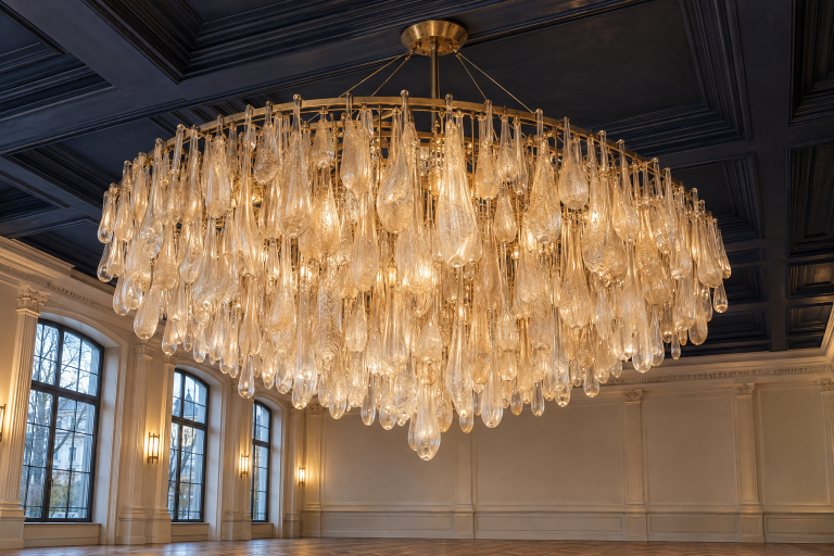
These palettes assign each color a job: dominant, supporting, or accent. They are practical starting points rather than universal harmony rules. Their values specify screen colors, and any text-and-background pairing still needs a contrast check.
 AI-generated editorial illustration; not a measured color sample.
Quiet neutral
| Name | HEX | RGB | Color | Role |
|---|---|---|---|---|
| Beige | #F5F5DC | 245, 245, 220 | Dominant | |
| Linen | #FAF0E6 | 250, 240, 230 | Supporting | |
| Sienna | #A0522D | 160, 82, 45 | Accent |
Use Beige for the broad field and Linen for subtle panels or layered surfaces. Sienna supplies enough depth to define small details, borders, or selected headings. On a Beige background, Sienna has approximately 5.07:1 contrast and can meet the 4.5:1 threshold for normal text at these exact values.
Earth and foliage
| Name | HEX | RGB | Color | Role |
|---|---|---|---|---|
| Beige | #F5F5DC | 245, 245, 220 | Dominant | |
| Dark Olive Green | #556B2F | 85, 107, 47 | Supporting | |
| Saddle Brown | #8B4513 | 139, 69, 19 | Accent |
This grouping shifts beige toward an earthy application. Dark Olive Green can structure larger secondary areas, while Saddle Brown works for smaller points of emphasis. Against Beige, the exact green has approximately 5.38:1 contrast and Saddle Brown about 6.41:1.
Crisp contrast
| Name | HEX | RGB | Color | Role |
|---|---|---|---|---|
| Beige | #F5F5DC | 245, 245, 220 | Dominant | |
| Navy | #000080 | 0, 0, 128 | Supporting | |
| Teal | #008080 | 0, 128, 128 | Accent |
Navy gives pale Beige a strong edge and reaches approximately 14.47:1 contrast against it. Teal creates a livelier accent, but its contrast against Beige is only about 4.31:1. That passes the 3:1 criterion for large text but falls below the 4.5:1 requirement for normal text, so Teal is better reserved for non-text elements or sufficiently large type in this exact pairing.
Using beige in digital design, art, and rooms
Beige often succeeds as a background because it leaves room for darker shapes, text, furnishings, or artwork. Its pale appearance does not remove the need to check contrast, reproduction, and surrounding light.
Contrast comes before mood
WCAG 2.2 sets a minimum contrast ratio of 4.5:1 for normal text and 3:1 for large text. Large text means at least 18pt for regular type or 14pt for bold type. A calculated result below the threshold cannot be rounded up to claim a pass.
Black against CSS Beige measures approximately 18.98:1, while white against Beige is only about 1.11:1. This is why white text can disappear on a pale beige surface even when the combination looks gentle or refined. Test the exact foreground and background values rather than relying on names such as “neutral,” “dark,” or “accent.”
Contrast compliance also does not guarantee that every interface element is easy to understand. Font weight, size, spacing, link identification, and interactive states still matter.
Why screens, print, and paint will not match automatically
sRGB supplies a standard reference for digital values, but devices and physical media reproduce color differently. Displays emit red, green, and blue light. Printers place inks on a substrate, and paint films reflect light according to their pigments, binder, sheen, thickness, and surface.
For a web project, preserve the intended sRGB value and preview it on representative displays. For print, use the color profile and proofing workflow requested by the printer rather than substituting a generic CMYK conversion. Paper color and finish can alter a pale neutral noticeably. For walls, art, or crafts, make a physical sample on the intended substrate and inspect it under the actual lighting.
A documented gallery example
Beige has a practical history as an exhibition background. The Museum of Modern Art once lined gallery walls with plain beige monk’s cloth. In a later installation, the museum selected grayish beige walls in relation to the paintings, frames, and lighting.
The useful lesson is not that beige is always the correct gallery or room color. It is that a quiet background remains an active design choice. Evaluate it beside the fixed materials it must support. A wall beige that complements warm wood in daylight may behave differently beside a cool gray floor under electric lighting.
Where the word beige came from
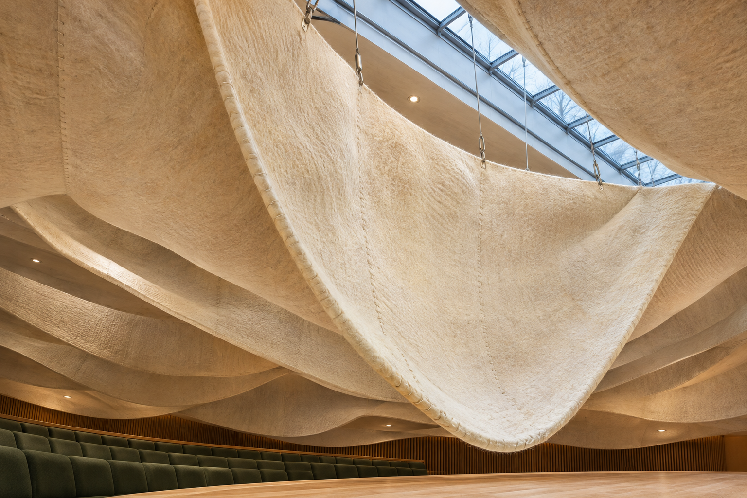
The English color term came through French and is tied to fabric in the natural color of undyed and unbleached sheep’s wool. The material name was later applied to the color itself.
 AI-generated editorial illustration; not a measured color sample.
That textile origin helps explain the word’s broad modern scope. Natural wool does not present one mathematically fixed appearance, so beige functioned as a family description long before browsers assigned the CSS keyword one exact sRGB value. The historical meaning and the digital standard can coexist as long as their different purposes remain clear.
Choose the right beige reference for the job
Digital design
Use #F5F5DC when you specifically want the CSS named color Beige. Store the HEX value as the controlling reference, derive displayed RGB values from it, and test every functional foreground and background pair. If a design calls for a darker, grayer, or peachier beige, assign that choice its own explicit HEX value instead of continuing to label several conflicting values as one exact color.
Paint and craft work
Work from the actual pigments and materials in front of you. Mix a controlled sample, label it, let it dry fully, and view it under the intended light. Notes about each adjustment will be more useful for repeating the mixture than an assumed ratio copied from a screen color.
Interiors, textiles, and print
Use manufacturer samples for walls, fabrics, finishes, and products, then compare them with fixed flooring, furniture, trim, and lighting. For printing, follow the printer’s profile and proofing requirements. In each case, treat “beige” as the starting category and the approved physical sample or managed digital value as the final specification.

Learn more about Israel Benloulou and about us.