

90s Color Palette: Four Retro Schemes With HEX Codes

A 90s color palette might be loud and playful, muted and distressed, unmistakably digital, or inspired by colorful late-decade technology. These four ready-to-use schemes capture those different directions with exact HEX values and clear roles for every color. You will also learn how to preserve the period character without sacrificing hierarchy, readability, or reliable output.
Four 90s palette directions at a glance
A useful 90s color palette depends on context because consumer products, experimental print design, early websites, and colorful technology followed different color directions. The combinations below are editorial digital reconstructions built with standardized sRGB colors, not measurements of historical crayons, inks, paints, or plastics.
Choose the direction that fits the project rather than combining all four. Pop Brights suits energetic graphics and playful crafts. Grunge Neutrals creates a worn, grounded atmosphere. Early Web recalls the sixteen named colors standardized in HTML 4, while Fruit Tech offers a cleaner late-decade technological look.
1990 Pop Brights
This palette pairs a broad teal field with fuchsia support, a concentrated yellow accent, and black for structure. It draws on consumer-facing color names documented at the start of the decade, but the exact HEX combination is a modern recommendation rather than a historical standard.
| Name | HEX | RGB | Color |
|---|---|---|---|
| Teal | #008080 | 0, 128, 128 | |
| Fuchsia | #FF00FF | 255, 0, 255 | |
| Yellow | #FFFF00 | 255, 255, 0 | |
| Black | #000000 | 0, 0, 0 |
Make Teal the dominant color across the largest area. Use Fuchsia as the supporting color in a smaller panel, shape, or repeated motif. Yellow works best as a compact accent on details that deserve attention. Black can define type, outlines, or divisions, although every text and background pairing still needs a contrast check.
For a poster, teal could fill the background while fuchsia frames the title and yellow marks a date or callout. On a handmade object, repeat the teal across the main surface and confine the two brighter colors to small painted or paper elements. That unequal distribution keeps the result lively without letting the colors compete at the same volume.
Grunge Neutrals
Grunge does not require a pile of unrelated browns and grays. This controlled combination uses Dim Gray as the dominant field, Dark Olive Green for muted support, Sienna as the warm accent, and Wheat as the light neutral. The named colors and values are standardized digital references; their use together is an editorial interpretation of the decade’s grunge direction.
| Name | HEX | RGB | Color |
|---|---|---|---|
| Dim Gray | #696969 | 105, 105, 105 | |
| Dark Olive Green | #556B2F | 85, 107, 47 | |
| Sienna | #A0522D | 160, 82, 45 | |
| Wheat | #F5DEB3 | 245, 222, 179 |
Begin with broad gray areas, then add olive to create an earthy cast. Sienna supplies restrained warmth, while Wheat gives the darker colors breathing room. In a collage, Wheat can function as the paper-like base, with rough-edged gray and olive layers crossing it and small Sienna marks creating emphasis.
Create age and wear through texture, broken edges, uneven coverage, and shifts in lightness instead of introducing more muddy hues. This preserves the identity of the four-color scheme. For additional control over reduced saturation, see the guide to creating a muted color palette.
Early Web
This scheme comes from exact colors in the sixteen-name HTML 4 set. Silver becomes the dominant background, Navy supplies dark structure, Blue serves as the conspicuous accent, and Teal offers a second supporting hue. Every color belongs to that compact standardized set, although this particular role assignment remains an editorial choice.
| Name | HEX | RGB | Color |
|---|---|---|---|
| Silver | #C0C0C0 | 192, 192, 192 | |
| Navy | #000080 | 0, 0, 128 | |
| Blue | #0000FF | 0, 0, 255 | |
| Teal | #008080 | 0, 128, 128 |
The effect works particularly well with simple blocks, visible borders, compact controls, and limited decorative shading. Let Silver occupy the open areas and use Navy for strong boundaries. Blue and Teal should indicate separate levels of emphasis rather than appear interchangeably everywhere.
A period reference does not excuse difficult reading. Some combinations that look distinct as swatches will not provide enough contrast for small text. Treat the palette as a source of colors, then validate the specific foreground and background pair used in each label, button, or paragraph.
Late-90s Fruit Tech
Apple documented its 1999 slot-loading iMac in Strawberry, Blueberry, Grape, Lime, and Tangerine. This digital reconstruction takes inspiration from that broader fruit-colored technology direction without claiming to reproduce any of those product finishes. Aqua is the dominant field, Purple adds darker support, Lime supplies the sharp accent, and Silver acts as the neutral.
| Name | HEX | RGB | Color |
|---|---|---|---|
| Aqua | #00FFFF | 0, 255, 255 | |
| Purple | #800080 | 128, 0, 128 | |
| Lime | #00FF00 | 0, 255, 0 | |
| Silver | #C0C0C0 | 192, 192, 192 |
Use Aqua across the main surface, Purple in a smaller solid mass, and Lime on only a few focal details. Silver can separate the saturated hues or provide a calmer field for supporting information. Curved shapes, glossy-looking gradients, and pale highlights can strengthen the technological association in digital artwork, but the flat HEX values remain the reproducible starting points.
Do not describe these HEX codes as matches for historical hardware. Screen color and colored plastic behave differently, and an exact digital value cannot capture transparency, reflections, surface depth, or changes caused by surrounding light.
What makes these palettes 1990s
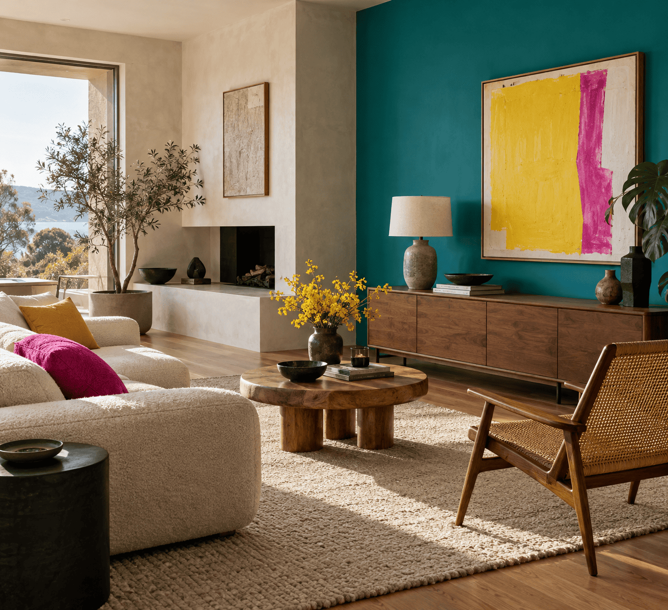
The decade’s consumer colors, print design, web standards, and product styling point to different but overlapping directions. Looking at them together explains why a rough neutral scheme and a high-intensity digital scheme can both evoke the 1990s.
 AI-generated editorial illustration; not a measured color sample.
Consumer color and grunge print design
Crayola added eight named crayon colors in 1990: Cerulean, Dandelion, Fuchsia, Jungle Green, Royal Purple, Teal Blue, Vivid Tangerine, and Wild Strawberry. These additions provide one dated example of consumer color naming in 1990. They do not provide authoritative HEX equivalents for the wax colors, so the Pop Brights table uses standardized screen colors as a practical interpretation.
The decade also supported a rougher visual direction. Letterform Archive identifies grunge type and bold photography in David Carson’s 1991 work for Beach Culture. Its account of the period also describes designers layering, warping, and curving type and pixels while analog and digital practices continued side by side.
That coexistence matters when recreating the look. A grunge project can use scanned marks, torn paper, paint, or digital texture without treating one technique as the only authentic option. Color provides the framework, while typography, image treatment, and surface variation establish more of the character.
Web standards and colorful technology
HTML 4 defined sixteen case-insensitive color names as exact sRGB values. Teal, Fuchsia, Yellow, Black, Silver, Navy, Blue, Purple, Lime, and Aqua all appear in that small set. This gives the Early Web palette a standards-based connection to period screen design and provides reproducible digital values for several colors used elsewhere here.
Late in the decade, Apple’s product record supplied another kind of reference. The slot-loading iMac introduced on October 4, 1999 was offered in Strawberry, Blueberry, Grape, Lime, and Tangerine. Those names establish a colorful product direction, not precise screen values. The Fruit Tech palette borrows the idea of a bright, fruit-associated technology scheme while deliberately using documented sRGB references of its own.
Together, these examples show why “90s colors” can describe both rough earth tones and high-intensity digital hues. The project context determines which current will look convincing.
Build a usable 90s color combination
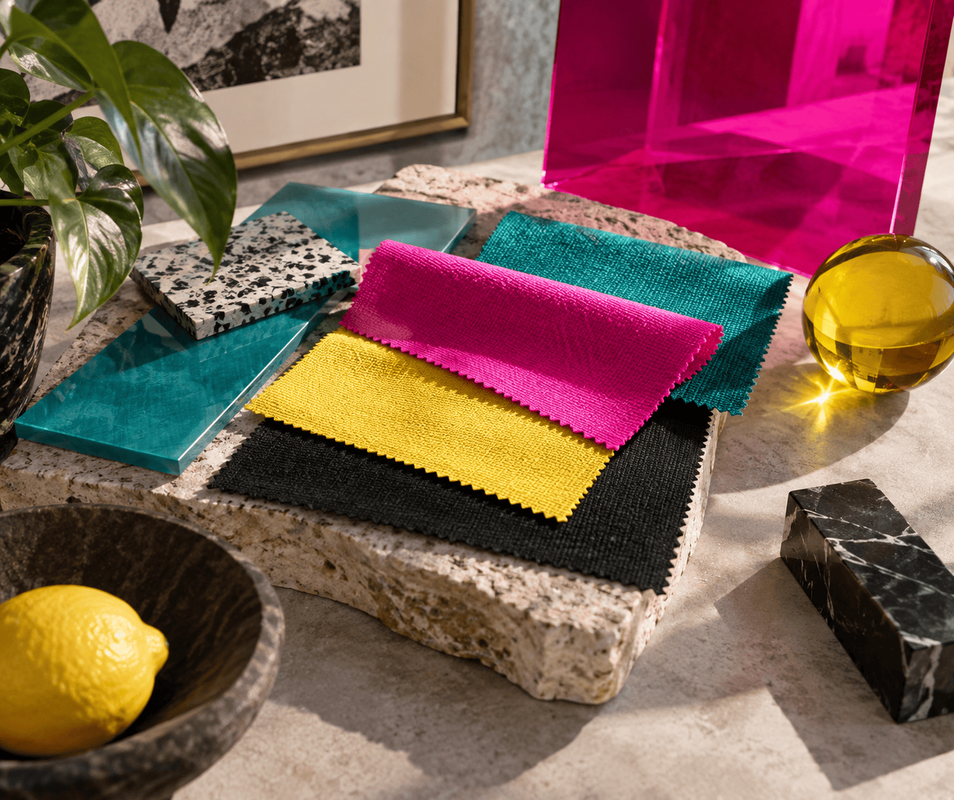
A recognizable reference is only the beginning. A palette becomes usable when every color has a job and the visual hierarchy remains clear at the final size.
 AI-generated editorial illustration; not a measured color sample.
Assign dominant, supporting, accent, and neutral roles
The dominant color occupies the largest visual area and establishes the overall temperature and mood. A supporting color reinforces that direction without overtaking it. The accent attracts attention to a limited number of focal points, while the neutral separates stronger hues or carries less prominent content.
These roles describe area and emphasis, not a mandatory formula. A teal-dominant poster and a fuchsia-dominant poster can use the same four colors yet communicate very different levels of energy. Choose the role assignment before decorating, then check the composition at thumbnail size. If every region demands attention, reduce the accent area or let the neutral occupy more space.
- For Pop Brights: let Teal establish the field, Fuchsia build the secondary pattern, Yellow mark the focal point, and Black organize the composition.
- For Grunge Neutrals: use Dim Gray broadly, Dark Olive Green to establish the muted direction, Sienna for warm emphasis, and Wheat for relief.
- For Early Web: make Silver the open background, Navy the structural color, Blue the strongest action cue, and Teal the secondary cue.
- For Fruit Tech: lead with Aqua, anchor it with Purple, reserve Lime for small highlights, and use Silver between saturated areas.
Adjust saturation and texture without losing the palette
When a bright scheme feels overwhelming, first change the amount of each color rather than immediately changing its HEX value. A smaller Fuchsia panel or Lime detail retains the relationship while reducing its visual force. Adding more neutral space can solve the same problem without creating an unrelated fifth or sixth hue.
For grunge work, apply texture selectively. Distress a large gray field, place a cleaner Wheat area behind essential information, and keep the Sienna accent recognizable. If every color receives heavy noise and equally dark shading, their roles collapse into one muddy mass.
Physical media require a separate decision process. HEX is not a paint recipe, and mixing pigments can change hue as well as lightness and saturation. When developing an earthier variation, a guide to mixing brown paint can help with the physical medium, but the result should be evaluated as a new material sample rather than an exact copy of a screen swatch.
For a room or craft surface, make samples on the intended material and inspect them under the lighting where the project will be used. Follow the manufacturer’s preparation, compatibility, application, ventilation, and drying or curing instructions for every product involved.
Choose harmony by model, not nostalgia
A complementary color sits opposite another color on a specified color wheel. The important word is “specified”: an RGB screen model and a traditional RYB artist’s wheel do not assign the same primaries or necessarily produce the same opposite.
RGB relationships for digital work
RGB describes emitted screen color with red, green, and blue channels. For digital work, select the RGB wheel or complement method in the design tool before naming an exact complement, and record that method with the palette. This guide therefore does not present one HEX code as the universal RGB opposite of Teal #008080.
A complementary pairing can provide emphasis, but opposition on a color wheel does not guarantee readable text. The two hues may still have similar perceived lightness. Use harmony to choose a relationship, then run a separate contrast test for the exact sizes and placements in the design.
RYB relationships for paint and ink
Traditional paint-oriented exercises often use an RYB wheel based on red, yellow, and blue. On that wheel, a blue-green such as teal generally faces a red-orange region. The precise result varies with the chosen wheel, pigments, transparency, and proportions, so a digital companion color should not be treated as a guaranteed mixing target.
For paint or ink, compare real swatches instead. Start with the closest available blue-green and red-orange colors, place dry samples beside each other, and assess both hue contrast and light-dark separation. Follow the product instructions for mixing and drying, especially when combining different product lines or surfaces.
Keep the palette readable and reproducible
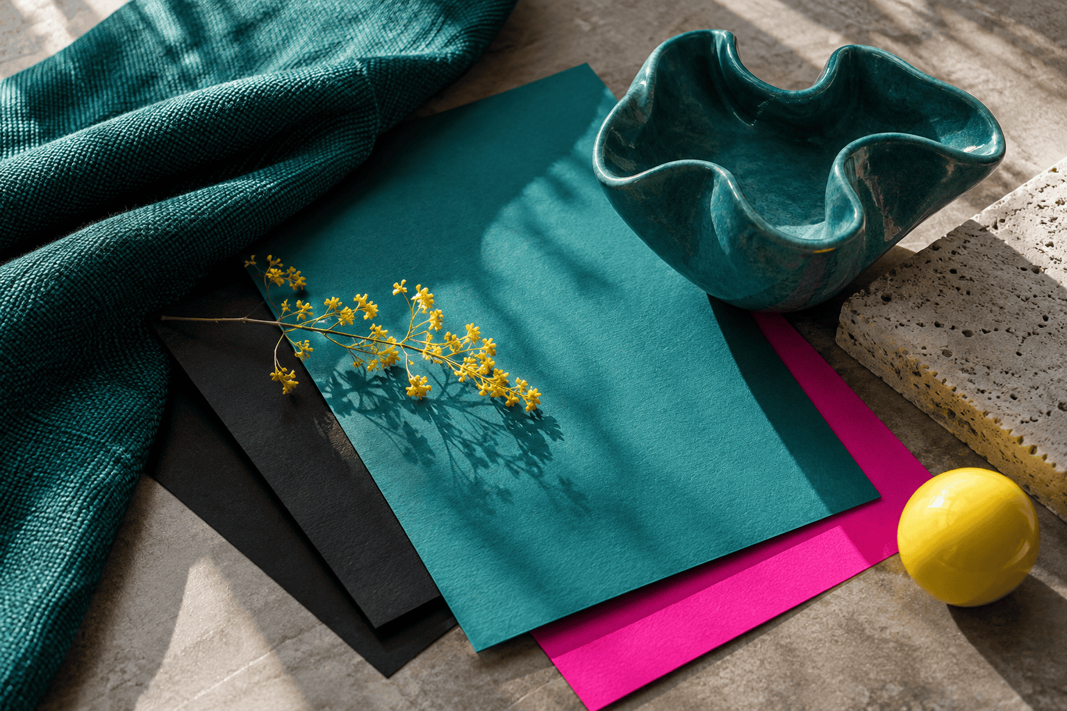
Nostalgic styling should not hide the message. Contrast belongs to a particular foreground-background pair, and reproduction depends on the medium that displays or carries the color.
 AI-generated editorial illustration; not a measured color sample.
Test text and background contrast
Under WCAG AA, normal text needs a contrast ratio of at least 4.5:1. Large text needs at least 3:1, with large text defined as at least 18pt when regular or 14pt when bold. A calculated value below a threshold must not be rounded up and reported as a pass.
The following checks apply the WCAG contrast calculation to specific foreground and background colors from the four palettes. Ratios are truncated to two decimal places, so a failing value is not rounded into a pass.
| Palette | Text on background | Contrast ratio | Normal text | Large text |
|---|---|---|---|---|
| Pop Brights | Black on Yellow | 19.55:1 | Pass | Pass |
| Pop Brights | Black on Teal | 4.39:1 | Fail | Pass |
| Grunge Neutrals | Dark Olive Green on Wheat | 4.52:1 | Pass | Pass |
| Early Web | Navy on Silver | 8.79:1 | Pass | Pass |
| Early Web | Teal on Silver | 2.62:1 | Fail | Fail |
| Fruit Tech | Purple on Aqua | 7.51:1 | Pass | Pass |
| Fruit Tech | Lime on Silver | 1.32:1 | Fail | Fail |
These results belong only to the listed pairs. A palette cannot pass accessibility as a group because the same colors can be arranged in many foreground and background combinations. Check body copy, headings, links, buttons, labels, and any text placed over an image or texture.
If a pair fails, change the text color, background color, font size, weight, or placement. Adding a solid neutral panel behind type can preserve the surrounding palette without forcing the words to compete with a patterned field. Do not rely on hue differences alone, and do not assume that a fluorescent-looking color automatically creates strong contrast.
Translate screen colors to print, paint, and crafts
The HEX references in these tables describe sRGB screen colors. Their appearance can vary between displays, and they are not universal formulas for printed ink, paint, crayon wax, dyed material, or translucent plastic. Each physical medium reflects and absorbs light differently, while a screen emits it.
For websites, social graphics, and other screen projects, use the listed HEX values as the controlling references and derive other digital values from them. Preview the work on more than one display when color differences could affect the result.
For printing, inspect a proof made with the intended printer, paper, and production settings. For paint, fabric, resin colorants, or other craft materials, compare physical samples on the actual substrate after the required drying or curing period. A successful translation should preserve the role hierarchy and overall direction, even when the material cannot reproduce the screen color exactly.
That distinction provides a practical final test: ask whether the project still reads as pop-bright, grunge-neutral, early-web, or fruit-tech when viewed in its real setting. If the answer is unclear, strengthen the dominant color and reduce competing accents before adding more hues.

Learn more about Israel Benloulou and about us.