
Cadmium Yellow: Color, Pigments, Mixing, and Safety

Cadmium yellow looks straightforward until a screen swatch, an acrylic tube, and a watercolor pan all produce noticeably different yellows. Learning what the name actually identifies makes it easier to choose the right product, mix cleaner colors, and avoid unsafe applications. Here is how to separate the digital reference from the pigment family and put both to practical use.
What Color Is Cadmium Yellow?
The Short Answer
Cadmium yellow is a family of strong artist yellows, not one universally standardized color. Its cooler members include pale primrose and light yellows that lean slightly toward green. Medium versions appear warmer, while dark or deep versions can approach yellow-orange.
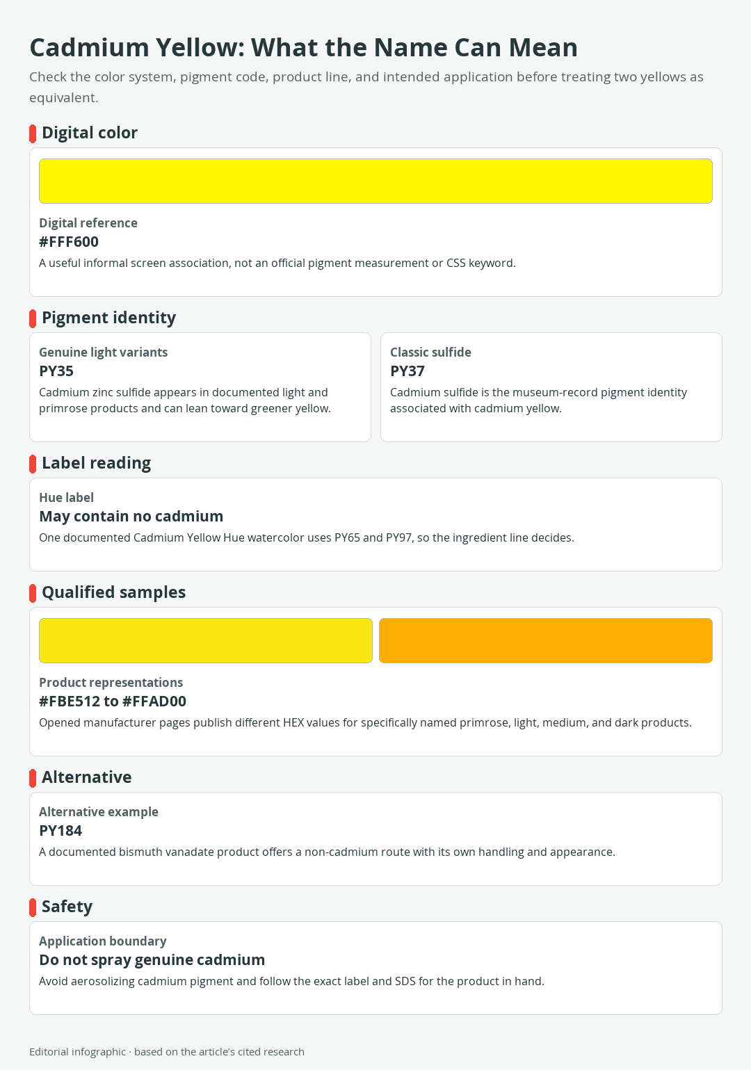
Download the complete color reference sheet (PNG): Cadmium Yellow: What the Name Can Mean (PNG)
For digital work, #FFF600 is a useful informal reference for cadmium yellow. It represents a brilliant yellow that is slightly warmer than CSS Yellow #FFFF00 on an sRGB screen, but it is not an official measurement of cadmium paint. It is also different from the CSS named color yellow, which browsers define as #FFFF00. There is no CSS keyword named cadmiumyellow.
Digital Reference Versus Physical Paint
A HEX code describes an emitted screen color. Paint produces color by reflecting light through pigment particles and a binder, such as oil, acrylic polymer, or watercolor gum. Pigment concentration, opacity, surface, lighting, binder, application thickness, and manufacturing choices can therefore make two paints with the same front-label name look different.
Published manufacturer HEX values are useful for comparing product representations online. They do not measure every tube, predict a dried painting under every light, or provide a formula for mixing the physical paint. Screen calibration and display gamut introduce further variation.
Eight Qualified Color References
| Name | HEX | RGB | Color |
|---|---|---|---|
| Selected Digital Reference | #FFF600 | 255, 246, 0 | |
| CSS Yellow | #FFFF00 | 255, 255, 0 | |
| Golden Heavy Body Cadmium Yellow Primrose | #FBE512 | 251, 229, 18 | |
| Golden Heavy Body Cadmium Yellow Light | #FFE100 | 255, 225, 0 | |
| Williamsburg Cadmium Yellow Light | #FFD700 | 255, 215, 0 | |
| Williamsburg Cadmium Yellow Medium | #FFC000 | 255, 192, 0 | |
| Golden Heavy Body Cadmium Yellow Dark | #FFAD00 | 255, 173, 0 | |
| Golden Heavy Body Bismuth Vanadate Yellow | #FFE312 | 255, 227, 18 |
The first row is the selected informal screen reference, and the second is a standardized CSS color. The next five values represent specifically named cadmium paint products. The final row represents one non-cadmium alternative. Together, they illustrate the range hidden behind yellow product names; they are not eight universal measurements of cadmium yellow.
How to Read a Cadmium Yellow Paint Label
Genuine Cadmium: PY35 and PY37
The front of a tube describes the color position, but the pigment line identifies its colorants. PY means Pigment Yellow, followed by a Color Index number. PY37 identifies cadmium sulfide in the museum pigment record, while PY35 commonly identifies cadmium zinc sulfide formulations. Adding zinc can move the color toward lighter, greener yellow, although the exact appearance remains product-specific.
 AI-generated editorial illustration; not a measured color sample.
Do not assume every paint called Light, Medium, Dark, or Deep uses the same pigment combination. For example, the documented Golden Heavy Body Cadmium Yellow Dark combines PY35 with PO20, an orange pigment. Names organize a manufacturer’s range; they do not replace the ingredient list.
What “Hue” and “Cadmium-Free” Mean
The documented Cotman Cadmium Yellow Hue watercolor uses PY65 and PY97 rather than cadmium pigment. This specific product shows why the pigment line matters, but it does not establish one universal recipe for every paint carrying a cadmium yellow hue name.
“Cadmium-free” likewise describes the absence of cadmium, not a single substitute pigment. One documented alternative uses PY184 bismuth vanadate. Its manufacturer describes that particular acrylic as strong, opaque, and lightfast, but another alternative may differ in transparency, tinting strength, drying behavior, or color bias.
A Four-Step Tube Check
- Read the full color name. Note words such as Primrose, Light, Medium, Dark, Deep, Hue, or Cadmium-Free.
- Find the pigment codes. PY35 or PY37 indicates a cadmium-family pigment in the documented references. Other codes reveal a substitute or mixture.
- Check the medium and performance data. Oil, acrylic, and watercolor products cannot be compared by name alone. Review opacity, permanence or lightfastness rating, binder, drying information, and intended application.
- Read the caution label and safety data sheet. The front name cannot tell you which handling restrictions apply.
This method is more reliable than choosing by a printed cap or online thumbnail. If two candidates remain close, make small dried swatches on the support and ground you intend to use.
How to Mix and Use Cadmium Yellow
Can You Mix Cadmium Yellow?
You can approximate the appearance of a cadmium yellow with other paints, but mixing does not create cadmium sulfide or cadmium zinc sulfide. The result is a visual substitute whose opacity, tinting strength, permanence, and handling come from the pigments actually used.
Start by identifying the target. A cool primrose yellow, warm medium yellow, and orange-leaning dark yellow require different adjustments. For a non-cadmium option, begin with a single-pigment yellow near the target when possible, then test small changes instead of assembling a complicated mixture. The broader guide to making and adjusting yellow explains how yellow mixtures shift in value and temperature.
Mixing Greens Without Guesswork
Color bias is the direction a color leans within its broader family. A cooler yellow leans toward green, whereas a warmer yellow leans toward orange. Blues also lean: some sit closer to green, and others closer to violet or red. Those biases help predict a mixture, but the particular pigments and their unequal tinting strengths determine the result.
Make a swatch ladder instead of relying on a universal ratio. Place the yellow alone at one end and the blue alone at the other. Between them, create several mixtures while increasing the stronger color in very small steps. Compare a cool yellow with a green-biased blue, then repeat with a warmer yellow or a red-biased blue. The second path will often produce a more muted green because the opposing bias reduces chroma, or color intensity.
Record the brand, product name, pigment codes, medium, and approximate proportions beside the dried swatches. That small record is more repeatable than a recipe that names only “yellow” and “blue.” See the paint-mixing guide for a wider treatment of pigment choice, tinting strength, and secondary colors.
Warm Oranges and Muted Earths
For orange, begin with the chosen yellow and introduce a warm red gradually. A powerful red can overtake yellow quickly, so increase it with the smallest practical brush load and preserve each step in a swatch row. If the mixture becomes too red, restarting is usually more efficient than adding a large quantity of yellow.
To create an ocher-like or earthy yellow, reduce chroma a little at a time with an opposing color or a dark earth paint. The choice changes the undertone, so test the mixture on the actual ground. A complementary mixture can neutralize rapidly, while an earth color may produce a more predictable warm mute. Neither method turns the mixture into a historical yellow-ochre pigment.
Why the Medium Changes the Result
In opaque oil or acrylic mixtures, cadmium yellow’s covering power and tinting strength can make small additions visually important. Compare mixtures only after accounting for the product’s normal drying behavior and the intended film thickness.
Transparent watercolor works differently. The white paper supplies much of the light, and dilution changes both value and apparent intensity. A transparent cadmium yellow hue therefore cannot be expected to behave like an opaque cadmium acrylic, even when their labels use similar words.
Use the recommended thinner or medium for the exact product, preserve sensible paint-film strength, and follow its instructions for drying or curing. A digital blend between two HEX values may help preview a design transition, but it is not a physical paint recipe.
Color Combinations for Paint and Digital Design
Three Practical Palettes
Editorial contrast palette
| Name | HEX | RGB | Color |
|---|---|---|---|
| Dominant: Selected Cadmium Yellow | #FFF600 | 255, 246, 0 | |
| Supporting: DarkBlue | #00008B | 0, 0, 139 | |
| Text and Fine Detail: Black | #000000 | 0, 0, 0 |
Dark blue restrains the energy of the yellow, while black provides exceptionally clear small text and fine marks.
Warm natural palette
| Name | HEX | RGB | Color |
|---|---|---|---|
| Dominant: Williamsburg Cadmium Yellow Medium | #FFC000 | 255, 192, 0 | |
| Supporting: SaddleBrown | #8B4513 | 139, 69, 19 | |
| Neutral Space: White | #FFFFFF | 255, 255, 255 |
This palette suits natural subjects and warm decorative schemes. Keep white as open space rather than small text on yellow, and verify any brown-on-yellow type at its actual size.
 AI-generated editorial illustration; not a measured color sample.
Warm analogous palette with a cool accent
| Name | HEX | RGB | Color |
|---|---|---|---|
| Dominant: Selected Cadmium Yellow | #FFF600 | 255, 246, 0 | |
| Supporting: Orange | #FFA500 | 255, 165, 0 | |
| Restrained Accent: DarkBlue | #00008B | 0, 0, 139 |
Yellow and orange create a warm progression. A small amount of dark blue interrupts that progression and can direct attention without competing with the dominant yellow.
Yellow and Violet Depend on the Color Model
Yellow and violet sit opposite each other on a traditional artist’s color wheel, so painters often use the pairing for contrast or neutralization. The exact opposite of a digital color depends on the selected model and its coordinates, however. An RGB complement, an HSL hue rotation, and a traditional paint-wheel opposite are not interchangeable calculations.
Use the relationship rather than a rigid formula: place a violet accent beside yellow for separation, or add an appropriate violet-biased paint sparingly when reducing a yellow mixture’s chroma. The site’s color wheel tutorial provides more context for complementary and analogous relationships.
Accessible Text on Bright Yellow
Bright color does not guarantee readable text. For WCAG 2.2 contrast, normal text needs at least 4.5:1. Large text needs at least 3:1, with large defined as 18pt regular or 14pt bold. A borderline calculation must meet the threshold without being rounded up.
Against #FFF600, black provides a contrast ratio of about 18.43:1, and DarkBlue #00008B provides about 13.43:1. White provides only about 1.14:1, so it fails for text at either size. On #FFC000, SaddleBrown #8B4513 is about 4.33:1: it passes the 3:1 large-text requirement but falls short of 4.5:1 for normal text. Test the final foreground and background pair rather than judging by color names.
Where Cadmium Yellow Came From and Why It Can Change
From an 1817 Discovery to Verified 1851 Material
Cadmium was identified in 1817, and yellow cadmium sulfide was proposed as a pigment soon afterward. Written references alone do not prove that a surviving artists’ material from the same period actually contained cadmium, however.
 AI-generated editorial illustration; not a measured color sample.
A 2026 analysis tested historical materials associated with dates often used in cadmium-yellow timelines. Investigators detected no cadmium in the examined 1836 and 1838 swatches. They did verify cadmium sulfide in a Reeves & Sons artists’ material set dated February 1851. That makes the 1851 set the earliest physically verified artist-ready example in that investigation, not proof that nobody used the pigment anywhere before that date.
Why Some Historical Yellows Faded or Chalked
Cadmium yellow is often discussed as a durable pigment, and specific modern products carry strong lightfastness ratings. Those ratings should not be projected backward onto every historical batch or sideways onto every formulation.
Research on cadmium-yellow paints from Joan Miró’s works and studio materials found that deterioration depended on interacting factors. Poor pigment crystallinity, zinc-bearing material, manufacturing history, light, and humidity could contribute to alteration products and a faded or chalky surface. The practical lesson is specific: judge permanence from the exact modern product data, and treat changes in historic paintings as conservation questions rather than evidence that every cadmium yellow behaves identically.
Safety, Storage, and Cadmium-Free Choices
Practical Studio Boundaries
Cadmium-containing products require label-led handling. Read the exact caution statement and safety data sheet because pigment concentration, binder, application, and regulatory classification can differ. In the United States, consumer art materials undergo chronic-hazard review and carry ASTM D-4236 conformity wording where practicable, but that language does not cancel product-specific warnings.
- Do not spray genuine cadmium pigments.
- Avoid handling dry cadmium pigment or sanding a cadmium-containing paint film, since these actions can create airborne dust.
- Keep food and drinks outside the work area, and never use a brush in the mouth.
- Wash hands after painting and before eating. Clean contaminated tools and surfaces without spreading dry dust.
- Store paint closed, labeled, and away from children. Prevent residue from transferring to clothing or household surfaces.
- Dispose of paint and cleanup waste according to the product instructions and applicable local rules.
Cadmium exposure can involve dust, fumes, mists, contaminated surfaces, and ingestion. Substitution is preferable when it can meet the visual and technical need. Studio ventilation and protective equipment should follow the product’s safety data rather than a universal checklist.
When to Choose a Cadmium-Free Yellow
Select a non-cadmium yellow when the method involves spraying, when dust cannot be controlled, when children will use the materials, or when genuine cadmium offers no necessary visual advantage. A “hue” mixture using pigments such as PY65 and PY97 may provide a transparent option, while a PY184 bismuth vanadate product can provide an opaque alternative. These are examples, not interchangeable formulas.
Compare alternatives by making dried swatches for mass tone, thin application, tint with white where appropriate, and mixtures with the palette colors you use most. Also compare transparency, staining or covering behavior, tinting strength, permanence rating, medium, and label restrictions. The best replacement is the one that meets the actual job safely, not simply the tube whose printed color looks closest.

Learn more about Israel Benloulou and about us.