
Best Colors for Bedrooms: 9 Practical Wall Paint Ideas

The best bedroom colors are not limited to one supposedly sleep-inducing hue. Pale blue, muted green, and warm off-white make versatile starting points, while dusty pink, terracotta, lavender, and deep blue-gray can create a more personal retreat. This guide helps you compare nine real paint references and choose one that works with your room’s light, furnishings, and desired atmosphere.
The Best Bedroom Colors at a Glance
For an airy bedroom, begin with After Rain, Breezeway, or Blank Canvas. Choose Sage Green or Canyon Dusk for an earthier room, Chivalrous or Retro Pink for muted color, and Adirondack Blue or Midnight Blue when you want greater depth. These are best-by-goal suggestions, not a universal ranking.
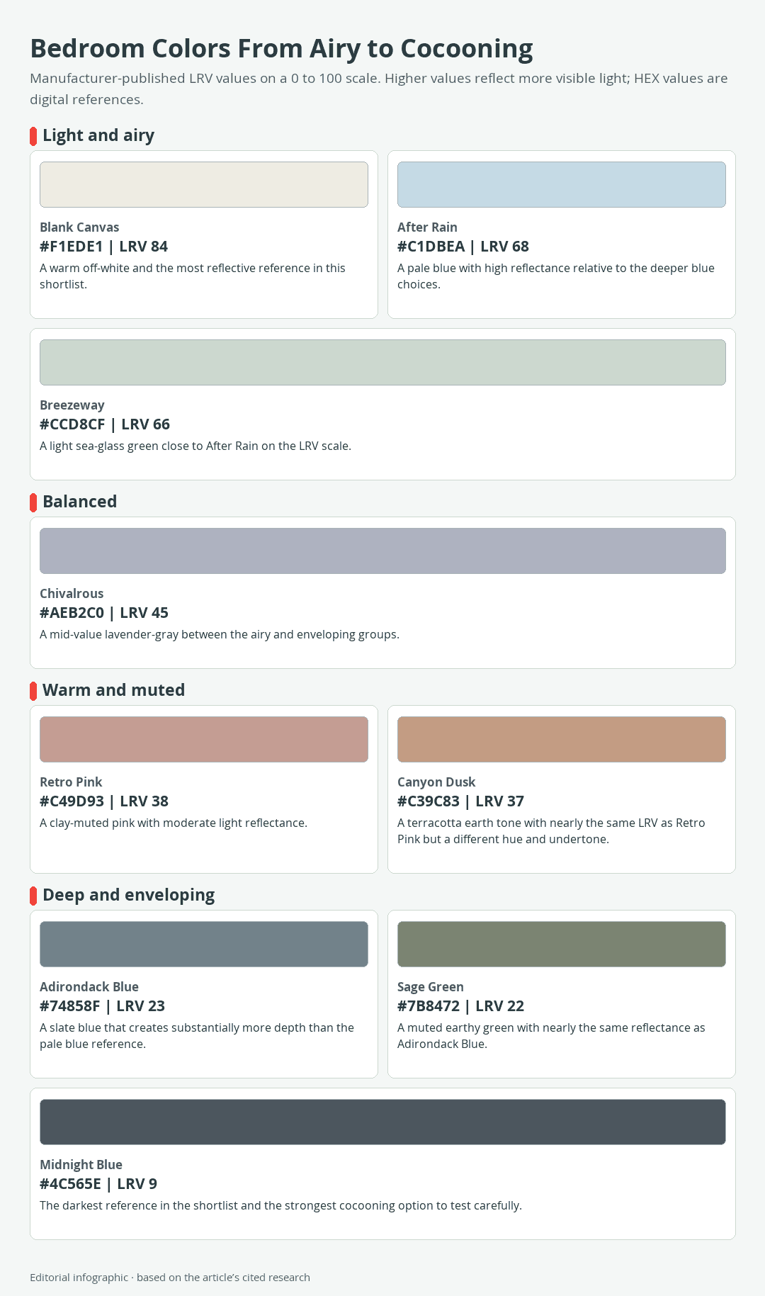
Download the complete color reference sheet (PNG): Bedroom Colors From Airy to Cocooning (PNG)
All nine references are Behr catalog colors, allowing their published HEX and light reflectance value, or LRV, to be compared consistently. The names and codes are proprietary Behr catalog references rather than standardized color names, and their inclusion is not a product endorsement.
Quick Picks by Bedroom Goal
| Name | HEX | RGB | Color | Code | LRV | Best-use direction |
|---|---|---|---|---|---|---|
| After Rain | #C1DBEA | 193, 219, 234 | M520-2 | 68 | Airy pale blue with visible color | |
| Adirondack Blue | #74858F | 116, 133, 143 | N480-5 | 23 | Slate-blue depth without using the darkest option | |
| Breezeway | #CCD8CF | 204, 216, 207 | MQ3-21 | 66 | Light, softly colored sea-glass green | |
| Sage Green | #7B8472 | 123, 132, 114 | ICC-77 | 22 | Muted green with an earthy character | |
| Blank Canvas | #F1EDE1 | 241, 237, 225 | DC-003 | 84 | Flexible warm off-white | |
| Retro Pink | #C49D93 | 196, 157, 147 | S170-4 | 38 | Clay-muted dusty pink | |
| Canyon Dusk | #C39C83 | 195, 156, 131 | S210-4 | 37 | Warm terracotta earth tone | |
| Chivalrous | #AEB2C0 | 174, 178, 192 | S550-3 | 45 | Veiled lavender with a cool cast | |
| Midnight Blue | #4C565E | 76, 86, 94 | N480-7 | 9 | Dark, enveloping blue-gray |
How to Read the Color Table
HEX is the controlling digital reference for each swatch, and RGB expresses the same screen color as red, green, and blue values from 0 to 255. A screen preview is useful for comparison, but it cannot reproduce dried paint under every lamp or daylight condition. A physical paint sample may also differ from a printed chip or screen because each medium produces or reflects color differently.
LRV runs from 0, representing black, to 100, representing white, and indicates how much visible light a paint reference reflects. Blank Canvas at 84 reflects far more light than Midnight Blue at 9. LRV does not describe hue, reveal undertone, or guarantee that a room will look large, comfortable, or bright.
Nine Bedroom-Ready Color Directions
Airy Blues and Greens
After Rain M520-2 is a pale blue with HEX #C1DBEA and LRV 68. It suits a bedroom where you want the walls to register as blue while keeping the overall envelope light. Because a cool cast can become more apparent in cool or muted daylight, test it beside the flooring and bedding rather than judging it alone.
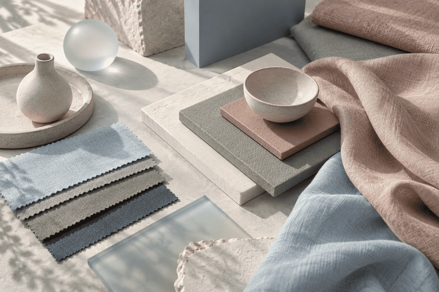 AI-generated editorial illustration; not a measured color sample.
Breezeway MQ3-21 is a soft sea-glass green with HEX #CCD8CF and LRV 66. Its reflectance is close to After Rain, but its green direction creates a different relationship with wood, textiles, and trim. It is a useful alternative when pale blue feels too cool.
Adirondack Blue N480-5 moves from airy to substantial. This slate blue has HEX #74858F and LRV 23, so it reflects much less light than After Rain. Consider it for a headboard wall or an entire room when a deeper blue envelope fits the goal, but view a physical sample on more than one wall first.
Warm Neutrals and Earth Tones
Blank Canvas DC-003 is a warm white with HEX #F1EDE1 and LRV 84. It is the most reflective option in the shortlist and offers a restrained background for changing bedding, artwork, and furniture. Warm white is still a color choice: nearby cool whites, warm wood, and lamp temperature can make its undertone more noticeable.
Canyon Dusk S210-4 is a relaxed terracotta earth tone with HEX #C39C83 and LRV 37. It provides warmth without relying on a bright primary red or yellow. Its moderate reflectance makes it suitable for an earthy, layered room, especially when lighter textiles prevent the scheme from becoming visually heavy.
Sage Green ICC-77 has HEX #7B8472 and LRV 22. Its muted green and earthy undertones can connect naturally with wood and neutral fabric, while its low LRV gives the walls greater visual weight. Do not expect it to behave like a pale botanical green; in limited light, it can look notably deep.
Muted Pink and Lavender
Retro Pink S170-4 has HEX #C49D93, LRV 38, and a neutral clay-colored undertone. That muted quality makes it easier to combine with warm off-white, wood, and subdued blue-gray than a sugary, highly saturated pink. Compare it beside the room’s fixed materials to see whether the clay or pink aspect becomes dominant.
Chivalrous S550-3 is a cool, veiled lavender with HEX #AEB2C0 and LRV 45. It sits near the middle of this collection’s reflectance range and can read as lavender-gray rather than overt purple. Its apparent balance can shift with warm or cool lamps, so an online swatch offers only a starting point.
Deep, Cocooning Blue-Gray
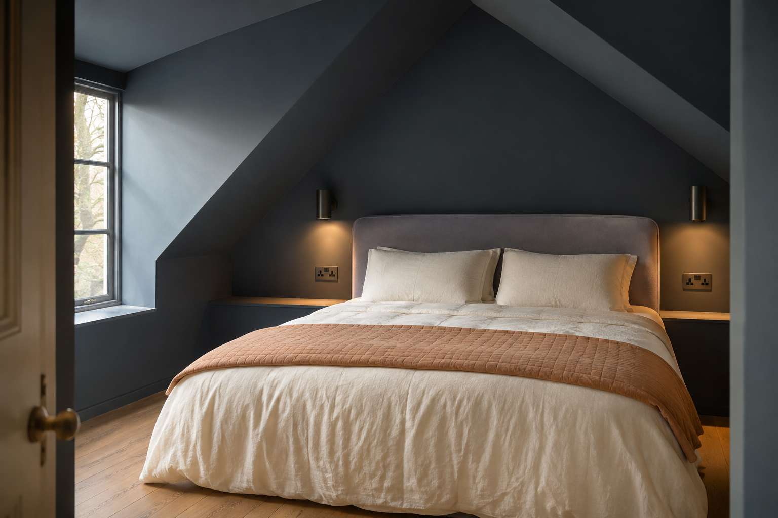
Midnight Blue N480-7 is a deep blue-gray with black influence, HEX #4C565E, and LRV 9. It is the darkest and least reflective selection here. Use it when the intention is an enveloping room rather than an airy one, then plan deliberate contrast through bedding, trim, or other light surfaces.
A low LRV does not automatically make a color unsuitable for a small bedroom. It changes the effect: dark walls can emphasize enclosure and mood instead of maximizing reflected light. Midnight Blue deserves especially careful testing in an already dim room because its blue-gray character and depth may change substantially across the day.
Match the Color to Your Bedroom
Choose the Room Envelope First
Start with the experience you want when entering the room. An airy envelope points toward Blank Canvas, After Rain, or Breezeway. A softly colored middle ground suggests Chivalrous, Retro Pink, or Canyon Dusk, while Adirondack Blue, Sage Green, and Midnight Blue produce progressively deeper surroundings.
This first decision is more useful than asking for one best color in isolation. It gives you a target against which to judge every sample. A light color is not automatically restful, and a dark color is not automatically oppressive; either can miss the goal if it conflicts with the room’s light or furnishings.
Consider Window Direction and Existing Materials
Northern daylight is commonly cool, consistent, and muted, so a cool blue or lavender may appear cooler there than in a sunlit image. Direction is only one variable. Time of day, season, location, and artificial-light temperature can also change a paint color’s apparent intensity and cast.
Collect the fixed elements before selecting a finalist: flooring, stained wood, upholstered headboard fabric, curtains, and trim. Place color samples beside them. Side-by-side comparison often reveals warm and cool undertones that are hard to recognize when a sample is viewed by itself.
If the room’s permanent materials already lean cool, a warm off-white or terracotta may create balance. If warm wood dominates, pale blue, sea-glass green, or lavender-gray can provide cooler contrast. These are design options, not fixed rules; the physical sample remains the deciding evidence for the room.
Use LRV Without Overreading It
LRV helps compare reflectance, particularly when two colors have different names or belong to different hue families. Retro Pink at 38 and Canyon Dusk at 37 have nearly identical LRV values, yet they do not look interchangeable because hue and undertone differ. Adirondack Blue at 23 and Sage Green at 22 demonstrate the same point.
Use LRV to anticipate relative depth, not to predict sleep quality, emotional response, or perceived room size. Surrounding surfaces, the amount of incoming light, and contrast within the palette all contribute to the finished result.
Build a Cohesive Bedroom Palette
The following combinations are editorial design recommendations, not manufacturer formulas or guaranteed physical matches. Their exact HEX values make the intended relationships clear on screen; confirm the corresponding paints and materials with real samples.
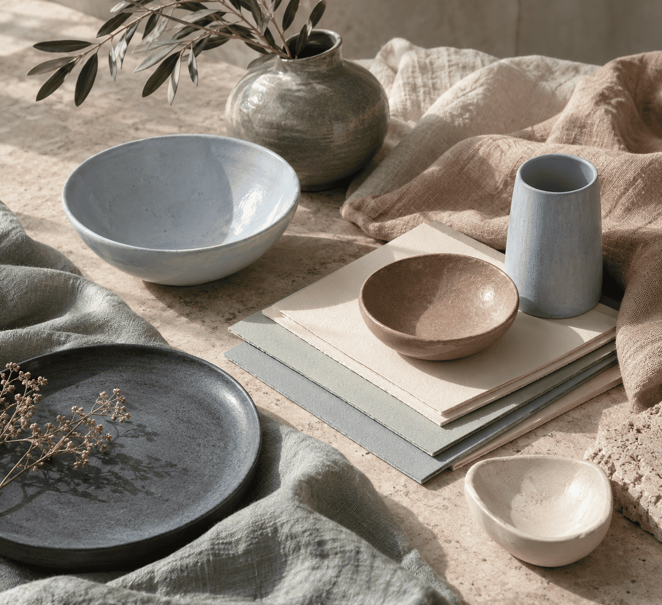 AI-generated editorial illustration; not a measured color sample.
Light and Low Contrast
| Name | HEX | RGB | Color | Role |
|---|---|---|---|---|
| After Rain | #C1DBEA | 193, 219, 234 | Dominant wall color | |
| Blank Canvas | #F1EDE1 | 241, 237, 225 | Supporting trim or textile reference | |
| Adirondack Blue | #74858F | 116, 133, 143 | Restrained deeper accent |
This palette keeps most of the room light while adding enough slate blue to define smaller details. Breezeway can replace After Rain if pale green relates better to the existing materials.
Earthy and Layered
| Name | HEX | RGB | Color | Role |
|---|---|---|---|---|
| Sage Green | #7B8472 | 123, 132, 114 | Dominant wall color | |
| Blank Canvas | #F1EDE1 | 241, 237, 225 | Light supporting color | |
| Canyon Dusk | #C39C83 | 195, 156, 131 | Warm accent |
Muted green and terracotta create distinct warm and cool directions while sharing an earthy character. Natural wood and linen can contribute texture without requiring additional strong colors.
Dark Walls With Controlled Contrast
| Name | HEX | RGB | Color | Role |
|---|---|---|---|---|
| Midnight Blue | #4C565E | 76, 86, 94 | Dominant wall color | |
| Blank Canvas | #F1EDE1 | 241, 237, 225 | Light bedding or trim reference | |
| Chivalrous | #AEB2C0 | 174, 178, 192 | Soft transition color |
The large difference between Midnight Blue and Blank Canvas creates clear contrast, while Chivalrous bridges the dark and light values. This approach preserves the enveloping wall effect without making every major surface dark.
Test the Color Before You Commit
A Four-Condition Sample Check
- Narrow the shortlist. Record the exact color name and catalog code so a similarly named or displayed shade is not substituted.
- Obtain physical samples. Apply the intended sample product as directed. A movable sample board can help you compare more than one wall without scattering isolated patches around the room.
- Check four conditions. Observe each sample in morning daylight, afternoon daylight, evening light, and the artificial lighting normally used at night.
- Compare it with fixed materials. Move the sample beside flooring, trim, furniture, and large textiles. Remove candidates that create an unwanted undertone or contrast.
Keep the finalists in place long enough to see changing light rather than choosing from one brief viewing. Follow the selected product’s directions for surface preparation, application, drying, ventilation, and protective equipment.
Choose a Bedroom-Wall Sheen
Matte paint has low luster and is commonly recommended by Behr for bedroom walls. Flat finishes are non-reflective and can help conceal minor wall imperfections. Eggshell and higher sheens reflect more light, so the same color may show more visible highlights in those finishes.
Compare the sheen as well as the color. The practical choice depends on the surface condition and maintenance needs, so check the product guidance instead of assuming that every paint line gives identical performance.
What Bedroom Color Can and Cannot Do for Sleep
Wall Color Is Not a Sleep Treatment
Direct research does not establish one bedroom wall color that universally improves sleep. Blue and green often carry calm or relaxing associations in bedroom guidance, but those associations can vary with culture, learning, context, personal experience, lightness, and chroma, meaning the intensity or purity of a color.
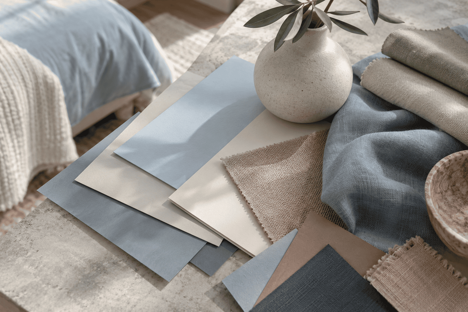 AI-generated editorial illustration; not a measured color sample.
That is why a pale blue and a dark slate blue should not be treated as emotionally identical merely because both are blue. Choose a wall color that supports the atmosphere you personally find comfortable, but do not treat paint as a remedy for insomnia or a guaranteed sleep aid.
Paint Color Is Not the Same as Colored Light
A painted wall reflects the light falling on it. A lamp, phone, or other screen emits light. Research that changes bedroom lighting or electronic-device use before bed therefore examines a different exposure from blue paint on a wall.
For example, a randomized crossover study involving 24 adults examined emitted bedroom-lighting and device conditions, not wall-paint colors. Its findings cannot establish that a blue bedroom wall helps or disrupts sleep. Keeping these variables separate prevents a useful design preference from turning into an unsupported health claim.
Frequently Asked Questions
Should the bedroom ceiling match the walls?
It can if you want one continuous color envelope, but matching is an aesthetic option rather than a requirement. For more value contrast, choose a lighter ceiling. Compare physical samples of the intended wall and ceiling colors before committing.
How many paint colors should I sample?
There is no universal number. Use the table to create a focused shortlist representing genuinely different directions, then compare those physical samples in the four lighting conditions. Three well-chosen alternatives are often more informative than many near-duplicates, but the room should determine when the choice is clear.

Learn more about Israel Benloulou and about us.